My “Eye On Art” column appears monthly in the Sag Harbor Express
__________________
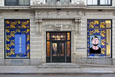
Pollock for the Holidays
12-10-2015
This holiday season, modern art aficionados have three Jackson Pollock gifts in their metaphorical stockings. An expanded version of the exhibition built around his 1943 mural, recently at the Peggy Guggenheim Collection in Venice, is on view at the Deutsche Bank KunstHalle in Berlin. “Jackson Pollock: Blind Spots,” which originated at Tate Liverpool and is now at the Dallas Museum of Art, focuses on the artist’s lesser-known black enamel paintings of 1951-52, bracketed by examples of his earlier and later work. But if you’re not in the mood for a trip overseas, or even to Texas (passport not required), you can get a Texas-size helping in “Jackson Pollock: A Collection Survey, 1934-1954,” at the Museum of Modern Art in New York through March 13.
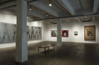
Since MoMA’s 1944 acquisition of The She-Wolf, its first Pollock painting, the museum has become the preeminent collector of his work. With some 85 examples in almost all media to choose from, it’s the only museum that could mount a mini-retrospective entirely from its own holdings. Just imagine: no loan fees, no special insurance, no shipping nightmares, no cranky private collectors to placate—a curator’s dream. The curator in question is Starr Figura of the drawings and prints department, hence the show’s preponderance of works on paper, which is not by any means a weakness. There’s also a sizable selection of major paintings, both large and small, which are often on view in the permanent collection galleries, but the prints and drawings have never been exhibited in conjunction with them. In MoMA’s 1998 Pollock retrospective, graphics were sidelined in favor of the in-house masterpieces and blockbuster loans.
Among the roughly 50 works in MoMA’s current survey, some rarely-seen curiosities—like the painted cigar box from Pollock’s student days (the show’s earliest piece, pre-1934), and printing plates from the engravings he made in Stanley William Hayter’s avant-garde print workshop, Atelier 17, in 1944-45—have been awakened from their long hibernation in storage. It’s also great to see trial proofs of the engravings and several versions of his small screen prints (including a 1944 New Year’s card that is probably his first all-over poured image), as well as a wide range of graphic works that trace his development from Benton-inspired American Scene subject matter through the influence of Native American art, the Mexicans Orozco and Siqueiros, Surrealism, and the examples by Picasso and Miró that he saw at MoMA.
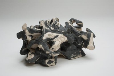
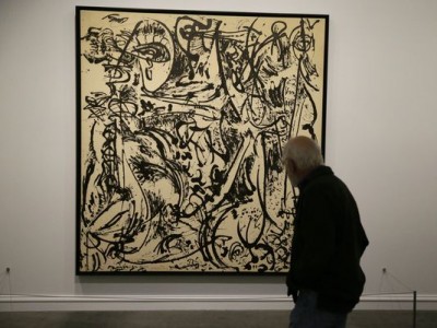
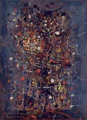
Those influences notwithstanding, Pollock’s unique sensibility is evident from the outset, and we find it maturing in the early to mid 1940s canvases, including Gothic, Stenographic Figure, There Were Seven in Eight and The She-Wolf, then blossoming in Full Fathom Five, 1947, and Number 1A, 1948. All this is crowned by One: Number 31, 1950, a premier example of Pollock—sober, very productive, and prodigiously inventive—at the pinnacle of his achievement. MoMA owns another canvas from this period, the beautiful golden frieze, Number 7, 1950, which unfortunately didn’t make the present cut. But with such a plethora of riches, who can complain? Not that there aren’t some gaps. MoMA has none of Pollock’s very few surviving sculptures, although perhaps this exhibition will encourage the gift of one from a private collection. Five of them, spanning his entire career, represent another unfamiliar aspect of his work in the “Blind Spots” show in Dallas.
Also in Dallas is MoMA’s only 1951 black enamel painting, Echo, which accounts for the absence from the survey of any canvases from that year. The unprecedented opportunity to bring together more than 30 examples of Pollock’s monochromatic paintings from a transitional, and still under-appreciated, phase made the loan of Echo to “Blind Spots” essential. But when that series was new, six of them were translated into photographic screen prints, and they are on view at MoMA. Unfortunately for Pollock’s bank balance, the lack of color and re-emergence of figurative imagery put off potential buyers, and the series, paintings and prints alike, was a commercial failure. For the next five years, he tried various tactics to redirect his creativity, and MoMA’s Easter and the Totem, 1953, and White Light, 1954, illustrate his efforts. They round out an exceptional show, perhaps the last chance for some time to see the full range of Pollock’s career in a single presentation.
Warhol in Montauk and Pittsburgh
11-12-2015
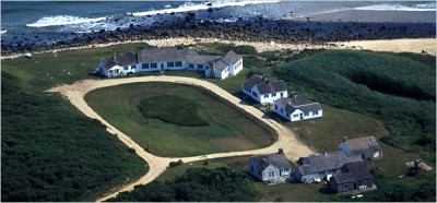
With Eothen—the Montauk oceanfront compound now owned by J. Crew CEO Mickey Drexler—about to change hands again, Andy Warhol is back on the East End radar. Although the property is popularly known as the Warhol Estate, that’s something of a misnomer. It actually belonged to the artist’s filmmaking partner Paul Morrissey, who bought it in 1971 as a summer hangout for the Warhol entourage. According to Morrissey, “Andy hardly spent any time out here,” nor did he contribute to the $225,000 purchase, which included seven buildings and land totaling 20+ acres. (The reported contract price for the 5.7-acre compound alone is more than 250 times that.)
Even if he wasn’t a frequent visitor, Warhol showed up with his ubiquitous camera when friends like Mick Jagger, Liza Minnelli, Jackie Onassis and Halston were in residence. His snapshots show guests relaxing on the grounds, cooking meals, and enjoying what Morrissey called the “very low key, very private” environment. And although, again per Morrissey, Warhol never had a studio there, the ocean view inspired his Sunset series of screen prints. With typical Warholian contrariness, the artist turned his eye westward from Eothen, which is Greek for “toward the east.”
The singularly contrary nature of Warhol’s life and career is brought into sharp and revealing focus at the Andy Warhol Museum in his native Pittsburgh, which has embraced him with the fervor of a doting parent. Of course his reputation goes far beyond his hometown; he’s arguably the world’s most famous American artist. But it all began in the City of Bridges, where the one that leads to his shrine, just across the Allegheny River from downtown, is festooned with reproductions of his 1964 self-portrait. The museum building is a revamped industrial warehouse that’s been handsomely designed to accommodate a comprehensive collection of his artwork, from his student days at the Carnegie Institute to examples from just before his untimely death, the result of gallbladder surgery, at age 58 in 1987. It also houses a library and archives, as well as his films and photographs.
In October, visiting the museum for the first time, I was impressed not only by the physical layout but also with the scope of the material on view and the insights offered by the installation. It traces the unlikely trajectory of the sickly youngest son of Slovak immigrants as he transitioned from a successful career as a commercial illustrator to fame and fortune in the fine art world by embracing the lowbrow, superficial and kitschy subject matter that was anathema to that world. Warhol was not the first artist of his generation to go there, but his iconoclasm was the most extreme. It included the cultivation of a campy self-image that even his gay contemporaries considered “too swish,” mass-production techniques that effectively erased evidence of artistic individuality, a circle of deviants and druggies whom he sarcastically billed as Superstars, and the kind of blatant self-promotion that was alien to most artists. How all of this worked in his favor instead of against him is still something of a mystery.
I have never been a fan of Warhol’s art, but his museum does him proud. Each floor begins with an illustrated timeline, and the galleries feature representative examples of work from each decade. On the top floor, devoted to his family history, school days and early career, I was charmed to learn that his cat drawings were based on those of his mother, Julia Warhola, who also lettered some of his self-published books. An instructive video shows how he created the idiosyncratic blotted line for his illustrations, and his use of dye, rather than ink or watercolor, to tint the images. This floor also shows his transition to hand-painted canvases of subjects derived from print advertising and consumer products, including unfinished studies of Campbell’s Soup cans. Below that, on floor six, are the screen-printed portraits of Elvis, Marilyn, Jackie and Liz that testify to his lifelong fascination with pop-culture idols.
And so it goes through the decades, chronicling the diverse projects of Andy Warhol Enterprises—the films, the band, the books, the magazine, the TV shows, the portrait commissions, the endorsements—ending with a cavalcade of head shots running the gamut from Mick to Mao, as well as the oxidation and camouflage paintings, tongue-in-cheek references to the abstract art he rejected. As he did at Eothen, Warhol found inspiration in the opposite direction.
Jacob Riis’s Revelations
10-15-15
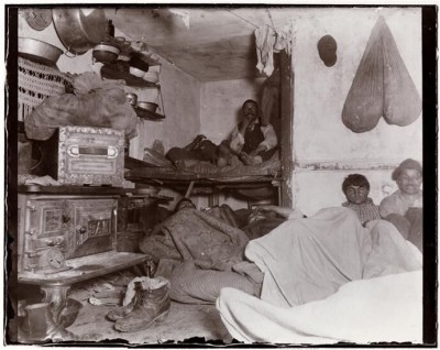
Dubbed “New York’s most useful citizen” by Governor Theodore Roosevelt, Jacob A. Riis pioneered the use of flash photography to document the shameful living conditions of the city’s slum-dwellers in the late 19th century. His newspaper articles, books and slide lectures awakened the public conscience in an era when improved housing was largely a matter of private initiative and charities were expected to deal with the needy. Although he was far from the first advocate for social reform, his brand of what we would now call investigative journalism, combined with a gift for well-illustrated, persuasive storytelling, made him the era’s most prominent and effective spokesman for the urban poor.
Even now, when image overload threatens to dull our sensitivity, Riis’s photographs are still shocking. Their intimate views of slum life, while not candid, were a revelation in the late 1880s, since the recent introduction of flash powder made it possible for Riis to take pictures in the darkest locations. The largest collection—including vintage prints, glass negatives, lantern slides and stereographs—is in the Museum of the City of New York, which has just opened the first major exhibition of them in more than half a century. Supplemented by material from his papers, lent by the New York Public Library and the Library of Congress, “Jacob A. Riis: Revealing New York’s Other Half” is on view through March 20, after which it will travel to the Library of Congress and two museums in Denmark, Riis’s native country. It commemorates the 2014 centenary of his death and reminds us that the issues of poverty and inequality he addressed are echoed in contemporary society.
I have a special interest in this exhibition because of a family connection. My maternal grandfather, August Quortrup, also a Danish immigrant, was Riis’s close friend and neighbor in Richmond Hill, Queens. Riis was my uncle Norman’s godfather, and his wife Elisabeth was my aunt Marjorie’s godmother. When he and Elisabeth came to our house, they would drink beer from custom-made ceramic mugs bearing their initials. I inherited those mugs, and lent them to the exhibition. They are among the many personal artifacts and documents that enrich the display and bring to life a fascinating character whose legacy is still relevant today.
Riis was born in 1849 in Ribe, a small town in northern Denmark, and came to the US in 1870. A carpenter by trade, he worked at itinerant jobs and lived from hand to mouth for several years before he found his calling as a journalist. In many ways, his is the classic immigrant story of hardscrabble beginnings, self-reliance, hard work and good luck leading to professional and personal success. What set him apart from other strivers was his dedication to exposing the social inequities he experienced first hand, when he was a member of the underclass. Writing for the New York Tribune, he started as a police reporter, which put him in touch with the seamier side of city life. It also increased his sympathy for the homeless, the transient, and others who ran afoul of the law for no reason other than their indigence and desperation.
Riis resolved to use his pen to describe the circumstances of their lives, but found that photographs enhanced the impact of his stories. Publications such as Harper’s Weekly already used engravings to illustrate the squalid living conditions in urban tenements. Riis’s innovation was to take a camera into the overcrowded apartments, dingy sweat shops, unsanitary rooming houses, filthy basements and dismal police station lodging rooms, and to present public slide shows of his photographs in an effort to stimulate charitable efforts on behalf of the deserving poor, especially the children, whose only crime was to be born destitute. His widely praised lectures grew into an influential book, “How the Other Half Lives,” published in 1890, which gained him national recognition.
That book and others, including Riis’s 1901 autobiography, “The Making of An American,” were written in a study he built behind his house on Beech Street in Richmond Hill, just up the road from our house. Although both he and my grandfather died some 30 years before I was born, I grew up with stories of their friendship and their shared belief in the progressive causes to which Riis devoted his career. This exhibition is a timely reminder that, a century after his death, his work is unfinished.
Kiesler’s Endless House at MoMA
9-17-15
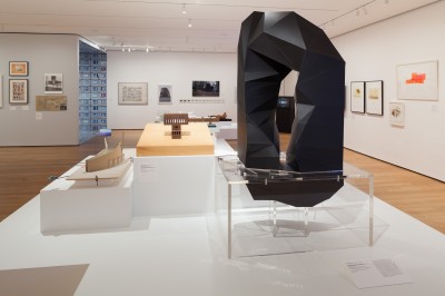
At his cottage on Old Stone Highway in Amagansett, the artist, architect and designer Frederick Kiesler (1890-1965) made sculptures and building models designed according to his principle of Correalism, which he defined as “the inter-relationships of natural and man-made organisms.” His most ambitious project in that vein, the Endless House, was never built, but its influence can be felt in the work of numerous architects at work during the 50 years since his death. To mark that anniversary, the Museum of Modern Art is presenting “Endless House: Intersections of Art and Architecture,” on view through March 6.
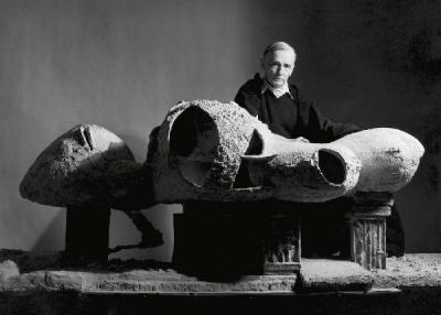
Born in Romania and educated in Vienna, Kiesler came to New York in 1926 and quickly established himself as an innovative designer for the stage. That year he exhibited his proposal for an Endless Theater, an egg-shaped structure with a ramped interior, designed three years earlier to illustrate his concept of “tensions in free space.” He later adapted this idea to a domestic building, the Endless House, which occupied him for more than a decade. A hybrid of architecture and sculpture, intended to be made of reinforced concrete over wire mesh, with frescoed walls, textured floors, bathing pools and colored lighting, it was conceived as a kind of multimedia experience in which all the senses would be engaged. A large scale model was included in the “Visionary Architecture” exhibition at MoMA in 1960. Its open-ended, biomorphic elements interlock like cellular growths, forming a structure that is, in Kiesler’s words, “endless like the human body—there is no beginning and no end to it.”
The current exhibition, drawn entirely from MoMA’s collection, includes Kiesler’s first Endless House model, a small ovoid ceramic sculpture made in 1950, and a series of freely drawn conceptual plans, elevations and sections that illustrate his structural and spatial variations. A large photograph shows the exterior and interior details of the famous 8-foot Endless House model, made in 1958-59, as it was displayed in “Visionary Architecture.” A scheme to build a full-scale version in the museum’s garden was never carried out, but a version of the model is in the collection of the Whitney Museum. The ideas it embodies— sculptural form, organic design, integrated interior spaces and the use of innovative materials, as well as an iconoclastic approach to the function of a domestic dwelling—are echoed in the work of the artists and architects represented in the current show.
In some cases, however, the designs are the very antitheses of Kiesler’s principles. Opposite the wall devoted to him is a model of Mies van der Rohe’s Farnsworth House (1945-51), a glass box that typifies the postwar style Kiesler rejected as sterile—“one box next to another . . . until they grow into tumors of skyscrapers.” Models of houses by Michael Graves, John Hejduk, Paul Rudolph and others are in the same camp. What the Endless House has in common with them, other than the fact that it’s a single-family home, is far from apparent. In his early career in Europe, Kiesler was the youngest member of the De Stijl group, which
espoused a similar geometric formalism, but he later adopted the organic approach reflected in such projects as his design for Peggy Guggenheim’s gallery, Art of This Century (1942), the Universal Theater (1960-61, unbuilt), and of course the Endless House.
There is a far more plausible relationship between Kiesler’s thinking and the design of the Wing House, by Hani Rashid and Lise Ann Couture of Asymptote Architecture, for a site in Finland. Looking like a space ship that landed in Helsinki in 2011, the building shows how modern materials could enable the construction of the sort of sculptural structures Kiesler envisioned.
There’s also a direct connection to Kiesler’s precedent in Peter Eisenman’s Max Reinhardt Haus proposal from the early 1990s, a model for a colossal monument to the legendary German theater director that would have replaced his destroyed Expressionist playhouse in Berlin. Based on a Möbius strip, the design is indeed endless. More geometric than organic, it nevertheless uses the same kind of continuously evolving structure that Kiesler employed. And, like all but one of his buildings—the Shrine of the Book in Jerusalem, designed with Armand Bartos and completed the year of Kiesler’s death—it was never built.
Sargent Portraits at the Met
08-20-15
This is shaping up to be the year of the portrait. Portraits, portraits everywhere! Sefies at Guild Hall Museum in East Hampton, drawings at the Morgan Library, portraits by Chuck Close at the Parrish Art Museum in Water Mill, by Elaine de Kooning at the National Portrait Gallery in Washington, DC, and of her at my museum, the Pollock-Krasner House. But even if you think that’s enough to hold you for a while, you should not miss “Sargent: Portraits of Artists and Friends,” at the Metropolitan Museum of Art through October 4. Drawn from the Met’s own extensive Sargent collection, supplemented by major loans, the show was co-organized with the National Portrait Gallery in London. It explores the full range of Sargent’s portraiture, from the slick, formally posed commissioned works to freely-brushed, intimate studies, fellow painters at work, and oil and charcoal sketches done for the artist’s own pleasure.
There are interesting parallels among John Singer Sargent (1856-1925), Close and de Kooning. All three of them are known for depicting members of their social and professional circle. All three developed singular painterly techniques that range from descriptive to expressive. And they all have been criticized for working in a genre outside the modern vanguard. But the results vindicate their decision to focus on the portrait as a primary vehicle for the development of their artistic gifts.
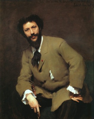
Sargent displayed those gifts early and prodigiously. Born in Florence to expatriate American parents, he grew up in a cosmopolitan milieu and met leading figures in European arts and letters, many of whom he befriended. In Paris, as a student of Carolus-Duran, the leading portrait painter of the day, his likeness of his teacher was shown at the 1879 salon and promoted suggestions that, at the tender age of 23, he had already surpassed the master. That painting is in the show, together with several early commissioned portraits that may have resulted from the honorable mention his Carolus-Duran canvas received.
Sargent’s admiration for Velasquez, Manet and Van Dyck is evident in his compositions, which often foil the figure against an indefinite background. In his 1881 double portrait of the Pailleron children, for example, the fully modeled faces and figures are backed by generalized dark red drapery that emphasizes their presence. The little girl is especially engaging, staring straight out of the picture, her frilly white dress contrasting with her serious, somewhat disquieting expression. The freely-brushed burgundy drapes appear again in Dr. Pozzi at Home, a full-length study of his friend, a leading French gynecologist, wearing a scarlet dressing gown. When it was shown at the Royal Academy in London, this “symphony of reds” was admired for its technical fluency and theatrical panache, qualities that would earn Sargent both praise and disdain in the years to come.
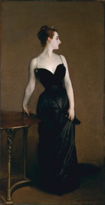
While Dr. Pozzi and other prominent figures of the era are not familiar to modern viewers, most folks will recognize several of Sargent’s subjects: writers Henry James and Robert Louis Stevenson; actress Ellen Terry, chewing the scenery as Lady Macbeth; and fellow artists Auguste Rodin, upstaged by his splendid beard; William Merritt Chase, posed with the tools of his trade; and Claude Monet, painting en plein air at Giverny. But his most famous portrait, the one that caused a scandal when it was shown at the 1884 Paris salon, is of a woman of no professional or artistic distinction, known as Madame X. A fellow American expatriate, Virginie Gautreau was a society hostess and renown beauty. Sargent hoped that painting her—the portrait was not commissioned—would further his career, but the tactic backfired and he moved to London to escape his French critics, who called the painting indecent. Yet in spite of its initial negative reception, he continued to show the portrait periodically. He kept Madame X until 1916, when he sold it to the Met, claiming that it was “the best thing I have ever done.”
What makes the current exhibition special—in addition to the unprecedented opportunity to see so many examples of Sargent’s painterly prowess—is the insight it gives into the web of connections among the intelligentsia of the day, many of whom were in Sargent’s circle. He went everywhere worth going, knew everyone worth knowing, and exhibited widely, becoming the most celebrated American artist of his generation. (Although born in Europe, he maintained his American citizenship and visited the US regularly.) This fascinating blend of personal and professional interaction enriches what might otherwise have been just a parade of beautifully dressed, gorgeously painted people.
Appreciating the New Whitney
07-23-2015
My mother was fond of the saying, “comparisons are odious,” so as a dutiful daughter I try not to make them. But—sorry, Mom—in the case of the Whitney Museum of American Art’s former and current buildings, comparisons are inevitable. The differences between Fortress Breuer on Madison Avenue, which opened in 1966, and the new Renzo Piano showplace on Gansevoort Street are so striking that they can’t be politely ignored. They are evident on every level, from the physical to the philosophical.
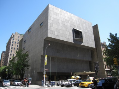
Taken as a whole, the buildings inevitably evoke the night-and-day cliché. The old Whitney, with its massive stepped façade looming over the entrance, was often likened to a bunker, with good reason, since the windows look like gun turrets. What little natural light got in did nothing to illuminate the galleries. Inside and out, the new Whitney is bathed in natural light. The terraces extend the exhibition spaces outdoors, and even the stairwells have great river views. The entrances alone illustrate the distinction. To get into the Breuer building, you had to cross what looks like a moat, and inside the first thing you saw was the shop. At the new building, a glass-walled café with a welcoming terrace greets you, and the shop is tucked off to the side of the lobby.
The philosophical shift is apparent there as well. How many people know why the Whitney is called the Whitney? Before, there was no evidence of the museum’s founder, except on the rare occasions when Robert Henri’s striking portrait of the sculptor and benefactor Gertrude Vanderbilt Whitney was exhumed from storage for temporary display. Now the painting—together with documentation of the museum’s history and works by some of its early associates, including a sculpture by Whitney herself—is showcased in a ground-floor gallery. This room, which you can visit before you pay admission to the rest of the museum, is a long overdue tribute to the woman whose vision and philanthropy laid the groundwork for the brilliant cultural asset her namesake institution has become.
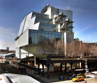
Not only the Whitney portrait, but also much of the museum’s permanent collection of more than 21,000 pieces, has long languished in the vault. In the 1980s, in response to perennial complaints, branches were established in corporate spaces ill suited to art exhibitions. Those branches are all gone, and now the new building, which opened on May 1, is filled with a large selection that surveys the Whitney’s holdings. This inaugural exhibition, “America Is Hard to See,” takes its title from a 1951 poem by Robert Frost, an ironic meditation on European exploration of the New World: “They could not see it from outside—Or inside either for that matter.” The exhibition’s intention is a kind of aesthetic exploration of the various, changing, and sometimes contradictory concepts that define American art.
With more than 60,000 square feet of gallery space inside and outside, there’s plenty of room to display both the old favorites and things that have rarely been seen. The installation is chronological, with works in different media grouped thematically to illustrate the cross-references among them. Some of the categories seem a bit forced, but the layout itself makes perfect sense. From the ground floor gallery devoted to Whitney and her circle, the time line jumps to early modernism on the 8th floor. Here abstractions by O’Keeffe, Hartley, Alfred Stieglitz, Stuart Davis and other familiar names share equal billing with works by Florine Stettheimer, Agnes Pelton, Richmond Barthé and Nancy Elizabeth Prophet, showing that women and artists of color were active participants in the modernist impulse.
And so it goes on the next three floors, questioning conventional assumptions about each generation and each art movement. Expanding the canon is only valid if there are works of high enough quality to justify inclusion, and the Whitney’s collection turns out to be rich in them. For example, Alfonso Ossorio’s Number 14, 1953 holds its own next to Jackson Pollock’s Number 27, 1950, and Hedda Sterne’s New York, NY, 1955 is in no way diminished by its powerful neighbor, Willem de Kooning’s Woman and Bicycle of 1952-53. In fact the Sterne’s linear structure plays off nicely against the de Kooning’s gestural looseness, just as the stark wood beams of Mark di Suvero’s Hankchampion, 1960, complement the colorful arabesques in Lee Krasner’s large 1957 canvas, The Seasons. In its new home, the Whitney has given us a broader and more inclusive perspective on American art, as well as a greatly improved setting in which to appreciate it.
Grace Under Pressure: An Artist’s Life
06-25-2015
Interviewed in 1990 by a writer for the Baltimore Sun, the paper of record in her adopted home town, Grace Hartigan affirmed her abstract expressionist roots. Yet three years later, she told the same interviewer that she was not an abstract painter in the 1950s, when her work was firmly aligned with that movement. This is only one of the many paradoxes explored by Cathy Curtis in Restless Ambition, her absorbing new biography of one of the few female artists of her generation—she was born in 1922—to achieve significant recognition in the male-dominated New York School of the mid 20th century.
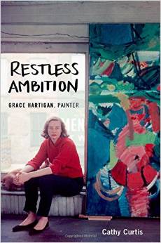 Curtis, a former Los Angeles Times staff writer, applies an investigative reporter’s sensibility to the artist’s life story, which is lurid enough to merit tabloid treatment. But you can’t write an exposé of someone whose excesses are common knowledge. Curtis doesn’t try to soften Hartigan’s rough edges or downplay the self-destructive behavior that threatened to derail her career. Liberal quotes from her journals (some of which were published in 2009, the year after her death) and her many lectures and statements allow her voice—veering from brash and egotistical to self-doubting and painfully conflicted—to propel the narrative, which is bolstered by material from her archives and interviews with family members, friends, colleagues, and former students. More than one quarter of the book’s 400+ pages are devoted to source notes and an extensive bibliography.
Curtis’s art history MA from Berkeley enriches her analysis of Hartigan’s paintings, some made in the Hamptons, but too few of which are reproduced. The author is aware of this limitation, explained in her foreword as a consequence of “overly restrictive reproduction stipulations, and the need to limit book production costs.” So you have to try to imagine many of the works she discusses, look them up in various exhibition catalogs, or refer to Robert Mattison’s 1990 monograph, “Grace Hartigan: a painter’s world.” There are two color signatures, illustrating exemplary paintings from 1950-1985, but the plate numbers noted in the text are missing from the reproductions, and one painting is misdated in the caption. This editorial carelessness is unfortunate in a book that is otherwise meticulously documented, to the extent that even minor facts are given endnote status.
From her childhood in suburban New Jersey through an early marriage (the first of four, with numerous affairs along the way), the birth of a son she virtually abandoned, and a succession of day jobs to support her tentative artistic development, Hartigan was both fiercely ambitious and deeply insecure about her talent. While rubbing elbows—and bending them—with luminaries like Pollock, de Kooning and Kline, she won early acclaim as a “second generation” abstract expressionist, a label she later disdained on both counts. She was also dismissive of the “woman painter” designation, an attitude shared by Lee Krasner, Elaine de Kooning, Helen Frankenthaler and Joan Mitchell, who maintained quite rightly that painters should be classified according to the quality of their work alone. That these women and others persisted, and eventually were vindicated, in the face of blatant art-world sexism is a testament to their unwavering commitment to their art.
In Hartigan’s case, she applied gestural abstraction to the mundane subject matter she saw around her Essex Street studio—raw material also being mined by Larry Rivers, Robert Rauschenberg and other contemporaries, as well as her poet friends Frank O’Hara and John Ashbury. This put her at the forefront of the transition from non-objective “action painting” to a focus on, in her words, “what is vulgar and vital in American modern life.” Leaving New York for Baltimore in 1961 isolated her from the artistic mainstream, yet she continued along a singular path that Curtis maps with candor and empathy. While she distanced herself from Pop art, which she found too detached, in the 1960s and ‘70s she was also using sources like coloring books and other commercial printed matter, although always with painterly flourish and emotional intensity that sometimes had autobiographical overtones. A tumultuous private life, including alcoholism and the long illness and death of her fourth husband, spilled into her depictions of fragmented female figures, tormented lovers, and mythological characters. Her later works, none of which are reproduced, clearly show her declining powers, but her earlier achievements are rightly recognized for their colorful, exuberant expression of a colorful, exuberant spirit.
Did Art Revolutionize TV? Maybe Not.
05-28-2015
What do Rod Serling and André Breton have in common? Overtones of Surrealism, formulated by Breton as the so-called “revolution of the mind,” color the science-fiction fantasy of Serling’s “Twilight Zone,” one of the television classics highlighted in “Revolution of the Eye,” currently on view (through September 20) at the Jewish Museum. Subtitled “Modern Art and the Birth of American Television,” the show purports to illustrate how “avant-garde art influenced and shaped the look and content of network television in its formative years.”
This premise is, to put it mildly, a stretch. While it’s commonplace today to see performance art and experimental video on television, as well as on the Internet,
broadcasting was hardly fertile ground for visual artists during the period covered by the exhibition—the late 1940s through the 1970s. The airwaves, dominated by three commercial networks, responded to trends in popular culture, just as artists were doing, but the developments were largely parallel rather than interactive. When they did cross over, it was often tangentially.
At the show’s entrance we see a projection of a clip from “Color Me Barbra,” a 1966 special featuring the young Streisand prancing around a gallery of modern paintings at the Philadelphia Museum of Art, belting out “Gotta Move.” The wall text would have you believe that “she has found what she was looking for, her place of self-expression,” yet the lyrics tell a different story. “Gotta get out,” she cries, “gotta leave this place.” Contradictions like this abound. Many of Ernie Kovacs’ antics had surreal overtones, but their source is the Marx Brothers, not the Surrealist Manifesto. Another forced reading is the equation of the Jewish Museum’s 1966 “Primary Structures” exhibition, devoted to minimalist sculpture, with the geometric sets on the Ed Sullivan Show, as if the art movement had influenced TV set design. In fact the sets were pared down well before “Primary Structures.”
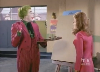
A good example of parallel influences is the ABC “Batman” series, 1966-68, based on the DC Comics characters. Pop artists were mining the same mother lode of imagery, and the museum could also have cited the “Superman” and “Wonder Woman” programs as derived from those pop-culture sources. But it’s silly to imagine that TV series based on comic book characters were inspired by Pop art. The first such program was in the early 1950s. I assume that “Batman” was chosen because of its 1967 art-themed episode, “Pop Goes the Joker,” which lampoons modern art, although of the abstract variety, not Pop.
The exhibition features excerpts from numerous programs about art and/or artists and implies that this represents influence. A documentary about art in America, an occasional visit to an artist’s studio, or Salvador Dalí’s 1952 appearance on “What’s My Line?” (which you can see here: https://www.youtube.com/watch?v=iXT2E9Ccc8A) hardly constituted a look-shaping shift for network TV. Nor did the employment of artists to design title cards and promotional graphics. Ben Shahn’s graphics for CBS are included, but they didn’t appear on air. No mention is made of Jimmy Ernst’s 1956 acrylic sculpture (still in the artist’s estate), commissioned by NBC for the closing credits of “Peter Pan.” And that was a one-shot deal. There is a passing nod to pioneering avant-garde filmmaker Stan
Vanderbeek’s work on the sets of “Winky Dink and You,” the first interactive TV program, on CBS from 1953-57, although just what his influence was isn’t specified.
Various iterations of the iconic CBS eye logo are supposed to show the modernist influence on the “Tiffany network’s” sophisticated image, but the fine print contradicts that notion. The design was actually inspired by a 19th century Shaker motif reproduced in a 1951 issue of Portfolio magazine. Most curious of all, while the echo of Surrealism in Serling’s “Twilight Zone” is rightly credited, his “Night Gallery,” 1969-73, in which paintings are the story hooks—actually shaping the content—is not included. We do, however, see a clip from “The Medium is the Medium,” 1969. Featuring Allan Kaprow, Nam June Paik, Otto Piene and others, it is one of the earliest examples of video art made for TV—public TV, that is. It was commissioned by WGBH in Boston. Here, modern art really does shape content, because it is the content.
Pollock Times Three in Venice
04-30-2015
For those planning to visit this year’s Venice Biennale, the international art extravaganza opening on May 9, a side trip to the Peggy Guggenheim Collection is a must. As if the superb permanent collection were not enough of an attraction, there are no fewer than three Pollock-themed shows, each of which is a revelation.
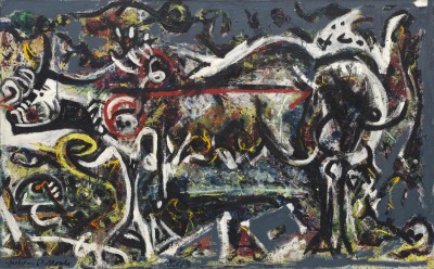
One multi-media display details the painstaking cleaning and technical analysis of Alchemy, Pollock’s 1947 canvas that belongs to the Guggenheim. It’s one of the first poured paintings made in his barn studio in Springs, and the treatment, which removed decades of surface grime, has brought it back as much as possible to its original brilliance. Also following a thorough restoration, Pollock’s 1943 mural, painted for the hallway of Guggenheim’s Manhattan apartment, was floated down the Grand Canal and installed in splendor in her palazzo, its first stop on a European tour. In a narrow gallery—not much wider than its original location, but much better lighted—the mural’s dynamic energy is almost overwhelming.
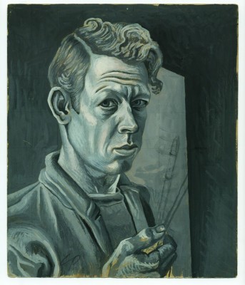
With all the well-deserved attention these two masterpieces are receiving, the third Pollock show should not be overlooked. It’s a career survey of Charles Pollock, (1902-1988), eldest of the five Pollock brothers, without whose example and encouragement Jackson probably would not have become an artist. Charles was the first brother to go to art school and the first to move from Los Angeles to New York City, where he studied with Thomas Hart Benton at the Art Students League in the late 1920s. When his two youngest brothers, Sanford and Jackson, expressed artistic ambitions, he persuaded them to go east as well.
The show, organized by the Peggy Guggenheim Collection’s director, Philip Rylands, begins with a series of analytical drawings and mural sketches from those days. There are also early works by Sanford and Jackson, and some of Benton’s that show how faithfully Charles emulated his teacher. Throughout the 1930s, when he worked for New Deal agencies and developed as a draftsman and muralist, he remained true to Benton’s brand of American Scene subject matter and figurative style. All that changed in the mid 1940s. After finishing a mural in Michigan, Charles spent three months in Arizona and came away as an abstractionist. As he put it, “I erased that whole social realist stuff.” Isolated from East Coast trends, he arrived at an
independent rejection of topical, anecdotal figuration. But it took another five years, during which he taught typography and design at Michigan State, for him to arrive at a fully abstract idiom. Fireworks, 1950, with its explosive staccato gestures—what Barnett Newman called “personal writing”—is considered his breakthrough painting.
Charles’ lifelong interest in calligraphy is reflected in his 1950s abstractions, represented by ink drawings, in which bold strokes and dense patches of black seem to float in a glowing atmosphere, and canvases made during a stay in Mexico. The Chalapa series, with its interlocking color elements and multilayered surfaces, were his most complex and ambitious paintings since he turned away from Bentonesque representation. Sadly, Jackson’s death in 1956 and other personal issues disrupted his progress for the next few years. From the 1960s on, color rather than line or gesture became his dominant concern, with beautiful results. Whether somber, as in his Black and
Gray and Rome series (the latter painted during a European sojourn), or bright and jazzy like the Post-Rome stain paintings, his thinly-applied colors soak into the canvas, creating softly vibrant effects.
Unfortunately the show peters out after the early 1970s, when Charles retired from teaching and he and his family moved to Paris, following a brief interlude in New York. While some of his so-called Passim and Slash paintings are illustrated in the excellent catalog, only one is actually on view. To judge by this presentation, his career ended in 1973. One wonders what he produced in the last 15 years of his life, when shows in London and Paris gave him some measure of recognition, not only as Jackson’s elder brother and avatar but as a significant artist in his own right. The Guggenheim show, on view through September 14, belatedly affirms that judgment.
Elaine de Kooning’s Portrait Addiction
4-2-2015
If you’re planning an excursion to the Cherry Blossom Festival in Washington, DC this month, or a trip to the capitol any time between now and next January 10, I highly recommend a visit to the National Portrait Gallery, where “Elaine de Kooning: Portraits” is on view. You’ll recognize some familiar East End neighbors—Harold Rosenberg and his daughter Patia, Denise Lassaw, Fairfield Porter, Leo Castelli, Megan Boyd, and of course Elaine’s husband Willem de Kooning—together with many other notable personalities from among her wide circle of colleagues, students, family and friends. Thirteen of her portraits, including two self-portraits, are in the NPG’s permanent collection.
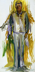
Her most famous subject, President John F. Kennedy, is the dominating presence. His monumental full-length figure, captured on a 10-foot tall canvas [left], looms behind the show’s entrance panel, on which images of Elaine with the painting in her studio, surrounded by numerous charcoal sketches and oil studies, are projected in sequence. This clever juxtaposition, made possible by Alfred Eisenstaedt’s series of color photographs for Life magazine, highlights Elaine’s obsession with the 1962 JFK portrait commission, about which more later.
Elaine once said that, for her, portraiture was an addiction. While she also painted abstractions, still lifes and other subjects, she never could kick the portrait habit. The exhibition and its accompanying book chronicle that craving, often for multiple versions of the same subject. From 1940s studies of Willem and their artist friend Joop Sanders to paintings of the soccer star Pelé and art dealer Aladar Marburger, done in her East Hampton studio in the 1980s, this commitment to a genre that was decidedly outside the avant-garde in which she was a major player reflects her contrarian nature. It also affirms her conviction that she could capture a likeness using the tactics of gestural abstraction and subjective perception. As she put it: “Working on the figure, I wanted paint to sweep through as feelings sweep through.”
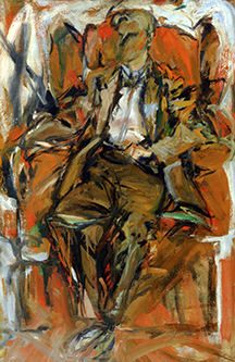
She achieved this most effectively with her so-called faceless men, in which recognition depends on each subject’s characteristic posture rather than his facial features. Since, like most of her portraits, they were done for her own benefit, not as commissions, she was free to experiment with that approach. She likened it to the way you can recognize your father from a distance by his walk, stance or carriage, even when you can’t see his face clearly. Examples in the current show are Willem de Kooning, ca. 1952, Frank O’Hara, 1962, and two 1954 canvases of Porter, who reportedly encouraged her to pursue portraiture, as he himself was
doing, regardless of Abstract Expressionism’s domination of painting in the 1950s. Not that the figure was absent from the Ab Ex repertoire, but the depiction of specific individuals was not a mainstream pursuit. Perhaps Elaine’s vigorous paint application, often dissolving the figure in a welter of energetic brushwork in response to the sitter’s vitality, and sketchy treatment of surroundings and details, were her ways of adapting portraiture to contemporary aesthetics.
Indeed it was the notion that she represented the “new frontier” in art, reflecting the Kennedy administration’s slogan, which got her the JFK portrait commission. Her ability to capture essential qualities quickly was also a factor, although she eventually spent many months on the project. After a two-week session sketching the president from life at the winter White House in Palm Beach, she worked in her New York studio on what she called a “composite image,” producing numerous versions in paintings, drawings, watercolors and sculpture. She was nearly a year into it in November 1963, when Kennedy was assassinated, which shocked her so deeply that she stopped painting for a year. A teaching gig in California helped get her back on track, and she later returned to painting with renewed enthusiasm, going on to create her Bacchus and Cave series as well as many more portraits after 1975, when she moved to East Hampton full time.
I was privileged to know Elaine in those years, and to mount exhibitions of her portraits at Guild Hall in 1983 and 1989—the latter a memorial tribute. She died on February 1 of that year, but her spirit inhabits the NPG’s galleries. In one room, her distinctive voice, narrating films of herself at work, enhances the feeling of her dynamic presence in every canvas.
Picturing Mr. Turner
3-5-2015
Picture this: a moody artist from a working class background whose radical vision and unorthodox techniques produced paintings that, as one writer put it, “astounded and bewildered his contemporaries and [are] still not altogether comprehensible today.” And the shakeup wasn’t just a matter of subject matter or style. This artist revolutionized the entire enterprise, to the point where “the whole condition of painting was in question.”
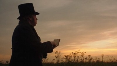 No, I’m not describing Jackson Pollock, although that summary fits him nicely. I’m quoting the art historian Lawrence Gowing on James Mallord William Turner (1775-1851), the subject of a brilliant biopic from the British director Mike Leigh, starring Timothy Spall as Turner. I saw it at the venerable, single-screen Sag Harbor Cinema, sans the annoying trailers we have come to expect at the movies. Just as well, since the film is some 2 1/2 hours long, and is in no rush to tell its story. From the opening scene, in which Turner, silhouetted against a glowing Dutch sky, is sketching the landscape, a languid pace is established. No particular motifs are visible. It’s almost as if the artist’s subject is the sunlight itself, which in a way it was.
“Mr. Turner” won accolades from the New York and London film critics, and Spall took the best actor award at Cannes. But in spite of four nominations it was snubbed by the Oscars. Its subtlety seems to have worked against it, at least in the Motion Picture Academy’s eyes, which is analogous to the Royal Academy’s response to Turner’s renegade phase. They just didn’t know what to make of it.
The film deals with the last two decades of Turner’s life, after his astonishingly early acclaim—he was elected to the academy at 24—and rapid rise to the top of his profession. As a painter of romantic landscapes and historical subjects, he traveled widely and gained the patronage of the aristocracy. By the time he reached middle age he was financially secure and could easily have become complacent, although he always had his detractors. Even early on, his canvases were criticized as technically careless and more imaginary than naturalistic. He hardly ever painted directly from nature, preferring to sketch on site and work up the finished picture from memory in the studio. He once famously advised a fellow artist to “paint your impressions,” a suggestion taken as gospel by the next generation of innovators.
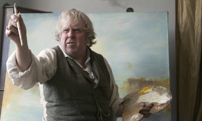
The skepticism and hostility that greeted Turner’s increasingly subjective imagery, as well as his seeming indifference to his critics, are accurately represented in the film. So too is his sometimes startling approach to the act of painting itself, which could involve scrubbing the paint, slapping it, and even spitting on it as he worked, punctuated by the grunts and snorts that also were staples of his conversational repertoire. In addition to mastering a faithful characterization, Spall reportedly spent two years learning how to paint like Turner, and unlike most actors’ efforts to mimic the process (Ed Harris’ Pollock excepted), the results are convincing. In fact every aspect of the production—from the locations, the clothing and the dialog to the general atmosphere, lovingly rendered in Turneresque tones by cinematographer Dick Pope—rings true, even when fictionalized.
Outstanding supporting performances flesh out Turner’s milieu, including his circle of admirers and detractors. In spite of its homage to Turner’s paintings, the film’s real focus is on the man and his family, colleagues, and intimates. The artist never married, but fathered two children with a mistress, Sarah Danby, and lived a second life with Sophia Booth, his former landlady (played with fine understatement by Marion Bailey). In this telling, he is emotionally disengaged from everyone except Mrs. Booth and his proud father, William (Paul Jesson), a staunch supporter and studio assistant, whose death devastated him. The one character who strikes a false note is the young John Ruskin (a simpering Joshua McGuire), a caricature of the aesthete who was the great champion of Turner’s late work.
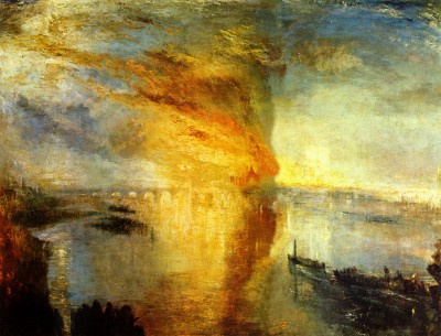
It would be too much to expect a biographical movie to do full justice to Turner’s artistic achievements, but I would have liked even more emphasis on the paintings themselves. During the period in question, he produced some of his most celebrated works, including his atmospheric views of Venice, and his oils and watercolors of the burning of the Houses of Parliament, which go unmentioned and unseen in the film. But what we do see is a cinematic portrait that literally illuminates Turner, the “painter of light.”
Big Changes in Brooklyn
2-5-2015
A few weeks ago, while staying with a friend in the city, Roy and I decided to take a trip to the Brooklyn Museum, where we met back in the 1960s. We were both Max Beckmann Memorial Scholarship students—he in painting, I in sculpture—at the museum’s art school, which closed 30 years ago. I hadn’t been there since the Lee Krasner retrospective in 2000 (Lee was a Brooklyn girl), and I knew there had been major changes since then. A glitzy glass and steel entrance pavilion went up in 2004, the exhibition program became more pop-culture oriented, and the permanent collection galleries were spruced up and completely reinstalled. Taken together, these revisions say a lot about how museums relate to the public in the 21st century.
Brooklyn real estate is now a yuppie magnet, but the old money that founded the museum is long gone. It has struggled for decades to attract the new money, which prefers its big sister in Manhattan. The art school died because the locals whose fees paid the bills disappeared. Nor were hoards of young people flocking to see the world-class collections of Egyptian, Asian and aboriginal art, American paintings and period rooms, or even the special exhibitions. So it’s understandable that when Arnold Lehman became director in 1997 he saw the need to reinvigorate the place. He’s done that, all right—remember the notorious “Sensation” show that gave Mayor Giuliani such agita?—and not all the changes are for the better.
A long ride to Eastern Parkway on the Number 3 subway took us to the revamped entrance, the Rubin Pavilion, which bears a distinct resemblance to a bus terminal, or maybe a small airport’s departure lounge. Its stepped design is supposed to recall the 1897 façade’s original grand staircase, which was removed in 1934 to create a more welcoming street-level entrance. This new pavilion is neither welcoming nor grand. The imposing Daniel Chester French allegorical statues, Brooklyn and Manhattan, that used to flank the doors have been shunted aside and are barely visible behind the tiered glass canopy. The old entrance walls are stripped to brick, a failed effort to evoke a hipster hangout. Rodin’s magnificent “Burghers of Calais” mill about like lost tourists embalmed in bronze and are pretty much ignored by the real tourists.
Inside, the main lobby’s sterility is offset by the visual overload in the adjacent Great Hall, which once was a treasury of native art of the Americas. It’s now a hodgepodge, billed as “Connecting Cultures,” that aims to provide “a dynamic and welcoming introduction” to the permanent collections by juxtaposing artworks and objects from various cultures and periods. The gallery’s three themes, People, Places, and Things (yawn) are so broad as to be meaningless, and what is learned from pairing, for example, an ancestral figure from New Guinea with Gaston Lachaise’s Standing Woman is beyond me. The room itself is so crammed with stuff that it looks more like a storeroom than a rational installation.
It’s far more enjoyable, and enlightening, to wander through the visible storage in the Luce Center for American Art on the fifth floor, where objects of different dates and styles are grouped by function. At least you know why they’re in the same case. Out in the American galleries, however, you get another thematic overdose, in which historical context is dumped in favor of variety. Under the catchall title, “American Identities,” there’s a roughly chronological procession from the Colonial era to the present that starts off fairly coherently but gets more and more scattershot as it progresses.
After a couple of hours trying to make sense of it all, we gave up and went to lunch. From the sunny café we looked out on the wing that used to house the art school. Suppressing a wave of nostalgia, we told each other that it was great to see lots of people in the galleries, although thankfully they’re not as jammed as those at the Met or MoMA. And the Egyptian collection, reposing in its own rooms on the third floor, is as splendid as ever. But more change is in the wind. Arnold Lehman is due to retire this year, so we’ll be curious to see how his successor reinvents the place yet again.
Egon Schiele’s Mirror
1-8-2015
Egon Schiele, the naughtiest of Expressionism’s naughty boys, just missed induction into the 27 Club. With his decadent lifestyle and transgressive art, he would have been right at home with Morrison, Joplin, Hendrix, Basquiat, Kobain, Winehouse, et. al., but he lived to be 28. Unlike them, however, his death was not self-induced. He was one of the millions struck down by the 1918-19 influenza pandemic, which also claimed his pregnant wife.
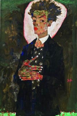
A superb exhibition of Schiele’s portraits, on view through January 19 at the Neue Galerie in Manhattan, offers a nuanced look at an artist who is often pigeonholed as a degenerate weirdo. Don’t worry, there are plenty of anorexic nudes and sexually explicit figure studies to titillate fans of Schiele’s more outrageous images. But it’s also evident that he was adept at the naturalistic rendering of faces and figures, and that his famous skeletal self-portraits are far from literal representations. Although he posed for them, naked or clothed, in front of a full-length mirror, the reflection he depicted was of an inner reality rather than outward appearance. He was, after all, working in Sigmund Freud’s Vienna.
Born near that city in 1890, Schiele was devoted to art from an early age but rebelled against academic training; in 1909 he founded the New Art Group with other disaffected students. He also allied himself with Gustav Klimt, a founder of the renegade Vienna Secession, who recognized his precocious ability and promoted him while he was still a teenager. He was only 21 when he had his first solo exhibition.
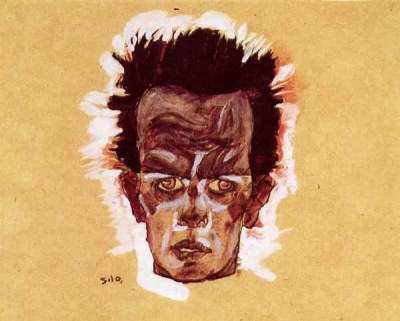
Photographs from about that time show the artist as a well-nourished young man, quite good looking and conservatively dressed, mugging a bit for the camera but far from grotesque. By contrast, his emaciated self-portraits could be premonitions of Auschwitz, and his 1910 disembodied head literally blazes with demonic energy. Lopped off at the neck, surrounded by a ghostly aura, the red-eyed, beetle-browed head suggests that of an executed criminal. Two years later, he would be stigmatized as a real criminal, convicted of exposing children to pornographic pictures. He spent 24 days in jail, an experience reportedly so traumatic that he began to tone down his style and content. A small side gallery contains reproductions of his jailhouse watercolors, and a remarkable tiny carving—yet another anguished head—made of compacted bread from his prison rations.
The main gallery is a virtual compendium of Schiele’s career, from student works and images indebted to Klimt, stylzied self-portraits, and watercolors of female models, including his mistress Valerie (Wally) Neuzil, to turgid allegorical oils and a full-length portrait of his wife Edith. (In 1915, in a turn toward respectability, he married the girl next door.) Painted the year of their marriage, it depicts a sweet-faced, guileless soul whose wholesomeness contrasts sharply with the sensual women who populate his earlier watercolors. Apparently Schiele was trying to clean up his act, although without complete success, since he continued to make erotic drawings and watercolors for the rest of his life.
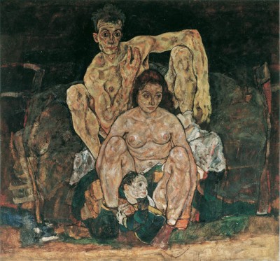
It’s a testament to the appreciation of Schiele’s singular talent that during World War I, while he was serving in the Austrian military, he was given light duty so he could continue painting and exhibiting his work. In 1918, with the war still raging, he had shows in Zurich, Prague and Dresden. Fifty of his pieces were included in the Vienna Secession show that year, and nearly all were sold. Patrons were lined up to commission portraits from him, and he and Edith were about to start a family. His life-size painting of a family group, with himself as the father crouching protectively over a mother and child—a model substituted for the pregnant Edith—illustrates his more naturalistic turn.
Unlike the watercolors, in which the figures often float in undefined space, here they are shown in domestic surroundings, seated on a piece of heavy upholstered furniture. It’s a claustrophobic scene, and the facial expressions hint at underlying anxiety, no doubt a reflection of the military conflict that was ravaging Europe. The artist’s gaze is turned inward, as if contemplating an uncertain future—a future that he, his wife and his unborn child wouldn’t live to see. They died within three days of each other, some two weeks before the war ended.