My “Eye On Art” column appears monthly in the Sag Harbor Express
Abstract Expressionism in London
12-15-16
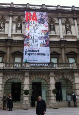 Visiting the monumental exhibition of Abstract Expressionism at the Royal Academy of Arts in London, I was reminded that many of the artists who made such an impact on international modernism in the years immediately after the Second World War lived and worked on eastern Long Island. The show is jam-packed with masterpieces by New York School painters whose seasonal retreats or full-time homes were here. They include Willem de Kooning, who worked on his infamous Women series in a makeshift studio on Leo Castelli’s porch in Georgica and later settled permanently in Springs. Mark Rothko developed his multiform abstractions in a Louse Point summer rental. Clyfford Still used the gatehouse at The Creeks in Georgica, not far from Robert Motherwell’s home and studio made of adapted Quonset huts. Joan Mitchell summered in East Hampton, and Adolph Gottlieb had a house there. Franz Kline rented the Red House in Bridgehampton. Jackson Pollock and Lee Krasner’s Springs home and studio are a stone’s throw from Conrad Marca-Relli’s property on Fireplace Road. They are all featured—some more prominently than others—in this testament to America’s most important contribution modern art.
Nearly 60 years ago, Abstract Expressionism did a victory lap around Europe when the Museum of Modern Art sent “The New American Painting” to eight countries. The exhibition finished its tour in London in 1959, and this is the first time since then that the city has seen a survey of the movement. It’s not only a look back to the days when New York replaced Paris as the center of vanguard art, but it’s also an unparalleled opportunity to see gallery after gallery—there are 12 big ones—lined with major examples. And it’s a look forward, tacitly asking whether such an aesthetic is still relevant in the 21st century and whether it can inspire a new generation of innovators.
The galleries alternate between thematic groupings—such as “Gesture as Colour,” “The Violent Mark,” and “Darkness Visible,” bracketed by early and late works that suggest the roots and legacy of Ab Ex—and solos by the Top Five: Gorky, Pollock, de Kooning, Rothko and Still. This upper echelon is strictly by the book, although one could argue that Kline and Barnett Newman also deserve to be on the A list, while the choices in the thematic rooms reflect a certain degree of revisionism. A single Norman Lewis canvas acknowledges the recent effort to insert one of the few New York School African-Americans into the Ab Ex fold, and a loopy abstraction by the naïve painter Janet Sobel pushes the untenable theory that she influenced Pollock. Photography, which was marginal at the time, is given more space than it deserves.
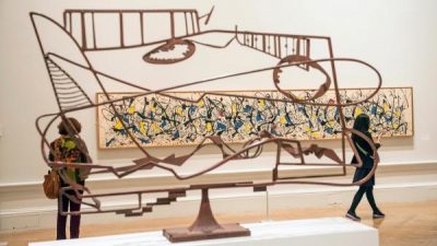
Apart from the many excellent David Smiths peppered throughout the show, one bronze by Newman, and a large Louise Nevelson construction that’s completely out of place in this company, sculpture is virtually nonexistent. Ibram Lassaw (Springs), Philip Pavia (ditto), David Hare (Hampton Bays), Herbert Ferber, Louise Bourgeois, and others who were integral members of the group have been eliminated from the canon, as have James Brooks (Montauk and Springs), Grace Hartigan (The Creeks), and Theodoros Stamos (East Marion), three solid Ab Ex regulars who were in “The New American Painting.”
Despite these shortcomings—or, more charitably, debatable curatorial decisions—the show and its accompanying lavish catalog invite culinary metaphors: a feast for the eye, an artistic banquet, and food for thought, with a tasty selection of works on paper as the icing on the cake. The sheer number of high quality loans from museums, galleries, and private collections around the world is awesome. And such a major grouping probably will not occur again any time soon. Seeing Pollock’s 1943 Mural and his 1952 Blue Poles on opposite walls, bookending his greatest achievements, is a once-in-a-lifetime experience. And that’s not all, folks. With no fewer than 19 Pollocks, 17 de Koonings, 14 Rothkos, 11 Stills, and 10 Gorkys, plus more than a dozen Smith sculptures and numerous works large and small by many others, including Gottlieb, Kline, Krasner, Marca-Relli, Mitchell, Motherwell, Newman, Sam Francis, Philip Guston, Hans Hofmann and Ad Reinhardt, this is indeed an Ab Ex smorgasbord.
After closing at the Royal Academy on January 2, the exhibition will move to the Guggenheim Museum in Bilbao from February 3 through June 4, 2017. Reserve your table now!
Gay Gotham
11-17-16
From anonymous snapshots of Times Square cruisers to mainstream music, theater, dance, literature and visual art, “Gay Gotham,” on view through February 26 at the Museum of the City of New York, celebrates the LGBT community’s contributions to the city’s cultural life in the 20th century. This is the first major museum show on the subject, and it’s a revelation on several levels, telling the story with video, photographic portraits, examples of creative work, and large maps pinpointing gay gathering places and landmarks. By highlighting key individuals and their personal and professional circles, the exhibition illustrates how mutual support helped queer subcultures to thrive in times of tacit acceptance and active suppression. The first section, covering the years 1910-1960, traces the shift from tolerance to increasing censorship and demonization of gay people in society. It also deals with the conflict felt by those who were closeted or who led double lives, with separate public and private personas.
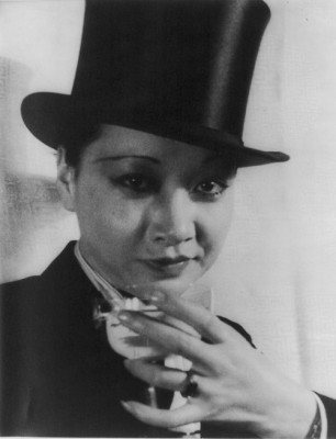
In the 1910s and ’20s, Greenwich Village and Harlem were home to artistic networks that nurtured talents like the writer Richard Bruce Nugent, an openly gay figure in the Harlem Renaissance, and the painter Charles Demuth, whose watercolors depict same-sex encounters at the Lafayette Baths. I had no idea that the word “gay” as a synonym for homosexual dates from this period. It was the era of the so-called Pansy Craze, when female impersonators and cross-dressing were staples of stage—as in Mae West’s 1927 play, “The Drag”—and screen. Greta Garbo, Anna May Wong and Marlene Dietrich titillated movie audiences by wearing men’s clothing and were rumored to be bisexual. Film clips at the entrance to this section show some of what was publicly performed before the advent of the Hays Code and other crackdowns.
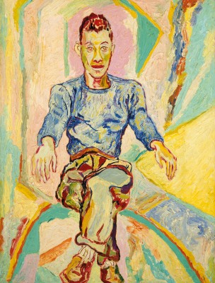
Major figures of this period include the openly lesbian writer Mercedes de Acosta, whose affair with the actress Eva Le Gallienne inspired two of her plays; the bisexual dance impresario Lincoln Kirstein, co-founder with George Balanchine of the New York City Ballet; and Leonard Bernstein, who, like Kirstein, was a married man and only acknowledged his same-sex relationships late in life. Larry Rivers, also bisexual, is represented by his life-size nude portrait of his lover and frequent artistic collaborator, the poet Frank O’Hara. Here we see how supportive relationships with friends, lovers and professional colleagues, both gay and straight, produced a flowering of creative work.
Part two of the exhibition, covering 1960-1995, traces the rise of the Gay Liberation movement in response to the increasing homophobia that sparked the 1969 Stonewall uprising, through the women’s
movement, the AIDS epidemic and the growing acceptance of LGBT rights. New York City, the nation’s cultural magnet, attracted Andy Warhol from Pittsburgh, Harmony Hammond from Chicago, Bill T. Jones from Wayland, NY, and others who were drawn to its relative openness to gay life. As in part one, the period is introduced by film clips, culminating in excerpts from Tony Kushner’s “Angels in America: A Gay Fantasia on National Themes,” which won the 1993 Pulitzer Prize for Drama.
Thematic groupings place individuals in the larger context of their communities, from the downtown club scene and protest movements to the dance world of Jones and his partner Arnie Zane and the literary circles that produced publications like “Come Out!” “Christopher Street” and “DYKE.” No longer in the shadows or in the closet, artists, performers and writers became major voices of their generation, representing lesbian, gay, bisexual and transgender subjects in mainstream works. Warhol in particular, with his marketing genius and uncanny ability to transcend genres, captured the popular imagination, so much so that he is now one of the world’s most famous artists. Like Warhol, Robert Mapplethorpe has also achieved legendary status, although in his case it’s as much for his notorious homoerotic imagery as for his exquisite darkroom artistry.
Rich in documentation and photographic evidence, the exhibition is short on painting and sculpture, making it seem as if gays played little role in those areas. Even Warhol is represented largely by photographs and films. Rivers’s imposing O’Hara portrait, Beauford Delaney’s touching oil study of the writer James Baldwin, one small cloth piece by Hammond and a selection of dolls by the trans artist Greer Lankton don’t make up for the absence of Robert Rauschenberg, Jasper Johns, Ray Johnson, Ellsworth Kelly, Nell Blaine and others who were important figures in the New York City art world, regardless of their sexual orientation. Notwithstanding that limitation, “Gay Gotham” is an illuminating excursion into New York City’s queer history.
Carmen Herrera: “I just worked and waited”
10-20-16
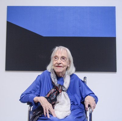
At 101, Carmen Herrera could be forgiven for resting on her laurels, but the Cuban-American painter is still actively making art, as she has been doing for more than seven decades, until recently under the art-world radar. These days she needs an assistant, but she can afford one, since her spare geometric abstractions have finally begun to sell. Her first sale came in 2004, when she was 89, and the current exhibition, “Carmen Herrera: Lines of Sight,” on view through January 2 at the Whitney Museum, is certain to stimulate the market.
The show is not only garnering rave reviews, but is also raising questions about why recognition was so long in coming. It’s clear from the selection, which spans the period from 1948-1978, that it has nothing to do with the quality of her work, which is superb. From the earliest abstract canvases, done while she and her husband were living in Paris, through paintings that prefigure Op Art and Minimalism, to colorful hard-edged compositions in two and three dimensions, her search for essential forms was—and still is—pursued with single-minded dedication. How could such an obvious talent have been ignored?
Born in Havana in 1915 to a newspaper publisher and his journalist wife, Herrera first studied architecture, which may account for her longstanding interest in rigorous structure. After marrying an American teacher, Jesse Lowenthal, in 1939, she moved to New York City and studied with the representational painter Jon Corbino at the Art Students League. She found that training frustrating, and it wasn’t until she got to postwar Paris that she discovered her true métier. As a member of the Salon des Réalités Nouvelles, an association of abstract artists founded by Robert and Sonia Delaunay, she exhibited in their group shows and was encouraged to expunge all figurative references.
Three factors combined to derail her subsequent career. After her Paris sojourn, from 1948-53, she returned to New York during the heyday of Abstract Expressionism, when her style was the antithesis of action painting. Even so, while her fellow geometric abstractionists Josef Albers, Ellsworth Kelly, Frank Stella and Leon Polk Smith were showing and selling in blue-chip galleries, as a female artist in the male-dominated art market she had no luck finding a dealer to handle her work. And she believes that after the rise of Castro’s totalitarian Communist regime there was prejudice against all things Cuban. She was initially a supporter of the 1959 revolution, although she was quickly disillusioned and repudiated Castro. But as we see today, nationality trumps individuality. So politics—both real-world and art-world—prevented her from achieving the visibility she deserved.
Even with three strikes against her, Herrera kept on working in obscurity, relying on her husband for financial and moral support. Now, with an art market more accepting of female painters and a wide variety of styles, and Cuba-US relations thawing, the timing of her first solo museum exhibition couldn’t be better. As she says in an excellent documentary made last year, “It’s about time. Better late than never.” The film, “The 100 Years Show,” is available on Netflix. There’s also a three-part interview with her, age 94, on YouTube, in which she talks at length about her fascinating and inspiring history, as well as her artistic evolution.
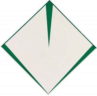
Constantly refining, paring down and simplifying her forms and her palette, Herrera believes in the cliché, Less is More. In the 1940s and early 1950s her imagery evolved from complex arrangements of interlocking shapes, as in Field of Combat, with its spiky suggestions of weapons, and my favorite, Green Garden, to stark black and white grids and bold geometric patterns in solid colors. One gallery is devoted to her Blanco y Verde series from 1959-71, in which fields of white are pierced by tapering green wedges. Prefigured by Green and White, a 1956 canvas that introduces the wedge motif, the imagery is at once static and dynamic, paradoxically holding fast to the painted surface yet buzzing with visual tension.
The show is rounded out by a group of studies on paper, several wall reliefs and free-standing pieces, and a series of black-and-color canvases named for the days of the week. Monday is appropriately blue, and the week ends on an upbeat note with a fiery red Sunday. Although the cutoff date is 1978, for the next quarter century and beyond Herrera has continued in a similar vein of seemingly inexhaustible invention—living proof of an adage she likes to quote: “If you wait long enough, the bus will come.”
Splendid Nudes at the Clark
9-22-16
If you want proof of Willem de Kooning’s statement, “Flesh is the reason oil paint was invented,” you need look no further than the walls of the Clark Art Institute in Williamstown, Mass., where “Splendor, Myth, and Vision: Nudes from the Prado,” is on view through October 10. The exhibition, courtesy of one of the world’s premier Old Master collections, comprises some of the most famous naked human bodies ever painted—though not the Prado’s most celebrated one, Goya’s La Maja Desnuda, which dates later than the show’s time frame. But with 28 canvases by Titian, Rubens, Tintoretto, Zurbarán, Reni and others, there’s no shortage of masterpieces. Twenty-four of them are on their first-ever trip to this country.
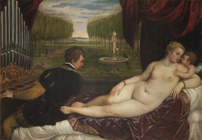
Venus with an Organist and Cupid, ca. 1550–55. Oil on canvas, 59 1/8 x 85 7/8 in.
The show examines the remarkable circumstances under which these paintings were commissioned or acquired by Spanish royalty in the 16th and 17th centuries. Two kings in particular, Philip II and his grandson, Philip IV, amassed extensive collections of mythological and Biblical subjects featuring nude figures, both male and female, many of them in overtly sexy poses. That they were able to do it during the Inquisition, when strict religious doctrine and public morality were being brutally enforced, is a testament to the monarchy’s power. Yet the royals didn’t flaunt their taste for the titillating. In deference to propriety, they sequestered their erotica in private galleries called salas reservadas.
Among the best known of the paintings that was hidden from view is Titian’s Venus with an Organist and Cupid, ca. 1550-55, one of numerous works by the Flemish painter commissioned by Philip II. The subject, ostensibly a Roman goddess but decked out like a contemporary courtesan, reclines on a divan while Cupid whispers in her ear and seems about to fondle her breast. She’s being ogled by the organist, who looks directly at her sex organ—an obvious visual pun. The parted drapes reveal a lush garden, where an embracing couple and other suggestive motifs reinforce the scene’s sensuality. This life-size canvas, one of several variations by Titian on the theme of Venus and music, demonstrates his masterful handling of textures, from the velvet drapery to Venus’s lustrous pearls and dimpled skin.
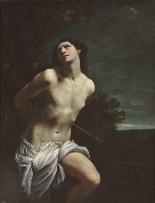
Saint Sebastian, ca. 1617–19. Oil on canvas, 66 7/8 x 52 3/8 in.
No slouch when it came to painting pulchritude, Rubens was a great admirer of Titian, whom he emulated to the point of imitation. His version of The Rape of Europa, 1628-29, was copied directly from his predecessor’s canvas in Philip II’s collection and was purchased from Rubens’s estate by Philip IV. Whether you consider it, as the current exhibition has it, “a bravura homage from one great artist to another,” or a blatant ripoff of the original—now in the Isabella Stewart Gardner Museum in Boston—there’s no denying Rubens’s virtuosity. A favorite of Philip IV, he and his assistants painted more than 60 canvases for the king, including two from ca. 1636-38: Fortuna, the Roman goddess of luck, whose skimpy clothing is being whipped away in a convenient windstorm; and The Lapiths and the Centaurs, in which the hybrid creatures, half-man, half-horse, invade a marriage feast. The bride’s abduction and the wedding party’s vigorous rescue is a tour de force rendering of nude and semi-nude bodies in tumultuous action. Sex and violence in paint don’t get much better than this.
While naked ladies take pride of place, there’s also plenty of beefcake on display. The labors of Hercules, commissioned by Philip IV, provided Zurbarán with ample opportunity to show off his skill in modeling the male physique. His Hercules and the Hydra, 1634, casts the legendary Greco-Roman hero as a sturdy Spanish peasant, whose powerfully muscled form is considered a metaphor for royal authority. Saint Sebastian, another male subject always shown nude or scantily clad, is seen here in three versions. The one by Reni, ca. 1617-19, in which a single arrow pierces the martyr’s body, has him swooning in a way that implies carnal rather than spiritual ecstasy. It was considered so provocative that his loincloth was later extended to hide more of his luminous torso.
The Clark is offering an unparalleled opportunity to study these amazing paintings first hand without traveling to Madrid. You’ve seen them illustrated in books, as slides in art history lectures, and on the Internet—but here they are, yes, in the flesh.
Artists’ Gardens in Old Lyme
8-25-16
Billed as the home of American Impressionism, the Florence Griswold Museum in Old Lyme, Connecticut, is graced by the Griswold family’s Georgian-style mansion, which became a boarding house in the late 19th century. Painters such as Childe Hassam, Willard Metcalf, Matilda Browne, Edmund Greacen and William Chadwick were welcomed by Miss Florence, a spinster daughter and sole surviving Griswold, who encouraged them to set up their easels for plein-air painting on the property. More than a century later, the historic house museum also boasts a handsome modern building for its permanent collection of works by members of the Old Lyme art colony—many of them boarding house alumni—as well as temporary exhibitions. The current one, “The Artist’s Garden: American Impressionism and the Garden Movement, 1887-1920,” is on view through September 18.
American Impressionism is often though of as a stepchild of its French parent—with some justification, since many Americans were directly inspired by Monet, Renoir, et. al. Several of them spent time in the art colony near Monet’s studio in Giverny. American artists also responded to the so-called Garden Movement, which encouraged both public parks and home gardening. They would be drawn to such themes at the turn of the 20th century, when urbanization and industrialization fostered a longing for “beauty and balance within this fast-changing world,” as the exhibition’s introduction explains.
The show, which originated at the Pennsylvania Academy of the Fine Arts, includes many works from the academy’s collection, plus selections from the Griswold’s own holdings. In truth, the title is a bit misleading, since the subject matter ranges far more widely than the type of domesticated plantings we associate with flower gardens like the one on the museum’s grounds. It includes urban parks, woodland scenes, winter landscapes, farm fields, vegetable patches and even flowerpots. What it suggests is that the total environment was fair game, and whether tamed or wild, nature was seen by these artists as one big garden.
Hassam, one of the most famous American Impressionists, traveled widely and had studios in New York City and East Hampton, as well as Old Lyme. He is represented here by paintings that span the territory from city to country. Across the Common on a Winter Evening shows Boston Common illuminated by streetlights, an innovation that transformed sometimes gloomy open spaces into pleasant respites from crowds and traffic. At the other extreme, Hassam’s Summer Evening celebrates the tranquil isolation of Appledore, in the Isles of Shoals off the New Hampshire coast. His visits to Celia Thaxter’s garden there resulted in watercolor illustrations for her book, “An Island Garden,” but in this oil painting the only evidence of horticulture is a single potted pelargonium on a windowsill.
Some of the artists were also gardeners, among them J. Alden Weir, Violet Oakley, Cecelia Beaux, George B. Burr, Clark Voorhees, Anna Lee Merritt and Daniel Garber. Weir’s backyard on East 12th Street in Manhattan is the setting for two charming etchings that illustrate how he created a private retreat amid the city’s bustle. Weir also had two country homes—now the Weir Farm National Historic Site in Wilton, CT—so he could escape New York’s pressures when in need of a break. Merritt was such an avid gardener that she became a recognized expert on artistic plantings in America and Britain. Her book, “An Artist’s Garden, Tended, Painted, and Described,” which she wrote and illustrated, is featured in the show, together with a painting that may be a study for one of the book’s lithographic plates.
The artists painted one another’s gardens as well as their own, and several were inspired by Miss Florence’s boarding house and grounds, including her old-fashioned flower beds and the views of outbuildings along the banks of the Lieutenant River, which borders the property. Ellen Axson Wilson, wife of President Woodrow Wilson and founder of the White House Rose Garden, painted the Griswold House porch and other scenes in the area during her several visits to Old Lyme. Greacen’s The Old Garden, and an oil of the same title by Charles Vezin, depict the Griswold House plantings, with their informal arrangement of heirloom flowers, as nostalgic remnants of a bygone age.
These are only a few of the many delights to be enjoyed in “The Artist’s Garden,” a reminder of the power of art to celebrate and transform nature, both on canvas and in reality, according to creative dictates.
“Stuart Davis: In Full Swing” at the Whitney
7-28-16
Decades before Andy Warhol painted portraits of soup cans and Jasper Johns enshrined a pair of Ballantine ale cans in bronze, Stuart Davis was translating product packaging into vanguard art. Davis’s unique synthesis of Cubist formalism and American imagery is now on eye-dazzling display at the Whitney Museum, where “Stuart Davis: In Full Swing,” continues through September 25.
Not since the 1991-92 Davis retrospective at the Metropolitan have we had an opportunity to enjoy his work in depth, but the current show is not intended to be as comprehensive. Instead, it focuses on the artist’s breakthrough in the early 1920s, when he transitioned from Ash Can School representation to geometric abstraction, and follows that path to his very last painting, left unfinished on his easel in 1964, when he died of a heart attack at age 71.
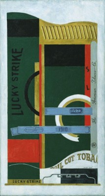
Like many other young artists of his generation, Davis was knocked for a loop by the 1913 Armory Show, with its extensive survey of European modernism, which he then struggled to assimilate without becoming a mere follower. Inspired by Cubist paintings and collages that incorporate familiar popular graphics like scraps of newspaper and wine labels, he made compositions based on product packaging. But instead of vin rouge and Le Monde, his sources were distinctly American—the wrappers for Lucky Strike, Sweet Caporal and Bull Durham tobacco, and LA+ rolling papers. Beginning in 1921, he focused on the evidence of a burgeoning consumer culture, using abstraction to transform a mouthwash bottle, a light bulb and other familiar objects into icons of mass-market modernity. His 1927-28 Egg Beater series, four of which are included in the show, illustrates an ever more reductive approach that nearly dissolves the objects into linear and planar color areas.
As a founding member of the Whitney Studio Club, forerunner of the present-day museum, Davis came under the patronage of Gertrude Vanderbilt Whitney, who sponsored a year-long trip to Paris that changed his direction. The city’s sights and sounds led him away from pure abstraction and back to the vitality of daily life, and he filled his canvases with shop signs, street signs and other symbols of the urban environment. Returning to New York, he adapted that approach to interpret the city scene and the fishing port of Gloucester, Mass., where he and his wife summered for many years. Motifs from those sources that originally appeared in the 1920s and ’30s recur in various guises throughout the next three decades. The show includes numerous examples of later works that recycle and adapt earlier imagery, offering fascinating insights into the artist’s creative process.
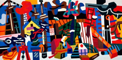
Davis believed that art could serve a social function, and in the 1930s he became involved in various populist causes. Working for the WPA Federal Art Project, he painted two murals for public buildings, and both of them are in the show. Swing Landscape, a riotous interpretation of waterfront motifs, with a stylized Williamsburg Bridge in the upper left, was intended for a Brooklyn housing project but was never installed; it’s on loan from Indiana University. Mural for Studio B, WNYC, with its jazzy saxophone and symbolic radio waves, left the municipal broadcasting station many years ago and now lives at the Met. It’s a treat to see them both here, together with New York Mural, a 1932 panel made for a Museum of Modern Art show designed to encourage architects to hire artists to decorate their buildings, and studies for the commission that resulted, Davis’s Radio City Music Hall mural.
His approach to picture making was highly theoretical, with many preliminary sketches and studies, several of which are included in the show. This is the antithesis of Abstract Expressionism, which he disdainfully called “a belch from the unconscious.” Paradoxically, as that movement gained prominence, Davis’s stature as a leading American modernist continued to rise. In the 1950s, while the action painters were celebrating spontaneity, he continued carefully planning his compositions. As they loosened gesture and dissolved color, his imagery became even more hard-edged, his forms more planar, and his palette more simplified. Words from signs and packaging assumed an even greater role, with letter forms blown up and isolated into singular graphic elements.
Davis’s syncopated rhythms and sophisticated compositional dynamics have parallels in the jazz music he loved, though his art never takes off in flights of improvisational fancy. What it does do is excite the eye and stimulate the imagination—two essential qualities for all great art.
East End Allure
6-30-16
“The Allure of the East End,” last Sunday’s panel at Art Hamptons, tried to pin down the reasons why artists of all persuasions have been drawn to the area for nearly a century and a half. I was the designated historian, while Christina Strassfield, director and chief curator of Guild Hall Museum, and the journalist and photographer Dawn Watson took a more contemporary view, with moderator Pat Rogers, pubisher of Hamptons Art Hub, doing her best to keep us in line. I traced the creative community’s evolution from the 1870s, when the arrival of the Long Island Rail Road brought an influx of artists and tourists alike, to the opening of Robert Wilson’s Watermill Center in 2006. Covering that much territory in a ten-minute talk required some serious editing, but even just hitting the highlights, a certain continuity was evident. It was clear that some of the qualities artists valued in the 19th and 20th centuries still attract them today, and that issues from past decades remain timely.
For example, the fact that artists exert a magnetic attraction on one another is as true today as it was in 1879, when the Tile Club’s glowing account of their excursion to “that sand place” (i.e., eastern Long Island) was published in Scribner’s Monthly. The club’s enthusiasm so impressed their pal Thomas Moran that he and his wife Mary decided to check out the place, and soon became the first artists to build a studio in East Hampton. They played host to artistic friends and family and, hey presto, instant art colony. Likewise with William Merritt Chase, whose Shinnecock Summer School of Art—the first outdoor art school in the US—was established in 1891. Like the Watermill Center, it injected new creative juice into the area and encouraged some of its students to form stronger ties to the community.
Unlike Chase’s students, the Abstract Expressionists and Pop artists didn’t come here looking for subject matter. It was just a lovely place to hang out, unwind, entertain friends, and get some work done without all that urban pressure. Nevertheless, the East End exerted its influence on their art—in Lee Krasner’s Earth Green paintings filled with nature allusions, Willem de Kooning’s clam diggers, Roy Lichtenstein’s stylized beach scenes, and Andy Warhol’s series of Sunset screen prints, inspired by the view looking west from Eothen, his estate on the Montauk bluffs.
Everyone on the panel acknowledged the importance of formal residencies for visual, literary and performing artists—at Watermill, Edward Albee’s Montauk retreat, and Guild Hall’s new program at Guild House—but we couldn’t ignore the problem of affordable housing and studio space for those who want to stay on. It’s bad enough for the transplants, but how about the natives? Artists were here even before the railroad came through, and their modern descendants undoubtedly benefit from access to the large, well-established community that includes top names in all the arts who can afford to buy in. But it’s getting harder and harder for young people, artists and otherwise, to stay in the area. Still, that’s not a new complaint. People were griping about high rents, crazy real estate prices and overdevelopment—oh, yes, and traffic—fifty years ago.
One audience member asked about artists’ political involvement, and Christina mentioned the group that created a communal mural, now in Guild Hall’s collection, that was auctioned for the benefit of the McGovern presidential campaign in 1972. On a more local level, I remembered that the Artists’ Alliance of East Hampton was originally formed in the 1980s as a political action committee to lobby for a zoning change allowing studios on residential properties. The group now mobilizing behind the proposed John Steinbeck Waterside Park in Sag Harbor includes artists who are taking a leading role in community affairs. Could affordable living/working space be the next item on the activists’ agenda?
On the other hand, why not just pack up and move to someplace cheaper? As Dawn pointed out, nowhere else is there such a concentration of creative energy, in such a beautiful environment, in such proximity to the nation’s cultural mecca. Other artists’ retreats are more remote. Other scenic places don’t have such vibrant art communities. The allure is obvious, even if you’re not a landscape painter.
Art for Every Home
6-2-16
In the depths of the Great Depression, with unemployment above 25% and the American art market in the doldrums, Franklin D. Roosevelt’s New Deal administration famously set up programs to put artists to work on the federal payroll. But not all artists were dependent on government handouts; they also actively tried to promote their work through a variety of enterprising schemes. One of the most successful, one that long outlived the hard economic times that inspired it, was Associated American Artists, a commercial firm established in 1934 to produce and market inexpensive limited-edition prints. The company lasted until 2000, a 66-year run during which it adapted to changing times and tastes with remarkable flexibility. Its story is told in “Art for Every Home,” a traveling exhibition on view through July 9 at NYU’s Grey Art Gallery on Washington Square in Manhattan.
Organized by the Beach Art Museum at Kansas State, which owns a large collection of AAA graphics, the show includes a representative selection of the prints for which the company was best known, as well as other products that broadened its scope after World War II. It doesn’t tell the whole story—the latest work I could find was dated 1978. That said, the premise that high-quality art, at affordable prices and in a variety of guises, could be sold to middle-class Americans is amply illustrated.
The mastermind of this novel scheme was Reeves Lewenthal, an agent and publicist who used mass-marketing tactics to promote his wares. He contracted with some of the top artists of the day, including Regionalists Thomas Hart Benton, Grant Wood and John Steuart Curry, paying them $200 per edition of prints that he sold for $5 each by mail order and through department stores. Predictably, the subject matter of most AAA graphics was upbeat Americana, although there were a few downbeat images. Lithographs by Joseph Hirsch and Harry Sternberg allude to labor unrest in the 1930s, but for the most part the focus is on reassuring scenes of rural life, folklore, and optimism in the fact of hardship.
Lewenthal also made deals with companies like American Tobacco, Standard Oil and General Foods to commission well-known painters to advertise their products. When the war came, as head of the War Department’s Art Advisory Committee, he had his artists make propaganda posters and patriotic prints. After the war, with abstract art being touted as the next big thing and American Scene subjects regarded as passé, he began to branch out. Taking advantage of the booming demand for consumer goods, in 1946 he hired Sylvan Cole, who had trained with Sears, Roebuck. They developed partnerships with firms like Steuben Glass, Riverdale Fabrics and Castleton China to produce artist-designed housewares, textiles and decorative objects, and created AAA’s own line of “Stonelain” ceramics. By merging the fine and applied arts, they could sell good taste on a practical level and exploit two markets simultaneously. The pitch for one textile line advised that the “easiest way to collect fine art . . . and pretty compliments” was to run up a dress using “beautiful fabric originals by world-renowned painters!”
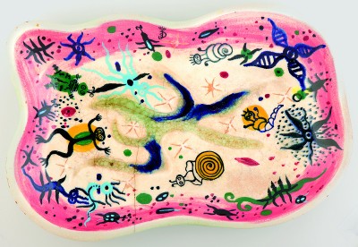
Samples of 1950s yard goods by several artists better known for their paintings and prints include designs by Anton Refregier, Aaron Bohrod, and even Grant Wood, whose 1931 painting, The Midnight Ride of Paul Revere, was cleverly adapted as a repeat pattern on cloth. The textiles are lively and colorful, although the design called “Chain Reaction,” Hans Moller’s bold motif of conjoined rings against a black background, is a chilling reminder of Cold War anxiety. Hardly the best choice for a party dress. It’s the only dissonant note in an otherwise cheerful collection. There are also examples of decorative housewares from the same period, including Benton’s etched glass dish for Steuben; a stoneware figure by sculptor Berta Margoulies that carries on the tradition of Americana imagery; and a whimsical ceramic platter, on which stylized frogs, snails and other aquatic creatures frolic, by Surrealist painter Julio de Diego.
Concentrating on the heyday of AAA’s push to market art to the masses, the exhibition is a reminder that, once upon a time, there was a virtual firewall between fine art and commercial design. Considering how commonplace the crossover is today, I’d say AAA did its job extremely well.
Munch and Expressionism
5-5-16
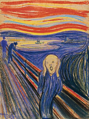
Edvard Munch’s painting, The Scream, is one of the most recognizable icons of modern art, yet it’s best known in reproduction. A Google search turns up posters, apparel, coffee mugs, pillows and knockoffs of all descriptions, with everyone from Homer Simpson to Hello Kitty parodying that famous howl. But as familiar as The Scream is, how many of us have ever seen the actual painting? In fact there are four of them, two oils and two pastels, dating from 1893-1910. Three are in museums in Munch’s native Norway. The fourth, formerly in a private Norwegian collection, was last seen at MoMA in 2012-13, after it was sold at Sotheby’s for a record $120 million. Now owned by financier Leon Black, it is the highlight of “Munch and Expressionism,” at the Neue Galerie in Manhattan.
The exhibition, on view through June 13, illustrates Munch’s affinities with the German and Austrian artists who pioneered Expressionism in the early 20th century. Although the existential angst embodied in Munch’s wraithlike figure was a manifestation of his own emotional anxiety, it symbolizes the broader social and cultural alienation that led the younger generation both to reject artistic tradition and to critique modern urban life. With iconoclasts like Van Gogh, Gauguin and the French Fauve painters as guiding spirits, the German and Austrian modernists explored the subjective, expressive and emotional potential of pictorial art. The imitation of nature was scorned as superficial, a poor approximation of outward appearance. Oskar Pfister, a colleague of Freud, defined expressionism as “the art of inwardness.” Who better than Munch, the ultimate visual diarist, to serve as the avatar of such a movement?
Born in 1863, Munch grew up in Kristiania, as Oslo was then called, in a family wracked by sickness and death. His mother and a sister died of tuberculosis during his childhood, and another sister was mentally ill. His own poor health often confined him to bed, where he occupied himself with drawing. Haunted by what he saw as “the heritage of consumption and insanity,” he used his art to exorcise the demons that plagued him. His frank depictions of loneliness, estrangement and anomie struck a chord with contemporaries like Ernst Ludwig Kirchner, Emil Nolde, Oskar Kokoschka and Erich Heckel, who saw his work in solo shows in Berlin and Dresden. In 1912, August Macke, a leader of the avant-garde group Der Blaue Reiter, wrote to Munch, “We young ones have inscribed your name on our shield.”
Common themes emerge from the juxtaposition of Munch’s works with those of his Expressionist contemporaries. Human vulnerability, both physical and emotional, is a thread that weaves throughout their paintings, drawings and prints. A wall of studies of adolescent girls by Munch and Heckel, including the former’s 1914-16 canvas, Puberty, illustrates an ambivalent and disturbing fascination with nascent female sexuality. Munch had lost his favorite sister Sophie at age 15, which may account for his morbid portrayals of sick and ghostly young women.
The ancient German art of woodcut was revived during this period, and numerous examples show how Munch and the Expressionists took it in experimental directions. Nolde, Kirchner, Pechstein, Beckmann and others created bold, primitivistic prints that were later denounced as “degenerate” by the Nazis. Munch’s variations on The Kiss, 1898, use cutout sections to vary the raw wood grain, which echoes the sinuous shapes of interlocked figures that seem to melt into each other with engulfing passion. A lifelong bachelor, Munch’s complicated romantic relationships are also reflected in images of women as predatory or, at the opposite extreme, distant and isolated, often faceless or with their backs turned to the viewer.
In a small gallery of its own, with only a few similarly angst-ridden graphics for company, The Scream is worth waiting in line for. Its original frame is inscribed with Munch’s statement about its inspiration, based on a momentary experience while walking with friends—a feeling of exhaustion, a blood-red sunset over the fjord, and suddenly the artist felt “an infinite scream passing through nature.” It’s a rare example of a subject that is both highly personal and universally meaningful. Unfortunately the cramped viewing area makes it hard to linger and study the pastel’s masterful nuances, which vary from lurid to subtle, but perhaps the claustrophobic atmosphere is appropriate. At least one isn’t, like Munch’s shrieking surrogate, trapped inside one’s own head.
Unfinished Business at the Met Breuer
4-7-16
The Metropolitan Museum of Art’s new outpost, in the former Whitney Museum building (designed by Marcel Breuer) on Madison Avenue, is still a work in progress, so it made sense to open it with a show titled “Unfinished: Thoughts Left Visible.” As the Met’s publicity has it, the exhibition “addresses a subject critical to artistic practice: the question of when a work of art is finished.” Spanning five centuries, the selection ranges from Old Master paintings by Rembrandt, Titian and Rubens, and drawings by Leonardo and Michelangelo, to Impressionism, Cubism, Pop art and video. It draws heavily on the Met’s own holdings, supplemented by key loans that flesh out the representation of incompleteness on several levels, from preliminary studies and deliberate lack of finish to open-ended evolution and abandonment.
It’s often said that a work of art isn’t truly complete until a viewer sees it, but that’s not what we’re dealing with here. Almost—although not quite—all of the more than 200 examples are either unresolved or only partly finished, either by the artist’s choice or because work stopped before the painting, drawing, print or sculpture was done. In some cases it’s easy to see why, and in others it’s virtually impossible to know what prompted the artist to carry it no further. Figure studies by Whistler, Picasso and Alice Neel, and still lifes by Cezanne and Warhol were left partial for reasons as varied as the images themselves.
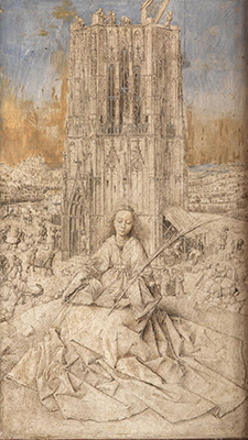
One of the most intriguing examples is Jan van Eyck’s “Saint Barbara,” an exquisite early 15th century drawing on wood, in which only the sky has been painted. The drawing itself is highly detailed and looks finished, but why wasn’t it fully colored? Is it a preliminary study, or possibly an interrupted effort? Whatever the reason, the piece is simply wonderful as it is, in spite of its fragmentary character.
The show includes several other antique oddities without key elements, inviting the viewer to fill in the blanks. My favorite is by Anton Raphael Mengs, a slick 18th century society portraitist. In his likeness of Mariana de Silva y Sarmiento, a Spanish noblewoman and fellow artist, her dress is lovingly rendered, while her face is virtually obliterated, as if the features had been dissolved. This uncanny, proto-Surrealist image is made even more peculiar by the empty shape of a lapdog cradled in her right arm. What did the poor pooch do that caused the artist to scrape it out? Maybe it died.
Speaking of death, there are a few works that the artists didn’t live long enough to finish. El Greco’s “The Vision of Saint John,” for example, was incomplete when he died in 1614. It has only a sketchy sky and
virtually no foreground, causing the elongated figures to float in an ethereal space. Modern viewers respond to its emotional and spiritual overtones, which are heightened by its unresolved quality. At the opposite aesthetic extreme, two of Mondrian’s geometric abstractions, unfinished at his death in 1944, bear evidence of the painstaking decision-making process by which he developed his rigorous linear compositions.
A side gallery devoted to J.M.W. Turner contains several canvases—dated to at least a decade before his 1851 death—which he left to the British nation in his will. Did he consider them finished, or had he set them aside for later completion, but never got back to them? With “Street in Auvers-sur-Oise,” however, it’s clear that Van Gogh was not quite done with it when he killed himself in July 1890. The rustic cottages along the winding country lane are fully rendered, while the sky is only roughly brushed in. It’s hard to imagine such a troubled soul creating such a joyful painting, and sad that he didn’t live to see it through. Doubly so, in the case of Gustav Klimt’s full-length figure of Maria Munk, whose family commissioned it as a memorial, following her suicide. After two failed efforts at a posthumous portrait, Klimt died before he completed the 1918 painting. Surrounded by his trademark opulent decoration, its only fully realized element is, ironically, the dead woman’s radiant face.
In a show as varied and wide-ranging as this one, questionable inclusions are perhaps inevitable. Can individual, fully realized works that are part of a long-running series, like Yayoi Kusama’s “No. B. 62,” truly be considered unfinished? If so, then artists like Giorgio Morandi, Alfred Jensen and other obsessives should also be here. As it is, there are more than enough genuinely unfinished treasures in this imaginative exhibition, which runs through September 4.
Miriam Schapiro’s Vision
3-10-16
It’s not a stretch to call Miriam Schapiro a visionary—as in the title of the current memorial survey at the National Academy Museum in Manhattan. Indeed the exhibition, together with a companion show at Eric Firestone Loft on Great Jones Street, testifies to the remarkable scope and depth of her artistic imagination and ideological preoccupations throughout an influential six-decade career. Her vision was multi-directional: looking back to predecessors who inspired her, as well as the long history of inequitable treatment of female artists; focusing critically on the contemporary art world; and looking forward to the day when women’s creative endeavors would receive the recognition they deserve.
Schapiro—Mimi to her friends—died in 2015 and is buried with her husband, the artist Paul Brach, in Green River Cemetery in Springs. In the mid 1950s they bought a barn on Alfonso Ossorio’s Georgica estate, The Creeks, and moved there full time in 1998. In the intervening decades, first in New York City and then in California, Mimi managed to balance her role as a wife and mother with devotion to her career as an artist. She was ambitious and competitive, at a time when “serious” painting meant big, bold, gestural abstraction. She could do that, and do it well, as demonstrated by canvases from the late 1950s like Fanfare and Façade, in the National Academy show. And she was successful, with work exhibited in MoMA’s 1957 “New Talent” exhibition and at the André Emmerich Gallery. But by then, Abstract Expressionism was being supplanted by Pop art, Minimalism and other alternatives, and Mimi was ready for new challenges.
In the early ‘60s she began to use geometry and architectural forms to anchor her brushwork. And in a series of so-called shrines, she introduced the symmetrical structure that became a defining factor in much of her later work, from pared-down, computer-assisted images like Big Ox, her iconic 1967 canvas, to the opulent collages of the of the 1970s and ‘80s, for which she coined the term “femmage.” After she and Paul moved to California to teach—first in San Diego, then at Cal Arts in Valencia, where she and Judy Chicago established the Feminist Art Program in 1971—a process of consciousness-raising and self-awareness opened up a wealth of artistic possibilities. The women’s movement was going strong, and Mimi took full advantage of its impetus, becoming a leader in the fight for equal consideration and against gender stereotypes. Her efforts also benefitted from the rise of the Pattern and Decoration movement, in which artists were inspired by embroidery, printed fabric, wallpaper, weavings and other sources traditionally dismissed as handicraft or women’s work.
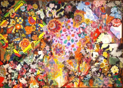
Paradoxically, in order to gain fine-art acceptance for such material, Mimi and others had to reconstruct it according to formalist principles, much as Picasso, Braque, Schwitters and Dove did with scraps of paper and found objects. Those male artists had pulled it off, and it was a strategy that served Mimi well. Her innovation was to do it on a monumental scale, using materials that are insistently decorative to create intricate compositions in which functional elements, like a handkerchief, an apron or a kimono, are taken out of context, yet retain their recognizable identities. But negating the raw material’s functionality renders it abstract by default. In Beauty of Summer, for example, a riotous explosion of printed and embroidered floral motifs, overlaid on geometric shapes, surrounds a confetti-like area of painted lozenges. Everything in this colorful mélange contributes equally to the overall impact of the design.
More than half a century after a newspaper cartoonist dubbed a crazy-quilting granny “the original cubist,” Mimi and other feminist artists critiqued the sexual politics that devalued traditional forms of female self-expression. Those impediments are satirized in The Dollhouse, a construction she made with Sherry Brody for the now-famous 1972 Womanhouse installation in an abandoned Hollywood mansion. Borrowed from the Smithsonian for the National Academy show, The Dollhouse is at once amusing, intriguing, disturbing, charming and scary. Various rooms represent the roles women normally play in the home, but one space, on the top floor, is reserved as an art studio, with a tiny version of one of Mimi’s geometric paintings on the easel and a miniature nude man in cowboy boots on the model stand. Although he’s obviously not posing for the painting, the role reversal is a pointed commentary on the art world’s myopic view of women, one that Mimi and her fellow visionaries rejected.
Peggy Guggenheim’s Passions
2-11-16
For the amorously inclined, the perfect Valentine’s Day movie is “Peggy Guggenheim: Art Addict,” a feature-length documentary about the legendary lady whose fame as a collector of modern art is rivaled only by her notoriety as a collector of lovers. The film will play at the Sag Harbor Cinema on Saturday and Sunday at 3 p.m.
Directed by Lisa Immordino Vreeland—whose debut film, “Diana Vreeland: The Eye Has to Travel,” chronicled the career of her grandmother-in-law, the renowned fashion editor—this portrait of an equally formidable female is based in a 1986 biography of Guggenheim, who died in 1979. The author, Jacqueline B. Weld, interviewed her extensively shortly before her death, and lost track of the tapes. But during the exhaustive research for this nuanced character study, Vreeland found them, and has used them to excellent effect in the narrative, which delves deep beneath the surface image of a woman who is often dismissed as a flighty, promiscuous socialite.
In a family of colorful crackpots, Marguerite Guggenheim was the self-described black sheep, rebelling early and often. Moving to Paris at age 23, she embraced a bohemian life style whose rough edges were smoothed by inherited wealth—not a huge fortune, but enough to enable her patronage of artists and writers. Well aware of her naiveté, she sought guidance from art-world insiders, notably Marcel Duchamp, whom she credits as “my great, great teacher.” He introduced her to the Cubists and Surrealists whose masterpieces form the core of her collection, now enshrined in her eponymous museum in Venice. Examples sparkle throughout the film, like precious gems scattered on a light box.
Some people questioned Guggenheim’s judgment for investing in such novelties, others wrote her off as a gullible dilettante who was being hoodwinked by charlatans, but she was undaunted. When she opened a gallery in London, there was virtually no market for modernism, so she decided to create a museum to rectify the widespread ignorance. Unfortunately World War II derailed her plans, and she was forced to return to her native New York City, where her gallery, Art of This Century, became a beacon for the nascent American avant-garde.
She never shied away from controversy, and even agreed with some of her critics. “Yes, all that’s true,” she invariably declares, whether admitting to affairs with married men, neglecting her children, or sleeping with Brancusi because she thought it would get her a better deal on one of his sculptures. As Hitler’s army was conquering Europe, she was frantically buying “a picture a day” from artists desperate for enough cash to escape. For this she was disparaged, as if she had exploited them, whereas in fact she was their lifeline. She also paid the passage for several of the Europeans who fled to the US, including the German painter Max Ernst, whom she married in order to protect him after America declared war on the Axis.
Her union with Ernst was shorter but no less turbulent than her first marriage, to Laurence Vail, the father of her two children. An especially poignant section of the film deals with her troubled daughter Pegeen, who committed suicide in 1967. Guggenheim’s failure as a mother is often attributed to her obsession with her collection and the self-aggrandizement it afforded her. But without glossing over her shortcomings, the film examines her complex motivations for collecting art and supporting artists. When she opened her New York gallery, she took a flier on unknowns like Pollock, Motherwell, Still and Baziotes, giving them their first solo exhibitions and in effect launching their careers. She lived long enough to enjoy the enormous satisfaction of seeing her commitment vindicated by history.
Amid the host of voices testifying in Guggenheim’s behalf—from friends and acquaintances to art historians, critics and art dealers—her own statements confirm the passion she developed and nurtured throughout her singular career. Surprisingly, for someone so relentlessly driven and stubbornly devoted to the modernist cause, she is soft-spoken and quick to credit her advisors, remarking, “I always got hold of the right people.” Whether she means in the galleries or in bed is left open. In the end, as she puts it, “It was all about art—and love.”
Picasso’s Many Dimensions
1-14-16

Among the revelations that abound in “Picasso Sculpture,” the blockbuster survey on view through Feb. 7 at the Museum of Modern Art, is the extent of the artist’s penchant for recycling. Long before he famously combined a bicycle handle and seat to evoke a bull’s head (1942), or adapted a toy car as a baboon’s face (1951), he was using scraps of this and odd bits of that to make three-dimensional objects which, at the time, could not have been termed sculpture by any orthodox definition.
One critic has called the show a “dumbfounding triumph,” which is only half true. It’s a triumph, all right, comprising the full range of Picasso’s sculptural output in all media, including many pieces never before exhibited in this country. But it’s not dumbfounding; quite the opposite. Eye-opening is more accurate. By tracing Picasso’s progress from his very first sculpture to his very last, with examples of everything in between, we can see clearly, perhaps for the first time, why he was a protean figure in 20th century art.
The show posits that Picasso was such an innovative sculptor because he had no formal training in the craft, so he wasn’t limited by convention. He was schooled in drawing and painting by his artist father, but didn’t begin to play with clay until 1902, at age 20, in the studio of a local Barcelona sculptor. His maiden effort, a tiny seated female figure, is lumpy and awkward, not unlike his juvenile drawings. But as with his draftsmanship, his mastery of three-dimensional form quickly blossomed, and within a year or two he was handling clay (later cast in bronze) with assurance. Also in the gallery devoted to his first sculptures are some wood carvings indebted to Gauguin, as well as to African and Oceanic precedents. Made from discarded lumber, these are the earliest surviving examples of his use of recycled materials.
Picasso’s packrat instinct was astonishingly fruitful. By the 1910s, having already developed cubist painting in tandem with Braque, he wrestled it off the canvas into real space, using cardboard, sheet metal, wire, string—even, in one small shadow box, upholstery fringe. Each of the six versions of his 1914 painted bronze absinthe glass sports a real strainer for the sugar that sweetened the liquor’s bitter taste. Whimsically painted with patterns that suggest the spots before a drinker’s eyes, they are together for the first time since they left the artist’s studio.
You might say that Picasso never found an object he couldn’t turn into something else, but what he turned it into was almost always a creature, either animal or human. A colander becomes a woman’s head, broken jug handles form a baby’s legs, a jump-roping girl’s body is fashioned from a straw basket, an entire party of beachgoers materializes out of scrap lumber, and in the gallery devoted to Picasso’s final sculptures, a charming little horse is made entirely of six metal table legs and four casters. These and many other examples demonstrate Picasso’s playfulness, as well as his uncanny ability to re-imagine, re-combine and re-invent forms in space.
These objects began with one or more existing things that the artist has transformed, but the show also includes many other works that don’t incorporate found materials. For example, after a 10-year hiatus from sculpture, in 1927 Picasso was commissioned to create a monument to the poet Apollinaire. His maquettes, fabricated by Julio González from welded metal rods, are cage-like structures that sprout miniature heads and hands. (The memorial committee didn’t know what to make of such an unorthodox design, and the commission was rejected.)
In the 1930s, at his own sculpture studio at Boisgeloup, Picasso experimented with working directly in plaster. Inspired by the voluptuous body of Marie-Thérèse Walter, his young lover at the time, he created a series of monumental heads and busts that distort facial features and body parts into ambiguous, sexually suggestive abstractions. The swollen forms look almost pillow-like, contradicting the rigidity of the plaster.
For the next three decades, Picasso continued to innovate in numerous sculptural media, from ceramics and wood to plaster and metal, as well as found objects. Even during World War II, when bronze casting was forbidden, he managed to get around the restrictions. His final piece, the 1964 maquette for the Daley Center in Chicago, made of sheet metal and wire, harks back conceptually and formally to his 1914 Guitar, as if to bring his prodigious sculptural imagination full circle.