My “Eye On Art” column appears monthly in the Sag Harbor Express
Lichtenstein at the Whitney
12-5-19
In June 2018, the Whitney Museum of American Art announced the establishment of the Roy Lichtenstein Study Collection, created by the Roy Lichtenstein Foundation’s gift of more than 400 of his works in all media spanning his entire career. Among the themes represented in depth is architectural ornamentation, specifically the motifs the artist observed on building façades in downtown Manhattan and adapted in numerous paintings and prints, primarily in the 1970s. Beyond their implicit commentary on cultural appropriation and ironic take on the symbolism of what Lichtenstein called “imperial power,” on an aesthetic level they were his response to Minimalism, which prompted him to simplify his imagery. A selection of works on paper from that series is the subject of the Study Collection’s first exhibition, “Order and Ornament: Roy Lichtenstein’s Entablatures,” on view through April 2020.
The show took me back to the winter of 1979, when I reviewed “Roy Lichtenstein: Mirrors and Entablatures,” organized by Lawrence Alloway at what was then the Fine Arts Center Gallery at Stony Brook University. Those two series are the most abstract of Lichtenstein’s mature works. As I wrote then, “they are abstract in the orthodox meaning of the term, in that they express the essential qualities of the subjects they represent.” In fact they are doubly abstract, since he was using familiar visual symbolism from popular culture, in effect re-processing already essentialized forms. While, like much of his imagery, the mirrors are derived from magazine illustrations, the entablatures are based on direct observation, as documented at the Whitney in a group of his photographs of dentils, egg-and-dart friezes, Greek frets and other ornamental elements of neo-classical architecture.
The earliest example in which an entablature appears actually does come from a printed source illustrating a genuine antique structure. Temple, a 1964 lithograph, was inspired by a postcard of the Temple of Apollo ruins at Corinth, on which the triglyph and metope frieze is badly deteriorated. Beginning in the early 1970s, however, Lichtenstein focused on entablature details from his own pictures of modern temples of commerce in the Wall Street area. He was attracted to geometric designs, ignoring organic ones like garlands, acanthus leaves, and human figures. The crisp detailing is often emphasized by strong light and shadow contrast, which tends to flatten the motifs, further abstracting them, as in his 1971 graphite drawing of a faux keystone relief carving. The architectural stonework, evident in the nearby source photograph, is missing; only the shadows it casts are visible.
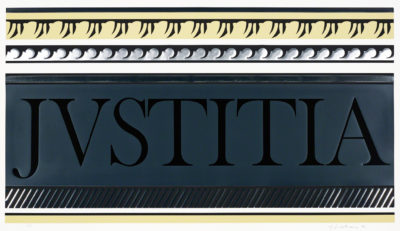
Scrapbooks containing cutouts of design illustrations, sketchbooks with many variations, and stencils used to make repeat patterns shed light on Lichtenstein’s painstaking practice of distilling and adapting the imagery, as in Entablature X, two variations on a close-up of the word Justitia carved on a courthouse frieze. Not only the designs themselves but also the textures of stone and concrete have been translated into graphics that contain embossing and metallic overlays. The study for “Entablature III” and the final print show how the texture was varied and drawn areas became embossment.
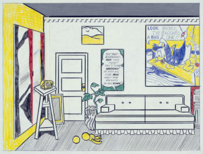
Most of the works on view are based on such details, but a few include classical building elements incorporated in more elaborate compositions. A study for the 1973 painting, Artist’s Studio ‘Look Mickey,’ in which Lichtenstein quotes himself à la Matisse, features a dentillated cornice, wittily paraphrased in the couch skirt. A 1985 study for Equitable’s monumental Mural with Blue Brushstroke, also a pastiche of his earlier work, has three references to Greco-Roman architecture. With typical deadpan detachment, he gives equal attention to everything from a cleaning product ad and a French curve to a piece of Swiss cheese and a Doric column.
Entablatures is only one of many themes represented in the Study Collection’s holdings, which include everything from paintings and sculpture to sketches, maquettes, and studio materials. With 26 other Lichtenstein works already in its collection, the Whitney is now the primary interpreter of the artist’s creative process from the early 1940s until his death in 1997.
Women of the 9th St. Show
11-7-19
 In the November 24, 1975 issue of New York magazine, the art critic Thomas B. Hess reviewed an exhibition of portraits by Elaine de Kooning. Hess, who was himself among her subjects, described her as “one of the sparkling ‘Amazons’ who emerged in the flowering of American painting after World War II and into the 1950’s.” He also mentioned several female artists of the early 20th century Russian avant-garde to whom that “equivocal nickname,” as he put it, had been applied. I’m grateful to my friend, the artist and composer Edvard Lieber, for sending me the complete text of Hess’s article, since I was having trouble understanding why on earth the phrase “Sparkling Amazons” was used as the title of the current exhibition at the Katonah Museum of Art. Having read what Hess wrote, I’m now even more perplexed.
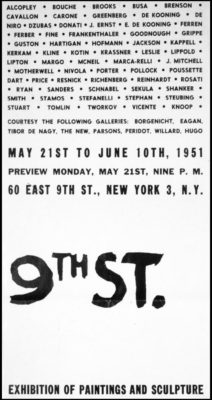
The Katonah exhibition, on view through January 26, features the eleven female artists included in the landmark 1951 exhibition of abstract art known as the 9th St. Show. Hess named four of them in his article, but not in reference to that show, which isn’t mentioned. He may have meant the term, which he acknowledged was ambiguous, as a tribute to the artists’ fortitude, since they’d been fighting for recognition for decades. But taken out of context and stripped of the internal quotation marks denoting its patronizing implication, “Sparkling Amazons” is a title that the artists would surely resent. Since they’re not around to complain—the last survivor, Jean Steubing, died in May—I’m doing it on their behalf.
The point, which several of them made repeatedly throughout their careers, is that they should not be categorized or pigeonholed as a female subset. They argued that their work should be judged by its quality alone, on the same basis as that of their male peers. If only it were so simple. Quality is a notoriously subjective judgment, but the issue is complicated when a two-tier system is in place. So in one sense, segregating the women, as the Katonah show does, perpetuates the inequity. On the other hand, you can’t judge what you don’t see, so this sort of exposure helps redress the imbalance. And, to be fair to the men, some of those in the 9th St. Show are now just as unheralded as some, though not all, of the women, a number of whom are enjoying overdue but significant exposure these days.
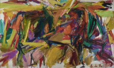
Among the eleven artists spotlighted at Katonah, the five painters singled out in Mary Gabriel’s book, Ninth Street Women, Lee Krasner, Helen Frankenthaler, Grace Hartigan, Joan Mitchell and de Kooning, are represented by outstanding examples. None of the canvases on view were actually in the 9th St. Show—documentation is sparse, and there was no checklist—but they are roughly of the period. In addition to big, bold works that can hold their own in any company, including Frankenthaler’s free-flowing Seascape with Dunes, de Kooning’s dynamic Bullfight and Krasner’s The Seasons, the masterpiece of her Earth Green series, smaller pieces illustrate the artists’ range and contradict the notion that all powerful abstract expressionist paintings are large. And the collages by Anne Ryan transform little scraps of paper and cloth into complex, multi-layered compositions that are just as compelling on an intimate scale.
Perle Fine, who also excelled at collage, though in a larger format, is not represented by her strongest work. The exception is Fragment, a vertical canvas in which the structure is crumpled like checkered cloth, for an almost trompe-l’oeil effect. Fine’s work has become better known in recent years, but the four remaining artists in the Katonah show, Guitou Knoop, Day Schnabel, Sonja Sekula and Steubing—who actually paid the rent for the vacant store in which the 9th St. Show was held—are virtually unknown today. Knoop and Schnabel, both sculptors, were born and trained in Europe, as was Sekula, whose works on paper recall Paul Klee’s brand of cubist-derived whimsy. Her one canvas, 7 am, is a response to her experience of the Lower East Side, where she lived in the same building as John Cage and Merce Cunningham, with whose artistic concepts she clearly felt in tune. Imposing sculptures by Knoop and Schnabel, and a lively gestural abstraction by Steubing, round out the selection. Notwithstanding the exhibition’s unfortunate title, I’m grateful for this rare opportunity to see their work, alongside that of their more celebrated colleagues, and to judge it on its own merits.
Looking Into Glass Houses
10-10-19
A few weeks ago, literally at the crack of dawn, an intrepid group assembled at LongHouse Reserve for an excursion to the Glass House and Grace Farms in New Canaan, Connecticut. Both sites are notable for their transparent architecture, but the concept behind each is very different. One was designed as a private residence, while the other was conceived as a public space where visitors can “experience nature, encounter the arts, pursue justice, foster community, and explore faith.”
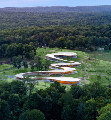 Set in 80 acres of meadows and woodland, Grace Farms was established in 2009 by Sharon Prince and her husband Robert, a hedge fund executive. Their non-profit foundation sponsors meetings, lectures, performances, social justice initiatives and faith-based programs, as well as events organized by outside groups, in what amounts to a combination community center, conference venue, and nature preserve. The price tag was reported to be $120 million.
The site is open to the public free, six days a week. Its primary attraction, designed by the Japanese firm SANAA, is a meandering 1,400-foot long building, known as the River, which opened in 2015. Under a continuous aluminum roof, glass walls enclose various activity areas, including an auditorium, library, gym and cafeteria. Our group happened to be there on a glorious fall day. The sky was cloudless, the temperature was comfortable, and the outdoor and indoor spaces complemented each other as intended. The effect is quite spectacular.
The River’s seamless integration of interior and exterior environments is also true of Philip Johnson’s Glass House, which predates Grace Farms by some 65 years. Built in 1949 and based on an earlier design by Mies van der Rohe, the Glass House and its opaque companion, the Brick House, are set well back from the road on a 49-acre site. Visitors need to register for tours and take a van from a reception center in downtown New Canaan.
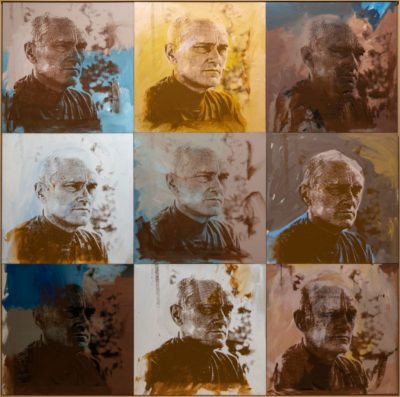
There are 14 buildings on the property, ranging from a couple of vernacular structures to Da Monsta, Johnson’s final addition, a 1995 folly suggested by a Frank Stella design—another illustration of the architect’s magpie sensibility. His close connection to visual artists is illustrated in separate buildings for the paintings and sculpture he collected with his life partner, the curator and art dealer David Whitney (no relation to Gertrude Whitney, founder of the eponymous museum). Their involvement with several other art-world homosexual men who spent time at the Glass House, including Andy Warhol, Robert Rauschenberg, Lincoln Kirstein and Merce Cunningham, is explored in an exhibition, “Gay Gatherings,” on view in Da Monsta and the Painting Gallery through December 15.
For much of his long life—he died in 2005 at age 98—Johnson hid his gay identity from the public, though it was well known in his social circle. It seems ironic that someone intent on keeping his private life secret should build himself a transparent home, in which everything that happens in every space except the bathroom is fully visible to the outside world. Of course Johnson’s “glass closet” sits deep into his own property, far removed from the prying eyes of neighbors and passersby, so it feels less like a risk of exposure than a safe place in which to express his identity openly. And when privacy was required, the Brick House served as a sheltered retreat, as well as a guest cottage. Unfortunately it’s now under renovation, so visitors can’t see the interior, with its so-called cuddly bedroom, where Warhol slept under a canopy backed by a specially commissioned Ibram Lassaw wall sculpture.
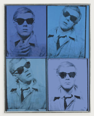
Warhol’s multi-paneled 1972 portrait of Johnson, rendered in muted tones said to have been inspired by colors in the surrounding landscape, is on view in the Painting Gallery, together with works by Rauschenberg and Robert Indiana. A video in Da Monsta traces the personal and professional interactions of his circle, dating back to his student days at Harvard. Photographs, documents, and correspondence add to the feeling of intimacy, shared concerns, and mutual support among this group of gay men.
Another ironic twist to the Johnson story is that his homosexuality, kept hidden for so long, is now widely accepted, while his overt Nazi sympathies, which he later vehemently repudiated, remain repugnant. He should have kept those feelings locked in the closet.
Montauk Highway III
9-12-19
For its third annual celebration of the artists who migrated to the South Fork in the years after World War II, the Eric Firestone Gallery in East Hampton has assembled a wide-ranging group of works, not all of which fit the bill. While many of the artists do have connections to the region, either as full-time or part-time residents, several do not. This not only dilutes the show’s premise, but also—like the spurious claim that Jackson Pollock played in the early artists’ and writers’ softball games—falsifies history.
Considering the wealth of talent with significant ties to the Hamptons, I wonder why it was necessary to insert artists who have little, if any, association with the area. Ernest Briggs visited Southampton at some point in his career, and his work was shown at East Hampton’s Signa Gallery in 1960, but he never lived or worked locally. Nor did Louise Nevelson, Seymour Lipton, Jack Tworkov, Corinne Michael West or Pat Passlof. Betty Parsons often traveled Montauk Highway to visit her artist friends out here, but her studio was in Southold, on the North Fork, where Theodoros Stamos was a neighbor.
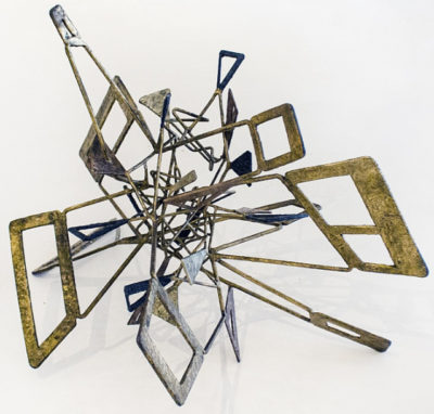
Among those who really did drive on Route 27 to reach their studios, the sculptors Michael Lekakis, Philip Pavia, Costantino Nivola and Ibram Lassaw are represented by fine examples of their signature work. Lassaw’s Ourania brilliantly illustrates his concept of open-space construction, using hammered and welded metal to create a symbolic homage to the muse of astronomy. Of three small but engaging pieces by Nivola, two were made using the sand-casting technique he pioneered on the beach near his studio in Springs. The third, an incised and painted cement panel, appears to depict a hawk, among other abstracted motifs perhaps inspired by the local environment. Pavia’s Battle Revisited, an impressive marble carving from 1962, treats the mineral as if it were organic, curving and twisting on itself, seemingly engaged in an internal struggle. The artist’s reverence for the stone’s character did not prevent him from manipulating it to create such an ambiguous result. Lekakis, on the other hand, emphasizes the inherent nature of wood in Spondilos, yet likens it to the human spinal column by subtly incising it to suggest vertebrae.
There are also two sculptures and a major 1953 painting by Joseph Glasco, a protégé of Alfonso Ossorio, who spent time at The Creeks in the 1950s and returned to the South Fork some forty years later to visit Julian Schnabel in Montauk. Glasco’s canvas, “Marvello,” is typical of the highly stylized figural
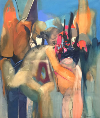
abstractions that earned him early recognition and inclusion in the Museum of Modern Art’s 1952 exhibition, “15 Americans,” which also featured Pollock, Rothko and Still. Ossorio’s Winter Colloquy, a 1950 ink, wax and watercolor on board, shows his masterful use of a resist technique to create layered effects, in which spectral figures occupy indefinite surroundings.
Outstanding paintings by Nicolas Carone, Perle Fine, Paul Brach, Miriam Schapiro, Charlotte Park and Kyle Morris represent these South Fork denizens well. In Red + Purple, Morris makes the colors dance across the canvas as if caught by an offshore breeze, while Fine’s aptly-titled Blue-Chip Blue #1 animates a monochromatic field with a collage of acrobatic cut-out shapes. Park’s black and white 1956 abstraction uses textural variation and rhythmic structure to enliven the composition, a strategy taken to the extreme by Carone, whose heavily impastoed canvas writhes with surface tension. By contrast, in Mother and Child, Schapiro’s translucent paint application nearly dissolves the figures, which merge into a colorful, landscape-derived setting. There are also nature allusions in Brach’s untitled 1955 canvas, with its whorls of paint bunched like a floral bouquet.
Even the minor works by major figures like Willem de Kooning, Robert Motherwell, Jimmy Ernst, Conrad Marca-Relli, Joan Mitchell and James Brooks fit nicely within the exhibition’s purview. And though it was painted decades before he came to the area, Peter Busa’s Beauty and the Beast II, an important example of his Indian Space imagery of the 1940s, is a justifiable inclusion. But let’s be clear: Montauk Highway doesn’t run all the way to Manhattan, and never did.
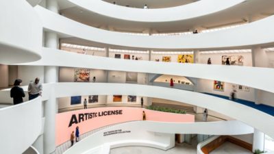
Artistic License at the Guggenheim
8-15-19
Thirty years ago, the Museum of Modern Art inaugurated a series of occasional exhibitions titled “Artist’s Choice.” The plan was to invite artists to organize shows drawn from the museum’s permanent collections. For the maiden effort, the sculptor Scott Burton chose works by Brancusi, whose sculpture, like Burton’s, straddles the line between fine art and functional objects. Among the artists who have since participated are Chuck Close, Elizabeth Murray, David Hammons and, most recently, Peter Fischli. Similarly, several years ago the National Gallery in London invited contemporary artists to select works from the collection that were especially influential on their own practice. To celebrate the sixtieth anniversary of its landmark Frank Lloyd Wright building, the Guggenheim Museum is following suit with “Artistic License,” an exhibition, on view through January 20, selected from its holdings by six artists who have had solo shows at the museum.
 The value of such exercises is twofold. Not only does it encourage fresh approaches to the curatorial process and allow for idiosyncratic selections, it also often brings to light little-known works long submerged in deep storage. Most museums display only a small fraction of what they own, and the frequent focus on crowd-pleasing loan shows tends to eclipse the collections. But those loan shows are getting more and more expensive to mount. As a purely practical matter, it’s a lot cheaper to show what you own, but how to make it intriguing? Answer: invite a bunch of well-known artists to put their personal stamps on the choices and the installations. This decision seems all the more relevant for the Guggenheim, since its founding director, Hilla von Rebay, was herself an artist, and her vision for the collection was highly subjective.
“Artistic License” is based on the premise that the artist-curators were limited to works made before 1980 that belong to the museum. Not everyone stuck to those rules. Cai Guo-Qiang, who picked an eclectic mixture of 75 small works, also included four large new works of his own; Richard Prince, whose curatorial emphasis is on mid 20th century abstraction in an international context, lent three paintings from his personal collection; and Julie Mehretu borrowed a painting from a commercial gallery and lent a work on paper she owns. These departures are gratuitous, and detract from the presumption that the museum’s holdings are the content. If, for example, Mehretu wanted to make the point that the Guggenheim under-represents artists of color, it would have been more effective to leave a blank space on the wall instead of importing a Norman Lewis and a David Hammons. The Hammons seems especially inappropriate, since Mehretu also included an excellent one from the museum’s collection.
Carrie Mae Weems and Jenny Holzer more effectively critique discrimination and exclusion by highlighting works by women and marginalized artists that the Guggenheim owns but rarely shows. Holzer’s section, titled “Good Artists,” is a riff on art historian Linda Nochlin’s rhetorical question, “Why have there been no great women artists?” By spotlighting Louise Nevelson, Louise Bourgeois, Agnes Martin, Ruth Asawa, Liubov Popova and several other women, Holzer suggests that they’re just as good as many of the male artists in the Guggenheim’s collection. Weems makes her point more obliquely, by restricting her choices almost exclusively to works in black and white, several of which depict, or were created by, black and Hispanic artists.
Paul Chen has taken a more playful approach in his thematic installation of water-related imagery. You know you’re in his section of the ramp when you step onto bright blue carpeting and encounter Lawrence Weiner’s conceptual homage to the sea, followed closely by Piet Mondrian’s stunning 1910 painting of a sand dune. From Fernand Léger’s whimsical Starfish to William Baziotes’ translucent Aquatic and Willem de Kooning’s shimmering …Whose Name Was Writ in Water (titled after Keats’ epitaph)—as well as a few of Rebay’s works on paper—Chen’s selection is a feast for the eyes and a reminder of just how broad a spectrum the Guggenheim’s collection comprises.
Artists Face to Face
7-18-19
On a visit to the Metropolitan Museum of Art, the artist Doug Reina was struck by William Merritt Chase’s full-length portrait of James Whistler in a dandified pose. Turns out that Whistler also painted Chase at the same time, but was so offended by what he considered Chase’s caricature that he apparently destroyed his own study of Chase. This got Reina wondering about the dynamics of one artist portraying another, and led him to propose an exhibition on the topic, “Face to Face,” on view through September 30 at the Long Island Museum in Stony Brook.
The museum is an especially appropriate venue for such a show, since its collection includes several 19th century portraits by members of the Mount family of Setauket. William Sidney Mount depicted his sister, Ruth, and his brother Shepard, both of whom were artists, and was himself portrayed by Charles Loring Elliott. The historical section also features examples by the artistic Moran family, including Paul Nimmo Moran’s likeness of his mother, Mary Nimmo, and Edward Percy Moran’s ink drawing of his father, Edward.
Chase’s portrait of Whistler remains at the Met, but his handsome study of his former student, Cadwallader Washburn, wielding a massive palette, transitions the show into the 20th century, where highlights include Florine Stettheimer’s charmingly stylized impression of Louis Bouché, Fairfield Porter’s outdoor portrait of Jane Freilicher with her daughter Elizabeth, and Moses Soyer’s brooding image of David Burliuk, who appears to be sketching Soyer at the same time.
The majority of examples are by 42 contemporary artists, many of them at the invitation of Reina and his fellow painter Ty Stroudsburg. The show is introduced by Kevin McEvoy’s portrait of his friend, Joshua Bellinger, holding a permanent marker of the type he uses to make intricately patterned abstractions, one of which serves as a backdrop. In an accompanying video of interviews with some of the participants, they discuss the challenges of portraying colleagues, who naturally are scrutinizing their efforts with professional as well as personal interest. As Reina points out, “When you paint another artist, you’d better bring your ‘A’ game.”
Portraiture done from life is a collaboration between artist and subject, and when the subject is a fellow artist the exchange is especially sympathetic. The sitter knows from experience the challenges and frustrations, as well as the rewards, of trying to capture the essence of another person. Elaine de Kooning, for whom portraiture was, as she put it, an addiction, described a successful portrait as “a kind of invasion,” penetrating beneath surface appearance to reveal things not apparent in a mere likeness.
The section devoted to reciprocal portraits is especially engaging. Here we see Reina through the eyes of Athos Zacharias, a self-described abstract expressionist, who was initially skeptical of the project but was won over, producing a dynamic interpretation of Reina’s face. Reina, in turn, depicts Zach in more conventional terms, seated quietly and in a contemplative mood. Reina also appears in a close-up courtesy of Jim Malloy, and at his easel en plein air, as observed by Stroudsburg, who is herself portrayed by Janet Culbertson, Bruce Lieberman, Amy
Worth, and of course Reina. In his studio, where he posed for Jerelyn Hanrahan, his portrait of Stroudsburg hangs on the wall. In a painting-within-a-painting, John Wissemann shows his wife, Nancy Wissemann-Widrig, working on her portrait of him at work, surrounded by his colorful materials, and her finished canvas is on view next to his painting on paper.
A couple of artists have chosen to portray predecessors whom they admire, rather than living contemporaries. Robert G. Carter’s homage to the late Charles White includes a sensitive image of the artist in a Superman shirt, with paper and a large pencil signifying his superior draftsmanship. David Slater—who himself is the subject of portraits by Mary Stubelek and James Daga Albinson—looks back at Jackson Pollock and Lee Krasner. His symbolic double portrait was inspired by his many hours spent in their former studio, which he monitors during the Pollock-Krasner House’s open season.
What would Whistler make of the more than 70 efforts by artists to shed light on each other through depiction? Judging by the universally congenial treatments in “Face to Face,” he might wish that, instead of Chase, one of the artists represented here had painted him.
Lee Krasner in London
6-20-19
In 1965, the Whitechapel Art Gallery in London presented Lee Krasner’s first retrospective exhibition. It was also her first overseas exposure, and it proved to be her last solo show abroad—until now, thirty-five years after her death. In a triumphant return to London, “Lee Krasner: Living Colour,” at the Barbican Art Gallery through September 1 and traveling to three other venues in Europe, places her in the context of international modernism, where she always insisted her work should be judged.
While it’s not a true retrospective, since a few key phases are missing—including her cubist paintings from the late 1930s, when she was at the forefront of the young American abstractionists—the show hits many of the pivotal points in Krasner’s fifty-year career, from her early self-portraits to the 1970s collages that illustrate her longtime practice of recycling earlier work. In fact, due to her periodic revisions, her oeuvre comprises only about 600 pieces, of which 74 are on view.
With its mezzanine divided into relatively small bays, the Barbican is not the most sympathetic exhibition space, but the show’s curator, Eleanor Nairne, has used the divisions to advantage. She was helped by Krasner’s self-described “breaks,” abrupt changes of artistic direction instead of smooth transitions. And often, when Krasner became dissatisfied with what she was doing, she transformed it out of all recognition. For example, most of the canvases from her 1951 exhibition at the Betty Parsons Gallery in New York City—her first solo show—became the backgrounds for large-scale collages a few years later. The overlays of cut and torn paper and fabric vitalize what were rather static compositions. Two outstanding examples, Milkweed and Blue Level, are included in the current show, as are several more of the 1953-55 collages that announced Krasner’s emergence as a force to be reckoned with in the New York avant-garde.
No sooner had she scored this success than she abandoned the collages to embark on a series of nature-based abstractions. Bordering on the grotesque, the forms are swollen with pent-up energy, reflecting the turmoil of her personal situation. In the spring of 1956, her marriage to Jackson Pollock in crisis due to his infidelity, she painted a bloated figure with a gash in its face, overlooked by an evil eye scratched into the black background. That canvas, later titled Prophecy, was on her easel in July when she traveled to Europe, while Pollock stayed behind. During her absence, he was killed in a car crash, leaving her to deal with the aftermath and to confront the image that foretold his death. Remarkably, this tragedy did not derail Krasner’s creative drive. Three related works painted soon after her return occupy a decisive position in her development, signaling her determination to persist. The bay that contains these four canvases is one of the show’s highlights.
What followed in 1957 was a group of life-affirming paintings, full of sweeping gestures and vibrant colors, known as the Earth Green series. She had moved out of her small studio in the house and taken over Pollock’s barn studio, where she was able to expand her scope, mounting her canvases on the walls and surrounding herself with works in progress. Sadly, none of the Earth Green paintings are in the exhibition, making the shift, two years later, to her nearly monochrome Umber series seem all the more abrupt. Five of those paintings, including the monumental The Eye is the First Circle, 1960, occupy the Barbican’s lower gallery, which has ample wall space to accommodate large works. Masterpieces from the following decade, such as Another Storm, Combat, Siren and Icarus, demonstrate her increasingly ambitious exploration of spontaneous action painting, and a group of beautiful works on paper shows that, even in a small format, she could create powerful imagery.
In the 1970s another break occurred, resulting in crisper, more geometric compositions. Two of those canvases are included, foreshadowing Krasner’s major collage series of 1976-77, titled after conjugations of the verb, “To See.” Composed of cut-up drawings from her time at the Hans Hofmann School of Art in the late 1930s, they proclaim her need to re-invent herself as often, and as ruthlessly, as necessary. The show ends there—on a high note, to be sure, but omitting the last five years of her productive life, when she continued to reconsider earlier work to find the way forward. As she asserted, “The past is part of the present, which becomes part of the future.”
Women Look at Themselves
5-23-19
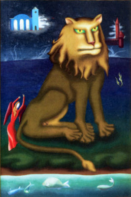
As we mourn the loss of Grumpy Cat, it’s a comfort to know that Sulky Lion is still with us, specifically at the Heather James Gallery in Manhattan, where he is a focal point of the current exhibition, “The Female Gaze,” on view through July 31.
The title is a twist on the much-maligned “male gaze,” which objectifies women and casts them in subordinate roles in the creative process. In this instance, however, the artists turn their gaze less often on the opposite sex than on themselves, exploring their inner lives using visual metaphors and imaginative symbolism. There have been other exhibitions on the topic, but this one narrows the field to Surrealism, with its capacity for fantasy, myth-making and dream imagery. And there’s no lack of material, since Surrealism is still a significant impulse in contemporary art. Two of the featured artists, Nancy Youdelman and Aube Elléouët—the daughter of Surrealism’s founder, André Breton, and the artist Jacqueline Lamba, another under-appreciated member of the movement—are among those who carry it on today.
The frowning feline is the creation of Stella Snead, a British-born painter associated with the Surrealists in the 1940s. She is one of the fifteen artists featured in the show, subtitled “Women Surrealists in the Americas and Europe,” a wide-ranging survey that includes well-known artists like Frida Kahlo, Leonora Carrington, Dorothea Tanning and Magdalena Abakanowicz, as well as more obscure figures such as Snead, who withdrew from the art world in the 1950s and devoted herself to travel and photography. Like several other artists in the show, Snead has created a hybrid creature that embodies human emotion, transcending physical reality to explore aspects of the psyche. With green-rimmed eyes and pursed lips, her anthropomorphic lion is attended by a winged woman clad in red, suggesting a devilish spirit that inflames his jealousy.
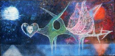
Other examples of hybrids include Sphinx Ariene, by Leonor Fini, and Manina Tischler’s Day to Night, an attenuated figure, seemingly made of delicate strands of wire, that spreads her leaf-like wings toward the sun, while her dreamy, heart-shaped head is lighted by moonglow. Austrian-born Tischler was married to the Surrealist poet Alain Jouffroy, with whom she collaborated. Breton declared her to be “a born Surrealist,” and included her work in exhibitions and publications. Fini, a native of Argentina, was also a member of the Surrealist circle in Paris, where she was one of Max Ernst’s lovers. Her sphinx’s sweet, feminine face and come-hither expression contrast disconcertingly with the formidable power of her lioness body.
As in Tischler’s day-night dichotomy, the moon, symbolic of the feminine principle, is a prominent feature of several works. Moody nocturnes by Gertrude Abercrombie, a largely self-taught painter who lived and worked in Chicago, hark back to the visionary imagery of Albert Pinkham Ryder, but refer to the artist’s own situation. As she once said, “it is always myself that I paint.” Isolated female figures in dark, desolate settings reveal her struggles, most notably in Diana Enters the Landscape, which shows her carrying her infant daughter across a bridge that represents her passage into motherhood. In Elléouët’s cheeky collage, Intrusion, a moon-woman intervenes in the creation story, as told in Michelangelo’s Sistine ceiling fresco. Before God’s finger can touch Adam’s, the female force takes hold and hijacks the process, as if to insist, ladies first!
A number of the artists spent time in Mexico, where the folkloric tradition contributed to their artistic development. This accounts to some extent for Kahlo’s rejection of the Surrealist label, since her deeply personal art reflects the traditional symbolism of her native country, as well as her efforts to overcome physical and mental suffering. Although championed by Breton, she remained aloof from Surrealism, which she claimed was “bourgeois.” Nor was she the only one to bristle at labels. After Tanning was chosen for “31 Women,” a 1943 show at Peggy Guggenheim’s gallery, Art of this Century (through which she met and later married Max Ernst), she vehemently objected to being classified as a “woman artist” and refused to participate in all-female shows. Nor would her posthumous foundation lend to the current exhibition, so she is represented by loans from other sources.
Tanning’s disapproval notwithstanding, her introspective approach aligns her with the other artists in this selection, and with Surrealists in general, irrespective of their sex. They seek to mine the unconscious, celebrate what emerges, and invite others to follow where it leads.
Miró at the Modern
4-25-19
“Joan Miró: Birth of the World,” on view through June 15 at the Museum of Modern Art, is both a delight and a revelation. The delight comes from seeing so many of the artist’s early and mid-career works together. The revelation is the work’s variety and subtlety, as well as the level of innovation Miró achieved under the influence of Cubism and Surrealism.
Drawn almost entirely from the museum’s extensive Miró holdings, plus a few strategic loans, the exhibition features well-known staples of the permanent collection galleries and obscure examples that rarely make it out of storage. Apart from illustrated books and other graphics, MoMA owns few of Miró’s late works, so the focus is on the key aspects of the artist’s development, from his youth in his native Barcelona to the 1950s.
The show takes its title from The Birth of the World, a 1925 masterpiece that has been regularly on view since its acquisition in 1972. The large canvas is both a culmination of Miró’s progress from Cubist-derived abstraction and a foretaste of the deeply personal language of abstract form that would place him in the vanguard of European modernism. To describe it as ahead of its time is an understatement; it would have seemed startlingly new if it had been painted in 1950. Its background of spontaneously flung, thinned-out oil paint prefigures both Pollock and Frankenthaler, neither of whom could possibly have seen it when they were developing similar techniques, since it disappeared into a private collection soon after completion. And the simplified, ambiguous motifs that dance across its surface became a hallmark of Miró’s work from then on.
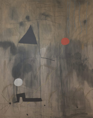
This is not to say that Miró hadn’t already evolved a singular approach to abstract imagery. A few early paintings, including an impressive 1920-21 still life with a rabbit and fish on a tabletop—a response to his first visit to Paris and exposure to Cubism—simultaneously simplify and elaborate on his observations, analyzing and interpreting them in his own terms. Still, it wasn’t until he returned to Spain that he was able to synthesize the distinctive formal vocabulary that was embraced by the Surrealists. An emblematic example is The Hunter (Catalan Landscape), 1923–24, which the movement’s founder, André Breton, acquired the year after it was painted.
Miró’s art has remarkably broad appeal, in large part because, like Calder’s, his work has a playful quality. But the amusing aspects of his forms often mask a troubling emotional undercurrent engendered by the political and social upheavals of the mid twentieth century. Surrealism arose in interwar Paris in response to those conflicts, and for Miró it confirmed a direction in which he was already heading. Unlike the Surrealists, however, he didn’t rely on chance and the unconscious to generate imagery. He invented a system of cryptic symbols that recur like pictographs, and he planned his complex compositions carefully, as the detailed study for Dutch Interior (I) illustrates. Virtually everything in the drawing also appears in the 1928 canvas, which is based on a seventeenth century painting he saw on a trip to Amsterdam. This is about as far from “pure psychic automatism” as you can get.
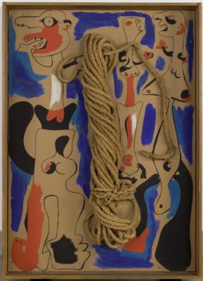
For all their quirky charm, Miró’s distorted figures are often in distress, anxious or agitated. Little wonder, when the artist’s native land was in turmoil, culminating in civil war in 1936, followed three years later by the century’s second global conflict. In the two versions of Rope and People, for example, twisted hanks of rope are surrounded by schematic figures that seem to be just as wound up, crying out and waving their hands like witnesses to a catastrophe. Painted in Barcelona on the eve of the civil war, they foreshadow the massacre at Guernica that Picasso would memorialize.
In an extraordinary self-portrait, painted in Paris in 1937-38, Miró reflects his own image as a translucent shadow-man, pale and grey, with touches of pastel that seem to drain from his ghostly form like the last wisps of vitality. Surrounded by a galaxy of his symbolic images, some of which cling to him, he stares out at us hypnotically, as if transfixed by his own lack of substance. To me, it reads as a commentary on his helplessness. Like his rope-people, all he can do is bear witness to humankind’s inhumanity.
Epic Abstraction at the Met
3-28-19
Ever since 1950, when the so-called Irascible Eighteen protested the Metropolitan Museum’s lack of interest in contemporary art, the Met has been playing catch-up. Things improved under the aegis of curators Robert Beverly Hale and Henry Geldzahler, and some recent acquisitions signal that the museum is making an effort to keep up with the times. But the current show, “Epic Abstraction: Pollock to Herrera,” covering the period from the 1940s to the present and drawn primarily from the permanent collection, is an illustration of why the Met is known for its scattershot approach to modern art.
The first problem, even before you enter the galleries, is the show’s title. How is epic defined? Clearly not in the dictionary sense, or even coherently in the introductory text. Is it about expansive ideas and subjects (broad), or existential concerns of the self (narrow)? The installation does nothing to resolve that dichotomy. Nor does one or the other of those two extremes apply to all, or even most, of the works on view. Frankly, apart from the obvious candidates and some that could arguably qualify in spite of their modest size, a lot of the choices left me perplexed, not least the subtitle closer. Much as I admire Carmen Herrera’s work, shown so beautifully at the Whitney a few years ago, I fail to see why she was picked to bracket the selection. Her long career is epic by any definition, but her individual canvases are not. The single painting at the Met—one of the works on loan from private collectors—is a fine example of her geometric style, but it hardly represents a monumental artistic statement. Pollock, on the other hand, is the obvious choice to begin such a survey, and the Met owns an exceptional cluster of four major canvases. They are followed, in canonical fashion, by a gorgeous room of Rothkos, as if to establish the benchmark against which the rest of the show must be measured.
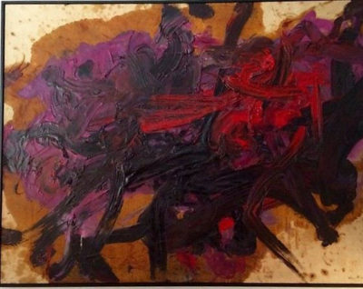
Fortunately the canon is disrupted by a terrific 1958 action painting, also on loan, by Gutai artist Kazuo Shiraga, who painted with his feet while hanging from a rope. It’s a bit misleading to pair him with Pollock, as if their approaches were similar, which they weren’t, but it does show that expressive abstraction had international ramifications in the postwar decade and beyond. And at the center of the Rothko room, Kouros, a powerful 1945 sculpture by Isamu Noguchi, extends the language of biomorphic abstraction into three dimensions. The remaining galleries are crowded and far less coherent, in part because, apart from Clyfford Still and Bridget Riley, each artist is represented by a single work. Standouts include Willem de Kooning’s Easter Monday, 1955-56, a big canvas for the period, full of energized brushwork and intriguing offsets from the newsprint he used to blot the paint—most prominently, a movie ad for “Alexander the Great.” It’s no wonder de Kooning was Robert Rauschenberg’s avatar.
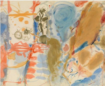
A large Helen Frankenthaler, Western Dream, 1957, on loan from her foundation, is a wonderful early example of her signature stain painting technique. Thornton Dial’s Shadows of the Field, 2008, made of rags and cotton on a metal frame, is an imposing and disquieting monument to the enslaved field workers of the South. And Joan Snyder’s big, bold Smashed Strokes Hope, 1971, a promised gift to the Met, commands the wall with authority. If only these outstanding pieces had more breathing room. For sheer physical monumentality, however, you need look no farther than Louise Nevelson’s Mrs. N’s Palace, a room-scale construction made over a thirteen-year period from wood she collected on the street. More than a hundred separate elements form the walls, and a floor of mirrored black glass is visible through the entrance. You can readily imagine the formidable Nevelson spirit, epic in its own right, enthroned inside.
The Met is to be congratulated for looking beyond the usual suspects—white, male, American—to a much wider range of abstract artists past and present. It’s always a treat to see things that rarely make it out of storage, but a selection that lives up to its billing, even if a smaller one, would have been better. And the strategic loans are reminders that, where modern art is concerned, the Met still has plenty of gaps to fill.
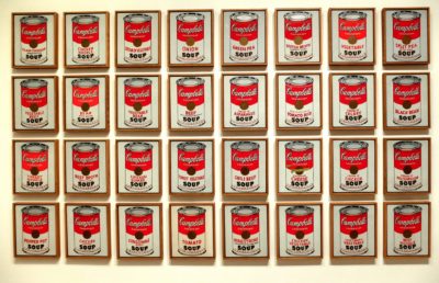
Andy Warhol at Face Value
2-28-19
Question: what’s the difference between an S&H Green Stamp and the Mona Lisa? Answer: nothing, when they’re silkscreened multiple times by Andy Warhol. Or, for green stamp, substitute Marilyn Monroe. Or switch out Mona for a dollar bill. Those images and many more have become touchstones of 20th century art, not only in America but around the world. Seeing them gathered at the Whitney Museum for the exhibition, “Andy Warhol: From A to B and Back Again,” on view through March 31, is a sobering reminder of Pop art’s enduring impact on visual culture, as well as an object lesson in branding against type.
The Whitney exhibition is billed as the first comprehensive New York presentation of Warhol’s work since MoMA’s 1989 retrospective, two years after the artist’s untimely death at 58, caused by complications from gallbladder surgery. In the catalog of that earlier show, the art historian Robert Rosenblum described Warhol’s subject matter as “the most commonplace facts of visual pollution in America that would make the aesthetes and mythmakers of the fifties cringe in their ivory towers.” And cringe they did, even as a few prescient dealers and a new generation of collectors jumped on the Pop bandwagon. The art world was knocked on its kiester by the unlikeliest successor to Pollock, de Kooning, Rothko and Klein—a gay misfit from Pittsburgh who lived with his mother and drew shoe ads for I. Miller.
After introducing itself with a few of Warhol’s greatest hits—Brillo boxes, Coke bottles, Campbell’s soup cans—the Whitney show does an admirable job of surveying his early career as a commercial illustrator, with a selection of book and magazine layouts that remind me of Ben Shahn’s graphics. There are also some juvenilia, eccentric character sketches of his friends, and drawings of shoes as surrogate portraits, in which we see Warhol’s singular linear style emerge. Then on to the hand-drawn newspaper, advertising, and cartoon knockoffs, for which source material is also displayed. Much of the documentation comes from the Andy Warhol Museum in Pittsburgh, a more inclusive and, to my mind, more revealing treatment of Warhol’s career. But since we’re not in Pittsburgh, we have to take the Whitney’s version at face value, though with a grain of salt.
The presentation segregates key aspects of that career away from the primary installation on the fifth floor, making it appear as if Warhol channeled most of his creative energy into the screenprinted canvases of pop-culture icons, car crashes, and self-portraits. Like the visual equivalent of a drumbeat, his repetitions reduce even the most compelling imagery, such as the mangled body of a suicide jumper and police dogs attacking civil rights protesters, to virtual illegibility. Conversely, his oxidation and camouflage paintings elevate random and utilitarian patterning to the level of abstract art. This kind of irony is classic Warhol, and there’s plenty of it here.
To get a fuller picture of Warhol’s achievements, however, you need to look elsewhere. Apart from a sampling of his Screen Tests and a group of Interview magazine covers, there’s little evidence of his wide-ranging enterprises, from film, video and television (he even had his own cable TV shows) to music, theater, product endorsements and the commissioned portraits that comprise the bulk of his oeuvre. The moving images and prints are on the museum’s third floor, and a large group of the portraits is in an easy-to-miss side gallery off the main lobby. I confess that I skipped the films. Having sat through several of them when they came out, I have no desire to revisit them. The portraits are even more slick and shallow than his Jackie and Marilyn and Liz, which themselves were not take seriously by the art-world cognoscenti when they first appeared in the 1960s.
I still find it astonishing that an artist who celebrated superficiality and constantly downplayed any serious consideration of his motives—one whose philosophy ran the gamut, as he put it, from A to B and back again—has risen to such a level of international renown. His avowed ambition was not to make great art but to be rich and famous, and by golly he succeeded on both counts. The exhibition tries to attribute deeper meanings, but I’m not convinced.
For Hilma af Klint, the Future is Now
1-31-19
Until very recently, if you were to ask an American to name a famous Swedish artist, the likely answer would have been August Strindberg or maybe Claes Oldenburg. The name Hilma af Klint would not have been on the tip of anyone’s tongue. That changed last fall with the opening of the Guggenheim Museum’s exhibition, “Hilma af Klint: Paintings for the Future,” on view through April 23. The show brings out of obscurity one of the most innovative artists of the twentieth century, but one who deliberately sequestered her work, believing that the world was not ready to appreciate it.
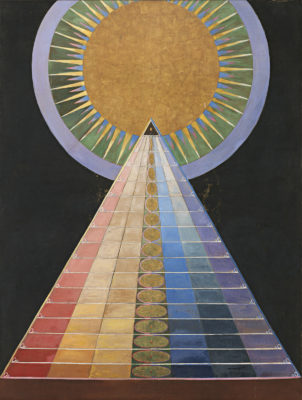
© Stiftelsen Hilma af Klints Verk
The Guggenheim is the ideal venue for this, the first af Klint retrospective in the United States, since its founding collection celebrated painters such as Mondrian, Léger, Moholy-Nagy and especially Kandinsky, considered the pioneers of non-objectivity. In fact af Klint, who shared Kandinsky’s interest in Theosophy, was creating spiritually inspired non-objective paintings as early as 1906, five years before Kandinsky’s book, Concerning the Spiritual in Art, spread the gospel of abstraction devoid of representational content. Unfortunately for posterity, she rarely exhibited anything from that body of work during her lifetime, and stipulated that it was not to be shown publicly until twenty years after her death, which occurred in 1944, the same year as Kandinsky’s.
It was not, however, until 1986 that af Klint made her international début in the exhibition, “The Spiritual in Art: Abstract Paintings 1890 – 1985,” held at the Los Angeles County Museum of Art. Three years later, a solo show was organized at P.S. 1 by the artist R.H. Quaytman, whose new series, + ×, Chapter 34, inspired by af Klint’s notebooks, is on display at the Guggenheim concurrently with “Paintings for the Future.”
Born in 1862 in Stockholm, af Klint began her career as a traditional painter and illustrator. In 1904, she joined four other female artists to hold séances in the hope of channeling guides to lead them toward art that expressed a reality beyond the observable world. Known as De Fem (The Five), the group created automatic drawings, a common practice among spiritualists at the time. But in af Klint’s case, they became her primary artistic inspiration. As she later explained, one of the guides commissioned her to undertake a monumental nine-year project she called “The Paintings for the Temple.” When it was completed in 1915, the series comprised nearly two hundred paintings and works on paper.
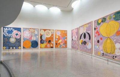
The show opens with “Group IV,” a suite of ten mural-size paintings from that series, completed in 1907. The imagery, derived from folk art and her own visionary introspection, symbolically depicts the human life cycle. She intended them to be wall decorations for the temple, which she imagined as a structure with multiple levels connected by a spiraling path. By coincidence, that could describe the museum itself, conceived by Frank Lloyd Wright as “a temple of spirit.” Given af Klint’s focus on transcendent imagery, it’s not inconceivable that if Solomon R. Guggenheim and his curator, Hilla von Rebay, had known of her work, they would have snapped it up for the collection when it started in the 1930s.
Filled with arcane shapes, annotated charts and references to primordial life, af Klint’s oils and watercolors illustrate a rich interior life of formal invention, an effort to picture unseen forces that are no less real for being invisible. The search for wisdom and meaning in a rapidly changing world, at a time when science and technology were challenging old norms and beliefs, led af Klint to explore concepts beyond conscious perception. Considered alongside the introduction of electric lighting, the telephone, X-rays and other innovations, her art is an attempt on her part to make sense of a universe in which such inexplicable phenomena occur.
At times her imagery lapses into mysticism bordering on superstition, but frankly it isn’t necessary to decode all the occult philosophizing. Even skeptics and materialists can enjoy the sensuousness of her colorful Eros series, and the complex symmetrical variations in the Evolution and Tree of Knowledge groups and Altarpieces. Her explorations of formal and chromatic relationships prefigure Albers and Klee. However, the fact that af Klint refused to share her work with the wider world meant that no one outside her small circle was aware of her accomplishments. Her belief that a future audience would be receptive to her vision prevented her from receiving timely recognition. Finally, 75 years after her death, the Guggenheim has become, at least temporarily, the spiritual temple she envisioned.