My “Eye On Art” column appears monthly in the Sag Harbor Express
__________________
Franz Kline’s Roadster Reborn
12-4-2014

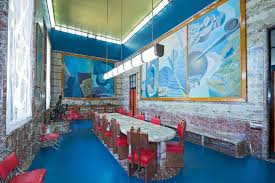
In the winter of 1960, William McCleery learned that the Old Whaler’s Church was giving away a broken pump organ, so he and his wife Alice drove out to Sag Harbor from their home in Bay Shore to collect it. McCleery, a stationary engineer by profession and a serious tinkerer by inclination, thought he could get the organ working again. On a detour to Springs to visit his aunt, they drove past Maggrett Auto Body, on the highway in Wainscott. Ever on the lookout for an antique car restoration project, he spotted, as he put it, “a diamond in the rough.” It was a 1931 Lincoln roadster, and rough it certainly was. Sunk up to the axles in the mud, with rotting canvas and pitted chrome, the car had zero curb appeal, plus it didn’t run. The owner, an artist, had more or less abandoned it in 1957, after a botched engine replacement. These negatives deterred McCleery not a bit. On the positive side, the price was $150. He promptly laid out a $15 deposit.
Turned out the owner was none other than Franz Kline, who lived in the city and used it only when he came out East. He had bought it in 1954, when he, Willem and Elaine de Kooning, Ludwig Sander and Nancy Ward (Kline’s girlfriend at the time) rented the Red House on Montauk Highway in Bridgehampton for a summer that has since become the stuff of legend. As Elaine later recalled, “It was a kind of pleasant but nightmarish summer, parties every night, entertaining in the way a nightmare could be entertaining… There is such a thing as too many friends, too much talk, too much booze, too much of a good thing.”
Kline had never owned a car, but he had a hankering for one, so he went up to the DMV in Riverhead and got a learner’s permit. You could argue that wheels are practical in the country, but the Lincoln was an impressive machine, much more than just a convenience. Kline’s friend, the publisher Barney Rosset, said it looked “like a steam locomotive.” With a powerful V8 engine, dual carbs, and handsome LeBaron coachwork, the K-series convertible coupé was a luxury car in its day. According to McCleery, only 275 of them were produced. It had a price tag of nearly $5,000 new, at a time when the average annual income was $1,850. Kline had paid only $150 for it, and he was eager to show it off. When his pal Jackson Pollock dropped by the Red House, they decided to take it for a spin.
In an essay for my anthology, “Such Desperate Joy: Imagining Jackson Pollock,” Rosset described what happened next:
“He and Pollock took it out on the road and hit more or less the first car coming toward them, head on. … Kline had to appear in court for demolishing the other car, which had about six people in it, uninjured, thank goodness. Franz said the only thing he owned was his Lincoln, and he was afraid the judge would take it away from him, so I agreed to buy it.” Fortunately the judge let Kline off with a warning, “so I gave Franz back the gorgeous car and he returned my $150 check.”
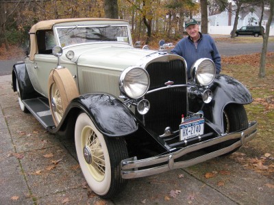
The car was a long way down from gorgeous when McCleery got it, but he saw its potential and spent the next ten years restoring it. One crucial missing part, the distinctive greyhound radiator cap, made by Gorham, was still in Kline’s possession, so McCleery went to his studio on 14th Street to retrieve it. The artist was apologetic: he couldn’t find it, but he knew it was around somewhere, and invited McCleery to search the place. It turned up in a closet, in what he thinks was an empty liquor box. Other original features, including the V8 engine, were swapped out from a parts car. His wife sewed the canvas top and spare wheel covers, and their son and daughter pitched in as well, until the Lincoln was finally ready for the road in 1971. Sadly, Kline didn’t live to see its rebirth. He died of a heart condition in 1962, just shy of his 52nd birthday.
Thanks to a tip from Tony Pepitone, an in-law of McCleery’s, I contacted him to verify that he really did own Franz Kline’s car. Not only did he tell me the story and show me the documentation, but after a delicious lunch prepared by Alice he took me for a ride around the neighborhood. Sitting where Pollock sat on that storied day in 1954, I was glad that McCleery is a much better driver than Kline was.
Krasner and Lewis in Context
11-6-2014
I’ve heard it said that the art world is like an athletic competition: there are many players, but only a few winners. In art as in sports, the top finishers get to stand on the podium, while the rest are relegated to the sidelines. Leaf through back issues of Art News and you’ll find legions of them. “From the Margins,” an exhibition (through February 1) at the Jewish Museum in Manhattan, focuses on two from among that multitude, and I wish the show had made it clear that they were far from the only ones. The so-called margins around the central few were very wide indeed.
The two artists in question, Lee Krasner and Norman Lewis, came of age in the 1930s, when they were on the WPA Federal Art Project payroll. Among its many virtues, the project was non-discriminatory, and it paid a living wage. Krasner, born in Brooklyn to immigrant Jewish parents, rose to the rank of supervisor, directing a team of artists that included her future husband, Jackson Pollock—in 1942 she was his boss. Lewis, an African-American, taught at the Harlem Community Art Center under WPA auspices. Like so many of their contemporaries, they matured in this non-competitive, non-commercial art world, where your sex and your skin color were immaterial.
All that changed after World War II, when the art market began to recover from the Depression and American artists claimed territory that had been reserved for the European avant-garde. Both Krasner and Lewis took advantage of that shift. Krasner, who first showed her Little Image abstractions at Guild Hall in 1949, had been active in the American Abstract Artists group. In 1950 Lewis participated in an important two-day conference, known as “Artists Sessions at Studio 35,” with most of the major players in the Abstract Expressionist movement. Although Lewis was the only artist of color on the panel, there were a few women. The pecking order had not yet been established, and the movement embraced a wide range of styles and approaches.
From 1949 to 1964, Lewis was represented by the Willard Gallery, a prestigious venue that also showed Morris Graves, Mark Tobey and David Smith. Krasner had her first solo show in 1951 at the well-respected Betty Parsons Gallery, which also represented Pollock, Mark Rothko, Clyfford Still and Barnett Newman. Her second was in 1955 at the Stable Gallery, a showcase for advanced contemporary art. Not slouchy, as she would have said. But in spite of these achievements and associations, neither Krasner nor Lewis got to stand on the AbEx podium, which was reserved for a small cadre of white males. Plenty of other white males were also excluded, so it can’t be chalked up entirely to art-world sexism and racism, although those factors undeniably played significant parts. But how much did it have to do with the art, rather than the artists?
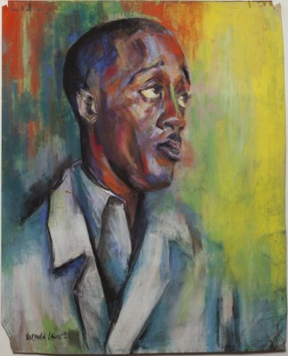
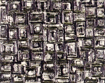
The Jewish Museum show posits that both Krasner and Lewis were outside the artistic mainstream during the period in question, 1945-1952. Neither of them painted the big, bold gestural abstractions or color-field canvases that were grabbing the attention of curators, critics and collectors. Yet like their more celebrated peers, both created all-over abstract compositions using spontaneously generated imagery. They shared an interest in jazz, with its syncopated rhythms and reliance on improvisation, and in linear forms, often interwoven, as in Lewis’ 1947 canvas, “Twilight Sounds” (note its kinship to Tobey’s calligraphic style), and Krasner’s Little Image paintings, like “Black and White Squares, No. 1” 1948. In terms of quality, works like these certainly hold their own with those from the same period by A-listers like Rothko, Adolph Gottlieb, and Ad Reinhardt, who were also working in small to medium-size formats.
So how marginal were Krasner and Lewis? In the past couple of decades, scholars and collectors have taken a broader view of mid-century American abstraction—the scholars recognizing that many excellent painters who were very much part of the movement have been overlooked and undervalued, and the collectors reacting to the inflated prices for paintings by the artists Krasner called the “big boys.” To return to the sports simile, you see a lot more talent if you widen the field.
American Today, Or Was It?
10-9-2014
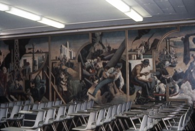
In his autobiography, Thomas Hart Benton (1889-1975) wrote that his purpose was to create a truly American art with “recognizable American meanings.” To that end, in the 1920s he crisscrossed the country, recording his observations in countless sketches of rural and urban life. They are the raw material of his 10-panel mural cycle, “America Today,” painted in 1930-31 for the boardroom of the New School for Social Research in Manhattan. Equitable Life purchased the mural in 1984, and 28 years later the insurance company donated it to the Metropolitan Museum of Art. It has now been installed in a custom-built room, Gallery 746 in the Met’s American Wing, where visitors can judge how well Benton lived up to his principles.
The exhibition, on view through April 15 (after which the mural will reportedly move to another location), includes many of Benton’s related drawings and preliminary studies. A selection of examples from the Met’s collection puts his work in context, from its formal roots in 16th century European Mannerist painting to its kinship with Reginald Marsh and John Steuart Curry, other so-called realists of the period, and its antipathy to the modernism of Stuart Davis and Stanton MacDonald-Wright. Most telling, however, are the photographs by Walker Evans, Dorothea Lange, James Van Der Zee and others chronicling the onset of the Great Depression, which was just taking hold as Benton’s mural was installed.
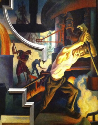
No sooner was “American Today” unveiled than it prompted a storm of disapproval, both on aesthetic grounds and for its subject matter. The art critics disliked Benton’s sinewy, sometimes grotesquely articulated figures, more like caricatures than character studies. His curious use of molding strips to separate areas of disparate imagery was likened to cheap tabloid layouts—a criticism Benton embraced. Objections to his content were centered on the fact that he had focused on the picturesque aspects of America, ignoring the hardship that was a more honest reflection of contemporary life. He depicted the vigor of industry and the bounty of agriculture, not the idle factories and foreclosed farms. The city scenes teem with gyrating dancers, prizefighters and circus performers. In speakeasies, at the movies, even at a revival meeting, everyone seems to be having a fine old time. Only as his mural was being completed did Benton add a reference to the bread lines that were an increasingly evident reality.
Benton dismissed the carping from left-wingers and those he felt were out of touch with grass-roots America, but even some of his supporters questioned the mural’s premise. His art dealer, Alma Reed, considered it dated, reflecting a bygone era of prosperity. The New School’s progressive director, Alvin Johnson, who had commissioned it, complained that Benton pictured “the gigantic inhuman machinery of industrialism with never a pathetic note for the wage slaves operating it.” To be fair, the artist did treat coal mining as a hellish occupation, but the farmers, dockworkers and other manual laborers are going at it with gusto. The strikes by textile workers and farm workers that were then in the news are literally out of the picture.
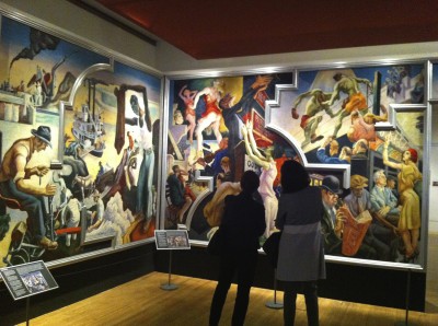
Now, more than 80 years after it was painted, how does “America Today” stack up, both as art and as a reflection of Benton’s aims? The installation recreates the boardroom’s original dimensions and uses sympathetic lighting to bring out the mural’s best features, with a helpful little text panel for each section. Viewers can relate directly to the life-size figures and get a good look at the many intriguing details and clever juxtapositions, like the dancer’s derrière cheek by jowl, so to speak, with the preacher’s head. In the Equitable Building’s lobby the panels were rearranged, hung too high and lighted too brightly, emphasizing the figures’ flaws—the gangly arms, outsize feet and awkward poses that Benton’s detractors scorned. And notwithstanding his claim that he was creating a genuinely American art, his style and technique are European in origin. This country’s true indigenous art is not in the Met’s Gallery 746, but in Gallery 356, Native Art of North America.
Color at the Clark
9-11-2014
If you’re among the folks who jump in the car and head north when the first red leaf appears on the Bay Street maples, you need to know that Williamstown, Massachusetts, will be having an exceptionally colorful fall. After enjoying the annual foliage display in the nearby Berkshire Hills, which peaks in early October, those in search of chromatic delights are advised to visit the Clark Art Institute, where “Raw Color,” a selection of painted sculptures and related spray paintings by David Smith, is on view through October 29.
Together with Alexander Calder, Smith (1906-1965) was a 20th century pioneer of welded metal sculpture. But while Calder routinely painted his mobiles and stabiles in bright primary colors, Smith is best known for steel constructions that are either brush-polished or have their natural metallic finish. Old tools, scrap metal and bits of mechanical detritus often found their way undisguised into his work. If a shape looks like a rusty wrench, it actually is a rusty wrench. Even the shiny cubes and rectangles are obviously welded metal. Such truth to materials was considered a hallmark of mid-century modernism, to the extent that after Smith’s untimely death in an automobile accident, one of his executors, the critic Clement Greenberg, had the paint stripped from several of his pieces.
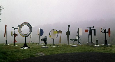
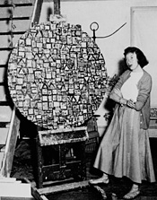
But Smith himself was not such a purist. Originally trained as a painter, he turned to sculpture in 1933, drawing on his early experience as a riveter in a Studebaker plant. As early as 1938, when he had his first solo sculpture show, he was painting some of his metal pieces. After he moved to a farm in Bolton Landing, New York—less than 100 miles from the Clark—he began peppering the property with examples of his work, some polychromed and some plain metal. In the early 1960s he executed a group of flat circular pieces painted in what he described as raw color—institutional green, school bus yellow, and other industrial hues. Known as the Circle series, they were installed in a row on the grounds. Each piece framed the next one in turn, establishing their relationship to one another and contrasting sharply with the natural tones of the surrounding landscape.
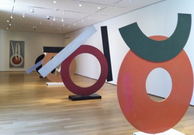
The current installation, in the Clark’s Lunder Center at Stone Hill, aims to recreate that effect, or at least that’s the billing. It is not, however, the result. Four of the Circles are said to be lined up as they were in the Bolton Landing field, but they’re in a clean white gallery inside the building, not out on the lawn interacting with nature. Even Primo Piano III, the one piece that’s outdoors, sits on the building’s pristine patio. I think they all look just fine, but let’s not pretend that, as the curator would have us believe, the installation tells us “how Smith approached the eternal problem of how to deal with nature.” What it does show is that, in addition to his genius for formal invention, Smith had a remarkable gift as a colorist.
If you get to the Clark before October 13, you can also take in another colorful show, “Make it New,” a group of abstract paintings on loan from the National Gallery of Art in Washington, DC. Installed in the brand new Clark Center, the museum’s impressive special exhibition venue, the show spans the years 1950-1975 and features some of the treasures displaced by the renovation of the National Gallery’s east wing. Jackson Pollock’s 1950 masterpiece, Lavender Mist, provides the chronological starting point, as well as the anchor of a mini-survey of Abstract Expressionism, featuring equally impressive canvases by Clyfford Still, Mark Rothko, Joan Mitchell, Barnett Newman and Franz Kline. Moving on to subcategories devoted to shape, color and texture, the show ranges widely while staying within the boundaries of abstraction, mainly domestic but also imported. Even David Smith gets into the act, with Primo Piano II, another painted piece from 1962, in the entrance court. Not as colorful as some of the neighboring canvases, it still looks right at home among the abstract paintings.
Motherwell in East Hampton
8-14-2014
Although Robert Motherwell spent relatively little time living and working in East Hampton, his brief tenure had a major impact on his artistic development, his personal life, and the history of the area’s creative community. That legacy is the subject of “Robert Motherwell: The East Hampton Years, 1944-1952,” on view through October 13 at Guild Hall. Organized by guest curator Phyllis Tuchman, the exhibition brings together choice examples, some of them rarely seen. It spans the period when Motherwell first summered in Amagansett, hanging out with the “artists in exile” who were displaced by the war, through his residency in a custom-built modernist house in Georgica (demolished in 1985), to his last East Hampton summer.
Born in 1915 in Aberdeen, Washington, son of the president of Wells Fargo Bank, Motherwell was educated at Stanford, Harvard and Columbia, and also studied in France. With his father’s financial support, he studied literature, philosophy and art history, as well as studio art. Exempt from military service due to asthma, he was in New York when the European émigrés arrived, and he soon attached himself to the Surrealist contingent. In 1944, when several of them decamped to eastern Long Island for the summer, he followed. He and his wife Maria rented in Amagansett for $35 a month; among their neighbors were John Cage, Stanley William Hayter, Jean Hélion, and Max Ernst. Harold Rosenberg, the influential critic with whom Motherwell edited the journal Possibilities, had already bought a place nearby on Neck Path.
While working on his first solo show, scheduled for that fall, Motherwell met the French architect Pierre Chareau, who would later design the artist’s controversial house and studio. In the meantime, he and Maria moved to East Hampton village for the fall, and when his show opened at Art of This Century in late October it included several paintings and collages made in East Hampton. Unfortunately none of them are in the current exhibition, but it does include “In Beige with Sand,” painted in East Hampton in late 1945, when they rented a cottage near Georgica Pond. Motherwell later said that the palette, with tentative sprinklings of beach sand embedded in the paint, was inspired by “the sand and sea in winter.” He also described the glowing red-orange of his 1947 collage painting, “The Poet,” as akin to “the reddened and angry sky” he observed on a winter’s day on the Long Island coast.
© Estate of Robert Motherwell / Licensed by VAGA, New York, NY.
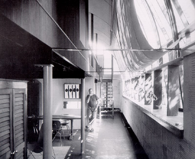
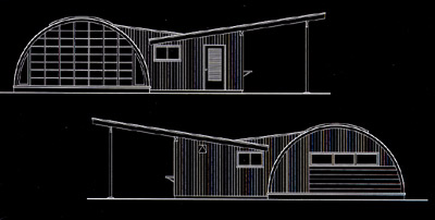
In 1946 Motherwell bought two acres of land in Georgica and commissioned Chareau to design a house and a separate studio, using army surplus Quonset huts. (Oddly, although the studio is discussed, it’s not pictured in either the catalog or the show’s documentary section. See the 1956 drawing below.) Needless to say, the neighbors in their shingled cottages were not amused by the corrugated metal half-tubes, and the artist, who thought the prefab design would be inexpensive, was dismayed by the cost overruns. The new digs also proved to have a negative effect on his already rocky marriage. His wife felt isolated there, and in 1948 they moved back to the city. A painting from that period, “Portrait of Maria,” is a telling psychological study in which her figure is reduced to a decorative dress pattern surmounted by a featureless, diamond-shaped head in a pall of darkness. That winter Maria left him.
This troubled period also saw the emergence of what would become Motherwell’s signature image. To illustrate a poem by Rosenberg, intended for the second (unpublished) issue of Possibilities, he sketched the black verticals and ovoids that established the basis for his Spanish Elegies. In the first painted version, a small work on paper from 1948-49 titled “At Five in the Afternoon,” the ominous forms are recast as a response to Garcia Lorca’s lament on the death of a matador. Such literary associations, both direct and oblique, run through Motherwell’s entire oeuvre. “The Voyage,” for example, takes its title from a Baudelaire poem, and “Ulysses,” 1947-51, and “The Homely Protestant,” 1948, both reference James Joyce.
Motherwell rented out the Georgica house until late 1949, when he returned with Betty Little, who would become his second wife. Sadly, Chareau, who lived on the grounds, died suddenly the following August, and Motherwell felt the loss of his friend so deeply that he never worked in the Quonset hut studio again. He sold the property to Barney Rosset in 1953. But while his time in East Hampton was limited and intermittent, it marked the creation of his first mature works and his early recognition as a pivotal figure in the emerging New York School—the term he coined to define the postwar vanguard.
The Prellwitz Legacy
7-17-2014
When Wendy Prellwitz was a little girl, she spent summers with her family on the North Fork at High House, overlooking Little Peconic Bay, where her great-grandparents, the painters Henry and Edith Prellwitz, had his-and-hers studios. She remembers her enchantment with the many paintings by both artists that were still there, and her fascination with the diaries and photographs that documented the artists’ community of which they were a vital part. Now, seventy years after their deaths, Wendy finds ideas for her own paintings and prints in the same locale that inspired her ancestors. Examples of her recent work are on view through July 28th at the South Street Gallery in Greenport.
Like its South Fork counterpart, the North Fork art colony attracted artists based in New York City because of its ready access by rail, as well as its natural beauty. Edith and Henry began visiting the area in the early 20th century and moved to Peconic in 1913, joining colleagues like Irving Wiles, Edward Bell, and Benjamin and Harriet Fitz, who were already established there, and William Steeple Davis, an Orient native. They lived in High House year-round for over a decade, during which they focused on views of their immediate surroundings—the coastal scenery, sailboats on the bay, the fishing fleet in the harbor—at all times of day, and in all seasons. Their property has stayed in the family, and with Wendy Prellwitz in residence the studio building is once again filled with creative activity.
During her career as an architect, with a practice in Cambridge, Massachusetts, Wendy nurtured her early aptitude for painting and drawing and is now
concentrating on visual art full time. Her childhood attraction to Edith and Henry’s maritime subject matter is reflected in her own imagery, but not literally. She starts from a similar place, but takes the impulse in a different, more personal direction. Instead of simulating natural elements in the impressionist style favored by
her ancestors, Wendy uses visual metaphors to evoke them. The wavy grain of wooden boards—actually rubbings from the steps leading to her Cambridge studio—becomes a stand-in for rippling water and/or cloud-streaked sky, and works equally well as either one. Reflections are achieved by translucent layering, which is especially effective in her monotypes, with their complex multiple overprintings.
A recurring motif is a dock near the Prellwitz property that juts out into the bay. Wendy made one painting of it that’s a fairly straightforward study, but it seems like a way to get the observation out of her system and move into more challenging interpretive territory. In “Departure,” the dock’s planks and pilings are clearly indicated, although schematically, leading the eye across the water toward Jessup Neck and the North Sea coastline. In other paintings, including “Departure #4” and “Coming and Going,” the dock is reduced to a linear outline or chromatic area. The departure and return are optical rather than actual, so the travel from place to place that the titles suggest is accomplished in the viewer’s imagination. The illumination, which could be reflected sunlight or moonlight, depending on your mood, enhances the ambiguity.
In an article in last October’s Fine Art Connoisseur magazine, Wendy Prellwitz considered her relationship to her forebears in terms of their shared enthusiasm for the Peconic environment. She described her fascination with “the reflections, the ever-changing, unknowable light,” and the pleasure of painting outdoors “in every season and in all weathers.” One can imagine her great-grandmother jotting similar observations in her diary nearly a century ago.
“Degenerate Art” Revisited
6-19-2014
At the same time as Futurism—the subject of my column last month—was challenging the academy in Italy, Expressionism was Germany’s answer to hidebound artistic conservatism. The Expressionists used formal distortion and unnatural coloration to go beyond surface appearance to expose the inner truth of a subject, as they saw it. Forward-looking private collectors and museum curators embraced this bold new approach, and works by members of Die Brücke in Dresden, Der Blaue Reiter in Munich, and the Berlin Secession entered prestigious collections all over Germany. Even the National Socialists, who came to power in 1933, were favorably disposed at first.
But Europe’s avant-garde was imperiled by the rise of totalitarian regimes. In Italy, as we have seen, Futurism was tolerated, if not supported, by Mussolini’s Fascist dictatorship, but it was a different story in Hitler’s Germany. The Nazi response to modernism was to ban it, burn it, and ridicule it in a series of exhibitions that labeled the artists as decadent or insane. Many of them were persecuted or driven into exile. That shameful episode in the devastating history of Nazi atrocities is the subject of “Degenerate Art: The Attack on Modern Art in Nazi Germany, 1937,” on view through September 1 at the Neue Galerie in Manhattan. Its overlap with the Futurism show at the nearby Guggenheim is a fortunate coincidence.
Smaller and more focused that the 1991 show on this subject in Los Angeles, the Neue Galerie’s overview is a fascinating and chilling glimpse of the systematic campaign to rid German art of corrupting influences. The purge extended to film, theater and literature as well—pictures of book-burnings are standard fare in documentaries about the Nazis—but paintings and sculptures were especially vulnerable. Confiscated from museums, they were crammed into makeshift galleries in Munich’s Hofgarten and presented as a “chamber of horrors.” The current show includes a selection of the survivors from the 1937 display, which featured more than 700 of the estimated 20,000 pieces that ultimately were seized.
“Entartete Kunst,” as the show was billed, opened a day after Hitler’s spanking new German House of the Arts—the first example of Nazi architecture—premiered with a lavish display of officially sanctioned art. One of the Neue Galerie’s rooms contains works from both shows. An especially apt juxtaposition is Max Beckmann’s haunting allegorical triptych, “The Departure,” on loan from MoMA, side by side with Adolph Ziegler’s triptych, “The Four Elements,” a saccharine celebration of ideal German womanhood in pseudo-classical guise. The contrast between the retarditaire Nazi paradigm and the powerful emotional impact of Beckmann’s images is striking. And don’t miss the room on the second floor where the empty frames of lost or destroyed paintings surround the original ledger that documents, on neatly typed pages, the items that were sold off to enrich the Nazi war machine.
Although only six of the 112 artists in the “Entartete Kunst” show were Jewish, all the work was denounced as reflecting a “perverse Jewish spirit,” an ominous warning that modernists would be subject to the same fate as their Jewish colleagues. They lost their jobs, were hounded by the authorities, and many simply left town. Paul Klee, an early casualty, had already moved to Switzerland in 1933. Oskar Kokoschka fled to Prague the following year. Beckmann left for Amsterdam the day after the Munich show opened. Ernst Ludwig Kirchner, a founder of Die Brücke, killed himself in 1938. Even Nazi Party membership was no protection. Emil Nolde, whose work had earlier been praised by Hitler’s propaganda minister Joseph Goebbels, was a party member and strong supporter of the regime, yet more of his works were confiscated than those of any other artist, and after 1941 he was actually forbidden to paint.
And what did he and his fellow modernists paint, model and carve that made the Nazis so hostile? The current sampling ranges from what now look like innocuous landscapes and still lifes to grotesquely distorted figures that still challenge our sensibilities. To the Nazis, however, they were dangerous alternatives to the weird amalgam of Aryan-Greco-Roman-Germanic aesthetics that represented their concepts of classic beauty and racial purity. Ironically, Hitler’s “Great Exhibition of German Art,” promoting those ideals, was far less popular than “Degenerate Art,” which attracted two million visitors to its Munich venue alone. Like the Hofgarten in 1937, the Neue Galerie has a line waiting to get in, this time not to mock the art but to admire it.
Back to Futurism
5-22-2014
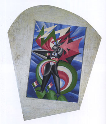
“We will glorify war—the world’s only hygiene—militarism, patriotism, the destructive gesture of freedom-bringers, beautiful ideas worth dying for, and scorn for woman. We will destroy the museums, libraries, academies of every kind, will fight moralism, feminism, every opportunistic or utilitarian cowardice.”
With those words, published in Le Figaro in 1909, Filippo Tommaso Marinetti announced the birth of Futurism, a literary movement that soon embraced all the arts in its fervid grip. Reading a translation of its founding manifesto on the wall of the Guggenheim Museum—where “Italian Futurism 1909-1944: Reconstructing the Universe,” is on view through September 1—you might dismiss the Futurists as a bunch of pompous misogynistic cranks. To be sure, the movement has long been marginalized as politically naïve and aesthetically weak. This exhibition, the first comprehensive survey ever mounted in the US, asks us to take a longer and more nuanced look at how the Futurists envisioned a civilization remade according to their principles.
Like last year’s brilliant Gutai exhibition at the Guggenheim, the current show delves into all aspects of its subject, from its revolutionary pronouncements and free-form poetry to painting, sculpture, photography, performance, urban planning, and design of utilitarian objects. It traces Futurism’s inception, in response to what the avant-garde perceived as an ossified, retrograde culture, through its various phases to its demise with the death of Marinetti. However misguided the Futurist worldview proved to be, this show finally gives the movement the full treatment it deserves. Far from glossing over its unsavory aspects, it presents them in the context of the political, social and artistic upheavals that shaped the first half of the 20th century.
The contradictions are evident from day one. The Futurists worshiped speed, especially mechanized speed, which symbolized modernity, but failed to express it effectively in their art. The first gallery highlights Umberto Boccioni’s sculpture, which aims to capture dynamic movement in a static medium and predictably misses the mark. Painters also tried unsuccessfully to depict motion optically without actual animation. In works by Boccioni, Giacomo Balla, Carlo Carrà, Gino Severini and others, racing cyclists, galloping horses, speeding cars and trains, a violinist sawing away at his instrument, all come to a screeching halt on canvas. Why didn’t the artists use cinema, a new, mechanical medium that actually could capture movement, and lacked the imprimatur of the despised museums? Instead, they chose the traditional media long enshrined in the very institutions they attacked.
With the advent of World War I, the Futurists’ dream of armed conflict as a tool of cultural renewal became instead the grim reality of destruction, misery, and death, which claimed three of them. In the aftermath, Marinetti formed a tenuous alliance with Benito Mussolini’s Fascist party, which came to power in 1922. Although he had formally renounced their association, Marinetti had a change of heart; he and his associates praised Il Duce and courted his favor. The most blatantly pandering example is Alessandro Bruschetti’s “Fascist Synthesis,” a 1935 triptych that glorifies Mussolini’s dictatorship. Under his rule Futurism was tolerated but never adopted as the official art that its promoters envisioned. This association has long tainted the appreciation of the movement’s interwar phase, to the extent that few works from that time have ever been seen in this country, until now.
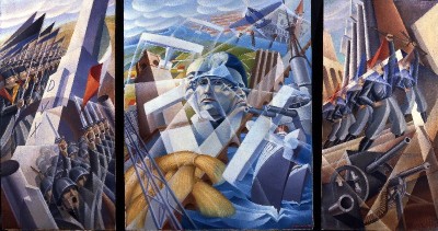
Another paradox is Futurism’s bias against women. Notwithstanding the virile posturing of its 1909 manifesto, it attracted several female members, notably Benedetta Cappa, who became Marinetti’s wife. Ironically, given the earnestness with which the macho Futurists pursued the macho Mussolini, the most important commission they ever got from his regime went to Benedetta, as she was known professionally. Her impressive 1933-34 murals for the Palermo post office’s conference room, painstakingly removed from the building and installed in their own gallery at the top of the Guggenheim’s ramp, treat various aspects of communication by airplane (a favorite Futurist subject), ship, rail, telegraph, telephone and radio. Unlike some of the more pretentious efforts of her male colleagues, they succeed in celebrating modern technology symbolically, instead of trying in vain to simulate its effects.
Ray Johnson’s Guessing Games
4-24-2014
When Ray Johnson drowned in Sag Harbor Cove on the night of January 13, 1995, he committed the ultimate act of performance art. His suicide at the age of 67—while in good health, and financially solvent—remains unexplained. One thing is certain: that’s how he wanted it. After all, in both his art and his life, Ray invited speculation, so is it any wonder that he keeps us guessing posthumously?
The game continues at Baruch College’s Sidney Mishkin Gallery on East 22nd Street in Manhattan, where a selection of Ray’s collages is on view through May 7. Spanning four decades, the show illustrates his signature use of free association and word play, combined with an eccentric graphic style, to create fascinating, mystifying, amusing, and sometimes disturbing imagery. That many of them are also quite beautiful is, I think, often overlooked in the effort to decipher their meaning. The quirkiness and deliberate cartoon-like quality of his drawings masks an aesthetic refinement that is most apparent from a distance. Once you get drawn in and start trying to decode them, you can get lost in the woods of Ray’s omnivorous imagination.
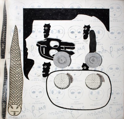
That said, it’s hard to make a wrong turn. Like the Dada and Symbolist poets he admired, Ray leads you in multiple directions at once, all of them fruitful. Although some of the references are very personal, especially when a piece is inscribed or dedicated to one of his friends, the visual puns may still carry beyond the in-joke level. To help the perplexed viewer, a few of the examples on view come with explanations, which are only somewhat useful. For instance, in the wall label that accompanies “Untitled (Golf Balls with Brick Snake),” with which Ray reportedly tinkered over a 15-year period, we are told that the repeated face is that of Betty Boop, a cartoon character he often referenced. But the faces bear the name Abby Friedman, the wife of the writer B.H. Friedman, and she isn’t mentioned in the gallery’s text. So why does Abby get Betty’s face? Perhaps because the two B’s in her name match the two B’s in Betty Boop. That’s how Ray’s mind worked.
A goggle-eyed bunny head, Ray’s iconic image and surrogate, casts a baleful glance at the pair of golf balls, which sport eyelashes that echo Betty/Abby’s, drawing the analogy between golf balls and eyeballs. The snake, another frequently repeated motif, makes three appearances. Two are inscribed with Ray’s name, and the brick one—now there’s a contradictory idea—is named Jim Rosenquist. A quartet of silhouette masks, identified as Edward Albee, flank the bunny head. As a professional name-dropper Ray had no equal, and the fact that his own signature appears several
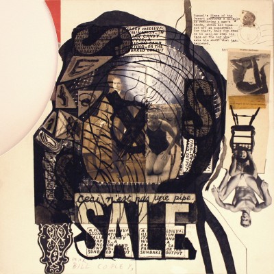
times in reverse tells you that he’s the one behind this elaborate casting call. Other examples, like “SALE,” are even more complex, with references to René Magritte, Luis Buñuel, Geraldine Chaplin doing a backbend, soft-core gay porn and numerous other unrelated elements, jumbled together inside and around a silhouette profile of the artist William Condon’s head, as if his thoughts—are they dirty? That’s what “sale” means in French—had suddenly become visible.
Writing about Ray’s art is difficult, because each image has multiple meanings. What I see may not be what you see. It’s all about connections, one thing leading to another, and if you let your eyes and your mind wander freely you can make your own links. Ray actively promoted this through his New York Correspondence School, in which drawings and collages were exchanged, altered, and forwarded by mail. It was a sendup of the New York School of abstract painters who dominated the art world when he first came to the city in 1949, fresh from Black Mountain College. Rather than working alone in the studio, Ray collaborated with his correspondents. Instead of meeting in person at The Club, he connected vicariously through the US Postal Service. When Happenings were all the rage, he staged Nothings. There wasn’t a trend he didn’t love to buck. Even his reclusiveness was contradictory, since he kept in constant touch with a wide circle of friends, admirers, and fellow artists via telephone and letter. If he had lived, not doubt we’d now be inundated by his emails, and his Facebook page would be off the charts.
Mural Gets a Makeover
3-27-2014
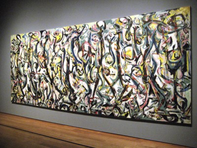
You might think that we already know all there is to know about Jackson Pollock’s life and work, but you’d be wrong. For example, before Pollock’s 1943 mural arrived at Getty Conservation Institute in Los Angeles, it had acquired a coating of varnish, as well as a heavy overlay of myth, both of which made it difficult to see the painting properly. Now, after more than 18 months of analysis and treatment, it has emerged from under its literal and figurative shrouds.
Anyone who doubts Pollock’s compositional and technical skills should study this canvas—at 8 x 20 feet, the largest he ever painted—on view at the Getty Center through June 1, after which it will travel. A tour de force of vibrant brushwork (this was before his signature pouring technique was fully developed), dynamic abstract rhythms and vivid colors, it signals his breakthrough after years of struggling to find his own direction. Like his hero, the Mexican muralist José Clemente Orozco, and his teacher, Thomas Hart Benton, Pollock wanted to paint big, bold pictures that could fill a room with energy. Thanks to his patron, Peggy Guggenheim, who commissioned the mural for the entrance hall of her Manhattan duplex, he was able to realize his ambition.
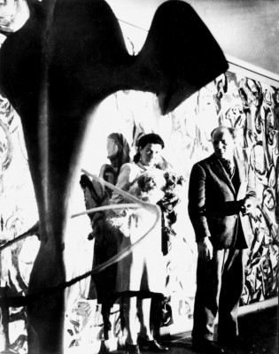
Photograph by George Carger
Pollock was unknown in 1943, and Peggy took a big risk in promoting him. His drinking problem and emotional fragility were red flags, but a talent that MoMA’s curator, James Johnson Sweeney, described as “volcanic” was also obvious. In addition to the mural commission, Peggy signed him up for solo shows at her avant-garde gallery, Art of This Century, and gave him financial support. She bet on his potential, and was rewarded with the credit for launching his career, as well as a superb collection of his paintings. When she moved to Italy after World War II she gave several of them to museums around the country, from Rhode Island to Seattle, and took the rest with her.
But the mural—which was made to be portable, since she was only renting the town house—was too big for her Venetian villa, and finding a home for it proved to be a challenge. There were no takers among the New York museums. Fortunately for the University of Iowa, the head of the art department learned that it was available and got it for the school. For years it hung in the art studio, but when the UI Museum of Art opened in 1969 it became the new building’s centerpiece.
Meanwhile the legend surrounding the mural grew and flourished. The story goes that after procrastinating for months, Pollock painted it in one furious burst of pent-up creative energy. He missed the deadline, so it wasn’t delivered until January 1944, two months after it was due. It was too big for the hallway, so Marcel Duchamp cut eight inches off one end. Turns out none of this is true. Doubts began to arise when the painting was shown at MoMA in Pollock’s 1998 retrospective, and it got its first major examination by conservators. There’s no evidence that it was cut down, and it certainly wasn’t painted in a single night.
Photograph by Roy Nicholson
The Conservation Institute’s painstaking analysis, discussed and illustrated on the Getty Center Web site, confirms that each layer of oil paint had to dry before the next one was applied, a process that takes days, if not weeks. Plus the finished painting needed drying time before it was unstretched and rolled, the only way to get it out Pollock’s studio door and into Peggy’s hallway. And a recently discovered letter from Peggy says it was in place by early November 1943, right on schedule. So much for the image of an irresponsible, impulsive artist splashing it out in a panic.
Looking at it now, without the 1973 varnish that dulled and flattened its surface, and cleverly re-stretched to disguise a slight sag caused by years on an inadequate support, it’s obvious that the mural is a thoughtfully conceived, methodically executed masterpiece. In addition to restoring its aesthetic glory, the Getty has done it a great service by unpacking its phony baggage.
Fred McDarrah’s Hungry Eye
2-27-2014
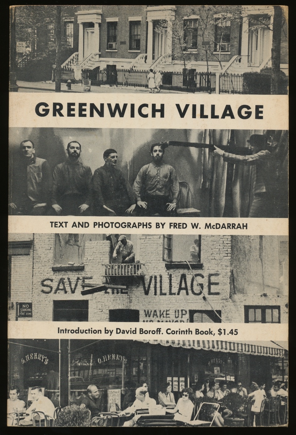 “I was a groupie at heart,” Fred W. McDarrah confessed, “and my camera was my ticket of admission.” It was also his meal ticket. As The Village Voice’s picture editor, and for a long time the only staff photographer, Fred (who died in 2007 at 81) made his living documenting the downtown scene for more than four decades. The result is a huge body of work, estimated at some 35,000 images, from which a sampling is on view through March 8 at the Steven Kasher Gallery in Chelsea. While it’s a small percentage of Fred’s total output, there are over 100 photos, many of which will be familiar to readers of his books on Greenwich Village, the art world, the gay pride movement, and the Beat Generation. In fact the exhibition’s title, “Save the Village,” is drawn from a cover photo on his 1963 paperback, Greenwich Village, showing the demolition of the sculptor Arnold Bergier’s studio, which had those words painted on its façade. Fifty-four years ago, when that building was torn down, the locals were already mourning the imminent demise of their historic neighborhoods, cheap lofts and far-out life styles.
Fred, a Brooklyn boy, migrated to Manhattan after his Army service and studied journalism on the GI Bill at NYU, when Washington Square was, in his words, “the focus of intellectual and cultural activity.” After graduating in 1954, he snagged a job as an ad salesman for the fledgling Voice, and soon became its photographer-in-residence. Starting with the beatniks, he chronicled the evolution of New York’s bohemia, as well as its surrounding milieu. He hit the street just as the counterculture was warming up the Cold War climate, and the alternative press was providing a forum for innovations in art, theater, music, writing and film. For those of us who came of age in the city during those years, Fred’s images are like the pictures in a family album. For those who weren’t there (or were and can’t remember), they conjure a time when, quoting Fred again, “painting, poetry, avant-garde performances and Off-Broadway theater were in full swing—everybody was creating something.”
The statements I’m quoting were written for an exhibition of Fred’s Greenwich Village photographs at the Pollock-Krasner House in 1990. It was the first show I organized there. When Fred wasn’t prowling the downtown byways, he and his wife Gloria retreated to a cottage on Three Mile Harbor Road, so they were the museum’s not-too-distant neighbors. That was my excuse to prevail on him to share some of his favorite pictures. He was a pleasure to work with, patiently sorting and selecting material and carefully identifying the characters—some famous or notorious, others now obscure—captured in his iconic images. Several of them, and many more, populate the current exhibition. Their habitat ranges from the Cedar Bar, the Club, the Living Theater, the White Horse Tavern and Café Wha? to Judson Church, the Factory and the Stonewall Inn, as well as the anti-war rallies, be-ins, Happenings and demonstrations that mark the Village as a legendary locus of political, social and artistic ferment.
Courtesy Steven Kasher Gallery, New York
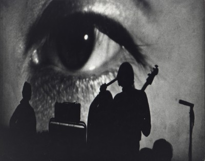
Fred never claimed that he was making art, but it can’t be denied that some of his images rise above reportage. Jack Kerouac’s impassioned reading from “On the Road,” gesturing as if to embrace the whole audience, illuminates a dingy loft more brightly than the glaring light bulb overhead. A performance by the Velvet Underground casts the band as stark silhouettes against a projection of the singer Nico’s eye—an appropriately surreal backdrop for their visionary music. And a shot of a gay power rally, in which a banner obscures the marchers’ faces, turns their singular embraces into universal gestures. There are also outstanding portraits of individuals, among them a gleeful Yayoi Kusama flashing her trademark dots; a trenchcoated Robert Rauschenberg lurking in an alley; Andy Warhol photographing Fred, as if each inveterate shutterbug were winking at the other; a grizzled Robert Moses, whose plan for a lower Manhattan expressway prompted bitter and ultimately successful opposition by Village denizens; Allen Ginsberg in an Uncle Sam hat, patriotically protesting the Vietnam War; and Bob Dylan earnestly saluting the camera. No doubt about it, Fred was in the right places at the right times, even as the times they were a-changin’.
HAH x 2
1-30-2014
Ever since enterprising wreckers began luring merchant vessels onto the treacherous reefs around Key West, the so-called Conch Republic has been a magnet for creative thinkers. The island is best known for its colorful literary characters, from Ernest Hemingway, Elizabeth Bishop and Tennessee Williams back in the day to contemporaries like Judy Blume, Alison Lurie and Joe Pintauro. It’s less renowned for its visual artists, although they’ve been drawn to its tropical climate and welcoming hospitality since 1832, when John James Audubon stopped at the Geiger house on Whitehead Street and fleshed out his “Birds of America” portfolio with novel specimens he spotted in the Geigers’ garden.
Today there’s a lively art scene and several commercial galleries, including Key West’s own Guild Hall, a co-op on the main drag, Duval Street. The former Custom House on Front Street is now a museum that shows both contemporary and historical art. At The Studios of Key West, in the old armory building, there’s a full program of residencies, classes, lectures, exhibitions and performances. Sculpture Key West, which began in 1995 as an informal outdoor exhibition for local artists in Fort Zachary Taylor State Park, has become an annual public art showcase that attracts entrants from around the country and even overseas.
Among the outstanding resident artists is Helen A. Harrison. No, I’m not boasting, because although I’ve been spending time in the Conch Republic for more than 20 years, it’s not me I’m talking about.
My husband and I have returned several times since our first visit in 1989, when we stayed at a charming Victorian guesthouse, The Palms, on White Street. Almost directly across the way, in a modest storefront at the corner of Olivia, I spotted the Harrison Gallery. Peeking through its big picture window, I saw some things that made me want to take a closer look. It turned out to be one of the best showcases for contemporary art in a town that’s burdened with more than its share of schlock houses and tourist traps. A bell tinkled as I opened the door, and a slim, attractive woman came out of the back room. I asked if she was the eponymous owner, and she said she was. I said, I’m a Harrison too, Helen Harrison. “So am I,” she said, “Helen A. Harrison.” Well, I’ll be jiggered. “And so am I,” I told her.
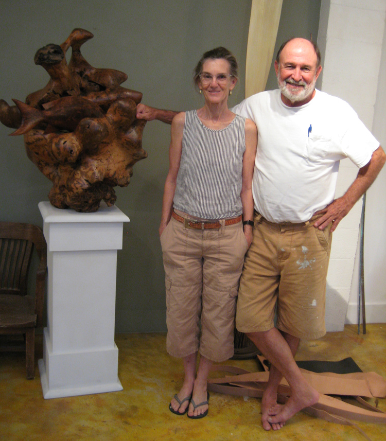
Piling one coincidence on another, the other HAH is a sculptor, which is what I was before going into museum work. In addition to carving wood, she uses natural materials like Cohuna Palm fronds and Royal Poinciana seed pods that she manipulates in ways that both enhance and disguise their botanical character. She might build up contours with metal mesh or fiberglas, cover the surfaces with glossy enamel paint and gold leaf, and add geometric stone or wood elements as counterpoints to the organic undulations. She respects the inherent quality of the material, but isn’t intimidated by it, and often pushes it beyond its apparent limits. Her shoe-shaped carvings turn functional forms into works of art, while her vessels and furniture are as useful as they are sculptural.
Helen and her husband Ben, a musician and author, arrived in Key West in the mid 1980s. After nearly a decade of living aboard their 38-foot sailboat, La Dulce Mujer, they dockedat the old Navy pier and decided it was time to become landlubbers again. This was not simply a practical matter—two kids and a sculpture studio were more than the boat could hold—but an emotional transition as well, because they had built La Dulce Mujer with their own hands.
“Sailing Down the Mountain,”Ben’s account of their sojourn in the Costa Rican highlands, where the boat took shape over three and a half years, is about to be published, and it promises to be both an excellent adventure and a cautionary tale. In a short version that appeared in Boatbuilder magazine ten years ago, Ben admitted that the project, “when looked on objectively, lacked any element of common sense.” But they did it anyway. As much as Helen and I have in common, that’s more than I would have been willing to take on, even in my most daring days. So when I tell you that Helen A. Harrison is an artist, a creative thinker and a risk-taker, I’m not tooting my own horn.