A Bellows Bonanza at the Met
12-13-2012
George Wesley Bellows (1882-1925) was one of the most acclaimed American artists of his generation, yet there has not been a major retrospective of his work since 1966. Happily that situation has been remedied by the National Gallery of Art, which organized the outstanding show on view through February 18 at the Metropolitan Museum of Art, New York, where Bellows was known to haunt the galleries during his student days and where his memorial show was held in 1925. For the first time in decades we can see the full range of Bellows’ stellar career, which was cut short by his premature death from peritonitis when he was 42.
Renowned as a painter of urban life, especially the gritty tenements, teeming streets and seedy prize-fighting clubs of New York City, the Columbus, Ohio native had Eastern Long Island roots. His father’s people came from Good Ground (Hampton Bays), and a relative, Daniel Bellows, owned a cooperage on Long Wharf in Sag Harbor in the 1840s. His mother was the daughter and granddaughter of Sag Harbor whaling captains, and the family often summered at Captain Davis’ house on Amity Street, where young George’s Aunt Fannie encouraged his artistic endeavors. Her faith was well placed.
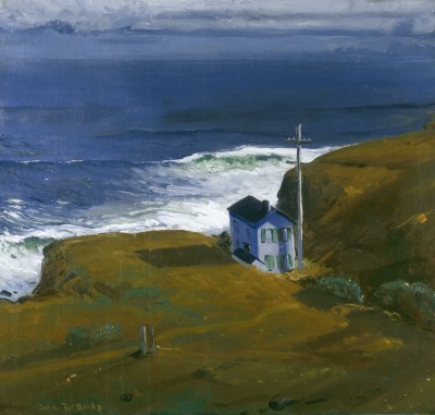
In 1910 Bellows and his bride honeymooned in Montauk, where he sketched the lonely dwelling on the bluff in “Shore House.” The canvas was painted the following year, when he became one of the youngest artists in the Met’s collection. He was only 29 when the museum acquired his 1908 oil, “Up the Hudson,” which unaccountably is not in the exhibition. The show does include several other views of the Hudson River and Palisades, as well as scenes of strollers in Central Park and a fascinating series documenting the construction of Penn Station. Also on display are the famous oils and drawings of urchins swimming in the East River, brawling on the Lower East Side and generally living up to the popular image of urban riffraff. But while Bellows’ character studies sometimes cloy into stereotypes they are always vibrant, and handled with the skilful draftsmanship and painterly panache that earned him early election to the National Academy—at age 27, the youngest associate in its history.
Bellows was adept at traditional portraiture and landscape painting, but he is most celebrated as a member of the so-called Ashcan School—whose subjects were dismissed as vulgar, even borderline immoral, by genteel critics—yet somehow he managed to move with ease in respectable social circles. He contributed Daumier-like drawings to the socialist magazine The Masses, and produced a gruesome series of prints (in the spirit of Goya) based on accounts of German atrocities during World War I, while painting tender portraits of his wife and daughters in their comfortably bourgeois surroundings. He was on the planning committee for the 1913 Armory Show, a modernist extravaganza that challenged everything the Academy held dear, at the same time producing Winslow Homer-inspired studies of the rugged Maine coast. In short, Bellows was a walking contradiction, and apparently he knew it. He thought an artist should “Be deliberate. Be spontaneous. Be thoughtful and painstaking. Be abandoned and impulsive.”
For many Bellows fans, the paintings of boxers are his signature works, and three of them are here: “Club Night,” “Stag at Sharkey’s,” and “Dempsey and Firpo,” his last major oil, as well as related works on paper. But where is the National Gallery’s “Both Members of This Club,” a masterpiece of what might be termed realist action painting? Its slashing brushwork is perfectly suited to the scene of brutal combat between a white fighter and an African American. Why the National Gallery didn’t send it to New York is as curious at the Met’s failure to show “Up the Hudson.” [NOTE: the Met tells me that Chester Dale, the donor of “Both Members of This Club,” gave the painting to the National Gallery with the stipulation that it never be loaned. No explanation about “Up the Hudson.”] In any case, it’s interesting to compare the dynamism of the early prize-fighting scenes to “Dempsey and Firpo,” with its rather wooden treatment of the boxers’ figures. There’s actually a film of this legendary fight on YouTube, where you can watch Luis Firpo, known as the “Bull of the Pampas,” send Jack Dempsey through the ropes in Round 1. (Dempsey climbed back into the ring and won the bout.) Bellows was there at ringside, and he worked a self-portrait into the painting. Maybe a sharp-eyed viewer can spot him in the film.
At the Parrish, The Real Thing

11-15-2012
When you visit the new Parrish Art Museum in Water Mill, where selections from the permanent collection are (finally!) on display, you can be sure that the paintings signed “Wm. M. Chase” really are by William Merritt Chase. They were checked six ways from Sunday by Ronald G. Pisano, the museum’s former director and Chase curator. Until his untimely death in 2000, Ron studied Chase for nearly 30 years. He was both a connoisseur with an eye for quality and a scholar whose meticulous research is apparent in his posthumously published Chase catalogue raisonné, which records all the artist’s known works.
Ron’s task of separating the bona fide from the bogus was made harder by the fact that some contenders were painted by Chase’s students, who were trying to imitate him and often succeeded. And he had hundreds of students. At some point down the road, an unscrupulous owner or dealer would occasionally remove a student’s signature and replace it with Chase’s, or add his name to an unsigned painting. So the style would be right, the age of the canvas and paints correct, but the master himself never touched the picture.
Authentication issues have been much in the news lately, making us more aware than ever that as market values rise, so does the number of fakes. The problem is complicated when, as with Chase, a popular artist is widely copied during his or her lifetime. It became such a problem for Thomas Moran, whose Yellowstone paintings were much in demand, that late in life he took to adding a thumbprint to his signature. (Guild Hall owns a fine 1917 example.) Many artists keep inventories, but they may be incomplete or ambiguous, and dealers’ records can be frustratingly vague as well. It sometimes takes years of painstaking sleuthing to come up with authoritative documentation of an artist’s complete output, and there are always a few things that get missed. Fakers just love to fill in those gaps.

Sometimes it’s true that the owners simply aren’t aware of what they have or how valuable it is. Take the case of the Wisconsin couple who thought their van Gogh flower painting (at left) was a reproduction, but it turned out to be an original. Or the guy on a recent episode of Antiques Road Show who learned that a painting he’d bought for $2.50 at a farm auction is worth upwards of $75,000. It’s still possible to score big at a yard sale or flea market, and lost works do occasionally emerge from the shadows.
The widely publicized case of Knoedler Gallery’s cache of discredited paintings by some of the biggest names in 20th century American art—including Pollock, Motherwell, de Kooning and Rothko—illustrates how previously unrecorded works can acquire an elaborate explanation of why they were missing for so long. The story went that a collector had bought them from a gallery employee behind the dealer’s back, and they were squirreled away until his heirs discovered them after his death. Suspended disbelief and wishful thinking, coupled with the blinding prospect of lots of cash, resulted in sales that were disputed when the paintings’ authenticity was questioned. The venerable Knoedler & Co., in business since 1852, was crushed under the weight of lawsuits and settlements, compounded by devastating press.
One reason the whole sorry business got as far as it did is the reluctance of experts to authenticate discoveries and to speak out about questionable works of art. Threatened with legal action if the owners don’t like their opinions, many of them just keep quiet. So it’s hard to get a credible judgment about a probable piece, much less a clear dismissal of a fake, even one that’s obvious to an expert. Nowadays it’s often left to scientific analysis to prove that the canvas is wrong, the paint is too new, and other so-called objective tests. Ironically, a recognized authority like Ron Pisano can spend a lifetime developing expertise that may land him in court when he uses it. Like the genuine paintings that can’t be acknowledged for fear of reprisal, connoisseurship like Ron’s is becoming a lost art.
Mike Solomon Makes His Mark
10-18-2012
Mike Solomon’s art is, in his words, “rooted in materials and what they can do.” This means not only the physical properties and capabilities of his media, but how they can function to express his concepts in tangible form. Over the past six years, his two- and three-dimensional work—featured in a solo show that opens today at Salomon Contemporary in Chelsea—has explored the potential of wax, watercolor and resin as vehicles for a deeper understanding of the phenomena that fascinate him.

His longstanding devotion to watercolor, which he uses to record his observations of the ocean, with its rhythmic tides and translucent reflective surface, has evolved into an independent entity—a material in its own right, rather than a mimetic device. The ocean also inspired his series of wave-shaped fiberglass sculptures, which echo the flowing curves of surf without literally imitating them. It isn’t the wave per se, but the arching form that folds in on itself, the translucence of a curtain of water, and the dynamic forces that give the wave its structure, that Mike translates into art.
The shapes are made on armatures overlaid with netting that serves to measure and define those forces. Pulled this way and that, the netting’s grid pattern illustrates the wave’s twist and torque without losing its own fundamental character; Mike describes it as “a way of visualizing that energy.” It also illustrates how, in art as in nature, large complex structures are made of small building blocks. In fact the finished sculptures are pieces of larger shapes that the artist has edited, implying that they could continue to evolve the way a wave rolls along the shore.

This kind of conceptual momentum—animating art that is inherently static—is also fundamental to Mike’s watercolor and resin works. Exploring chromatic relationships through layering, he applies watercolor in horizontal and vertical strokes to mulberry paper (one translucent material on another) and saturates the paper with resin, which makes it nearly transparent. Then another sheet with another color is added, and the process is repeated until a sandwich of multiple layers is created. It’s an additive method, in which each new color interacts with those underneath, subtly changing its character without masking it.
The remarkable vibrancy and spatial ambiguity of Mike’s layered watercolors are functions of the media he has chosen. But those media are only tools. He uses them not for their own sake, but for the effects they allow him to achieve. They create optical blending while keeping the pigments separate, and the process itself enables him to be both spontaneous and deliberate as he develops his compositions. As the colors aggregate, the inherent grid structure becomes more apparent. The luminosity of the resin-saturated paper further emphasizes the color shifts that occur when brushstrokes overlap. “I’m not hiding what I did before,” Mike explains, “but I have a chance to make a new decision with each layer.”
These recent works are rooted in Mike’s earlier muslin paintings, with their interactive surfaces that simultaneously mask and expose what lies beneath. Like the resin watercolors, they combine two seemingly disparate techniques. “Putting the opposites together was what was so interesting to me,” he says. The underlying canvas is unstructured and free-flowing, painted wet on wet with poured pigment, while the muslin overlay is a grid-based wax drawing enlarged from a small study. Wax makes the drawing translucent, so the random color underneath peeks through the surface, and the regular pattern gives coherence to the composition.
Whatever the medium, all of Mike’s work invites contemplation and reflection. Some of it is literally reflective—light bounces off shiny resin and shimmering wax—and colors are activated by illumination that penetrates shallow but perceptible space. But these physical properties alone don’t account for its fascination. It is that extra, intangible element, going beyond the material’s sensuous appeal—what Mike calls “taking it to the next level”—that sets it apart. His art embodies fundamental qualities that he perceives in nature, for which he creates aesthetic analogies. Without imitating those qualities he captures their essence, pins it down and offers it as a gift to those who take the time to receive it.
Space Lessons at the Lyceum
10-04-2012

“Shaping Space,” a selection of Hans Van de Bovenkamp’s bronze and steel sculptures, is on view through October 20 at the Lyceum Gallery at Suffolk County Community College’s Eastern campus in Riverhead, newly relocated to the Montaukett Learning Resource Center. Although the pieces are made of metal, Hans calls them menhirs—the Breton word for standing stones—linking them conceptually to ancient megaliths like Stonehenge. The original purpose of those monuments is lost to history, but whatever their ritual or commemorative function, they are made of natural rock rooted in the earth. Much of their power and mystery derives from that relationship.
Anyone who has seen Hans’s steel sculptures peppered along Montauk Highway in Bridgehampton or visited his Sagaponack Sculpture Farm, where many of his large-scale pieces are installed on the grounds, will appreciate their kinship with their prehistoric forbears. Like the ancient menhirs, they frame and define the spaces around them. Yet there is a fundamental difference. As Hans interprets them, the menhirs are not earthbound. They seem to defy gravity and contradict the character of their material. Heavy metal is made to appear light, ponderous shapes cavort playfully, and what looks solid is mostly hollow.

One typical example occupies the lawn in front of the Montaukett building. “Siv’s Tiara,” a nine-foot piece in brushed stainless steel, is dedicated to Hans’s late wife, the poet and artist Siv Cedering who died in 2007. A gracefully curving stalk supports a slightly lopsided crown of eccentric letter-like shapes. From the ground it’s hard to tell, but I suspect they are melted versions of L-O-V-E. On the day I visited, brilliant sunshine animated the surface with flashing reflections, enhancing the effect of a jeweled corona. Although it’s consistent with Hans’s other steel monoliths, its memorial association sets it apart as a deeply personal statement. Inside the Lyceum Gallery, “Letter to my Mother,” is a more intimate tribute with a similar aim. It also uses calligraphic references to suggest communication with a loved one, preserving the heartfelt message in durable bronze.
The room’s centerpiece is “Oracle,” an eight-foot bronze roughly elliptical in shape, like the earth’s navel (omphalos) of ancient Greece. It’s composed of boxy elements, loosely analogous to the grid on the Delphic omphalos, that appear to jostle for position, as if trying to cohere into a proper ellipse. The tension that holds them in place symbolizes the oracle’s dynamic energy. But the slightly off-kilter balance suggests that the whole thing might just as easily fly apart as stick together. Whereas prehistoric menhirs appear inert, Hans’s modern interpretations seem to have been arrested in the act of morphing into something else.

The gallery also contains several small-scale pieces, some of which Hans has made in much larger versions. The tabletop size “Sagg Portal #10 Landscape,” for example, includes a bronze miniature of an 11-foot tall steel structure at Grounds for Sculpture in New Jersey. It also proposes an environment that complements the portal or gateway, a landscaped setting in which the terrain and plantings are sculptural elements in their own right. It recalls Isamu Noguchi’s playground designs, with their combination of whimsical forms and interactive spaces, but in a more contemplative mood. By shaping not only the spatial presence of the sculpture itself but also that of the surrounding area, the artist seeks to create a unified experience.
Unfortunately the artist had no control over the space in the gallery. Its tall windows admit plenty of natural light, but that’s the most appealing feature of a room that is not well adapted as an exhibition space. In addition to intrusive furniture, it contains an ugly snack bar, inviting visitors to treat it as a lounge in which art is the décor rather than the raison d’être. A lyceum is a place of learning, and there’s a lesson here: art deserves more respect.
Mike Kelley’s Theater of the Absurd
8-23-2012
For the current exhibition, “Mike Kelley 1954-2012,” which pays tribute to an artist who made his reputation as a self-described anarchist and hippie in the 1980s, the entire south wing of the Watermill Center has been transformed into a venue for Kelley’s video and installation art. In contrast to the cool formalism of Robert Wilson, the center’s founder and artistic director, Kelley’s is an art of excess, deliberately piling on the visual and auditory stimuli, physical and emotional obsessions, social and political critiques, not to mention heavy applications of postmodern irony and slapstick humor.
Selected by the German art collector Harald Falckenberg, the show surveys Kelley’s career from his days at CalArts, where he and his fellow students made performance videos and played together in rock bands, to the project he was working on at the time of his death (an apparent suicide) in January. Four galleries featuring videos are filled with overlapping soundtracks and thumping music by The Poetics, a band he formed in the late 1970s with Tony Oursler, his frequent collaborator. There are also earphones for specific sound tracks, which helps cut down on the aural confusion, but then sensory overload is all part of the package. You just have to go with it. There’s plenty of narrative content, but don’t expect a coherent story line.
Much of the content deals with social, sexual, religious and political themes, treated with mockery and theatrical exaggeration. In “Family Tyranny,” for example, Kelley and fellow artist Paul McCarthy engage in a parody of parental control and infantile rebellion that also refers to institutionalized force-feeding and torture. Lots and lots of unappetizing food, broken furniture, toys and old clothes come into play—there can’t have been a dumpster in Los Angeles that Kelley didn’t dive into. In “Heidi,” also made with McCarthy, masks and dolls play roles that blur the lines between love and hate, affection and aggression.

Far from being innovative, much of this anti-establishment nose-thumbing has its roots in Dada and Surrealist performance, codified in Artaud’s Theater of Cruelty, and its post-World War II offspring, the Theater of the Absurd. Kelley’s final video project—the short title, “Vice Anglais,” refers to the English penchant for erotic spanking—could be the background action in Peter Weiss’s 1963 play “Marat/Sade.” There’s even a direct acknowledgment of Surrealist precedent in “Kappa,” a 1986 video collaboration that includes a clip from Buñuel and Dalí’s film,“Un Chien Andalou,” a classic made 57 years earlier. Kelley piles it on with more panache, overloads the special effects and does it in garish color, but his aesthetic is straight out of an avant-garde that led the countercultural charge a quarter century before he was born.

Kelley’s Kandor Project, on the other hand, is a genuine act of radical imagination, equal parts obsession, analysis and creative play. In the twelve years before his death, Kelley interpreted the fictional city of Kandor–capitol of the planet Krypton, the birthplace of Kal-El (a.k.a. Superman)–which was miniaturized and preserved in a bell jar. The project began with a 1999 video of an actor in a Superman costume reciting selections from Sylvia Plath’s “The Bell Jar” as he contemplates a model of Kandor. Other aspects involved growing crystals, making architectural models, and commissioning what are said to be the largest bell jars ever made, in which various chemicals bubble and seethe.
The two galleries devoted to elements of the Kandor Project are both visually engaging and conceptually fascinating. Not only do they illustrate the power of pop culture to inspire and impel the imagination, they also acknowledge the absurdity of Kelley’s endeavor, which envisioned, among other fantasies, an international Kandor-themed convention modeled on Comic-Con. A banner detailing the convention’s budget contrasts the original $17,000 outlay with projected costs topping $10 billion, showing that Kelley was not afraid to turn a mocking eye on himself.
The exhibition, which will be on view through September 16, may be visited by appointment. For timed admission, go to http://watermillcenter.org/events/mikekelley19542012. A $20 donation is suggested.
The Power of Sculpture at Hayground School
7-26-2012
When it comes to art, the power of playfulness is often discounted. Art should be serious, and we should approach it with respect and even reverence. Well, gravitas has its place, but sometimes art, even great art, can be fun. Alexander Calder may be the best-known artist whose sculpture is both sophisticated and whimsical, and Red Grooms certainly elicits a chuckle with his 3-D caricatures of urban life.

“Powerplay,” the current sculpture installation at the Hayground School in Bridgehampton, aims to take that attitude one step further by engaging children with sculptures peppered around the school’s 13-acre campus. Organized by The City Firm, a Chelsea-based art advisory service with connections to the East End, the project features work by 28 artists working with diverse materials. On opening day, July 14, a series of events and performances enhanced the overall theme of questioning “the value system of power and how it is interpreted within the American psyche.” For those who, like me, missed the occasion, there’s a YouTube video showing some of the day’s happenings. Apparently the idea was to have serious fun, mixing participatory activities with teaching and learning experiences.

Now that the dust has settled, what remains is a mixed bag of outdoor sculptures, some of which have not weathered well. When I visited, only a week after the official opening, several of the more ephemeral works were no longer in evidence. Matt Stone’s “Xithform” had lost its embellishments, “Pinwheel Park and Whirligigs,” an ambitious installation by Grant Haffner, Carly Haffner and Scott Gibbons (assisted by the Hayground Campers) was in disarray, with several pinwheels broken and other parts missing, and Matt Jones’ “Obelisk #1” had suffered the fate of some of its Egyptian forebears. But Mr. Jones’ other piece, “A Ruin,” a skeletal art gallery with a single painting on each wall, is anything but ruined. I take it as an ironic comment on art’s place in modern life, at the mercy of the elements and with little visible support.

The works that have stood up well are those made of durable materials, like welded metal. Joining Bill King’s family group on the main lawn are some witty entries, like Steve Heller’s “Fintasia,” a whacky rocket ship with a car tail light for a nose cone. (Mr. Heller’s “Cadillac,” a miniaturized version of the vintage tail-finned confection, is appropriately placed in the parking lot.) Also on the lawn are Willy Neumann’s “15 Minutes of Frame,” in which visitors can create their own tableaux vivant, Michael Chairello’s “Split Differences,” a linear interplay of calligraphic curves, and Gloria Kisch’s spidery constructions, “Copper Fusion” and “Golden Fusion,” that appear both organic and metallic at the same time. Jason Peters’ “When There Was Nothing, Now There is Something” makes clever use of plastic, a substance that’s all too durable in the environment. It’s a snaking loop of red and white paint buckets that unfortunately needs a lot of support to keep its shape. The crutches and guy wires detract from its graceful form, but the piece nevertheless makes the point that the artist’s imagination can transform even the most unpromising material.
Many of the “Powerplay” works use recycled or found objects, perhaps as a way of highlighting the exhibition’s theme of critiquing American values. What most people discard with impunity, artists often rescue and rehabilitate. But it seems to me that this high-minded purpose is not the project’s most important message. Regardless of what art is made of, what style it is or what idea it expresses, it should be part of everyday life, an essential element of our experience. Rather than teaching about art from secondary sources like books or slides, sculpture on the school grounds allows youngsters and adults alike to interact with it directly, question its meaning and purpose, and play with it in the most rewarding sense.
# # # #
Memory is the theme of the Summer 2012 issue of Voyeur, the Sag Harbor Express’ annual art and literary magazine, which features the following article:
Remembering Pollock
Imagining the Man on the 100th Anniversary of His Birth
What color were his eyes? Jeffrey Potter couldn’t remember, and it bothered him. Not being able to recall such a fundamental thing about someone he observed closely over a period of several years was frustrating. It became a recurring question Potter asked many of the more than 150 people he interviewed for his 1985 book, “To a Violent Grave: An Oral Biography of Jackson Pollock.” Armed with a cassette recorder and a strong sense of purpose, Potter was determined to document as many reminiscences as he could before it was too late. He encouraged each person—whether a family member, close friend, neighbor, fellow artist or casual acquaintance—to describe the Pollock he or she knew. His aim was to do with words what Pollock did with paint: to create “memories arrested in space.”
For his own part, Potter had an advantage. He didn’t have to rely on memory alone, since he had actually taken notes of some of his conversations with Pollock. His small blue notebooks, as well as his interview tapes, comprise a precious trove of first-person testimony about the artist whose volatile personality and controversial painting technique have become the stuff of myth. Among the gems Potter jotted down refers to a comment by George Sid Miller, a scion of Springs’ oldest family, that got back to Pollock, and rang true. “He told someone I had a lot of noise in me and I got to let it out. Now, there is one smart Bonacker!”
Some people felt that Pollock let out his noise too often and too loudly, while others saw him as quiet and withdrawn. In many cases, their memories were colored by his condition. His dual nature was nicely summed up by Betty Parsons, an artist whose gallery represented Pollock from 1948-51: “Jackson was a very shy man when he wasn’t drinking, hardly opened his mouth; when he was drinking, he hardly ever closed it.” Echoing Miller, she observed, “he had a power, a force inside, that disturbed him.”
Potter’s oral history archive, preserved in the Pollock-Krasner Study Center, contains many such revealing recollections, far more than made it into his book. His tapes are now being digitized by Stony Brook University’s Media Lab. As extensive as they are, however, they aren’t the Study Center’s only sources of personal remembrances. From time to time, someone comes forward with information that adds a new dimension to the picture. One of my favorites is a written statement by Lillian Meyer Emanuel, sent in by her daughter in 2001. She was Pollock’s girlfriend in 1933, when they were in an art class at the Henry Street Settlement. Sixty-seven years later, she described their brief relationship:
“Jackson and I would walk hand in hand all over Greenwich Village, silently looking at buildings and birds flying up above. Sometimes he would take me to exhibits.” One of their dates was a visit to the New Workers’ School, to watch Diego Rivera paint fresco panels. She particularly remembered Pollock’s disheveled appearance. “He had two shirts and pants he would alternate wearing every day,” she recalled. “They were washed, never ironed, and always wrinkled.” Their romance ended when she snubbed him in front of friends (“I was frankly ashamed of his wrinkled clothing”), and he became angry. Nostalgically, she concluded, “I remember him well, with a cigarette dangling from his lower lip. He was a western man and I was an easterner from Brooklyn. He did attract and fascinate me.”
Another favorite came from a Pollock-Krasner House visitor, Joan Schreder, who was a student at the City and Country School in 1934, when Pollock worked there. Received wisdom has him as a janitor, but Ms. Schreder remembers him as “a special teacher of drawing and painting” who worked with the 8th grade class on “a series of murals to be sketched and painted on large brown paper, depicting the opening of the U.S. Western states to settlement.” This revelation, which she contributed to the Study Center in 2006, casts the 22 year-old fledgling artist in a whole new light:
“Pollock, as a teacher, commanded respect and undivided attention—dressed casually as he was in cowboy jeans and boots.” Fresh from his training with the muralist Thomas Hart Benton, he “demonstrated how to create three dimensional shapes using shading with charcoal. Next step: extending the process with dark to light poster paint colors. The effects were impressive. Pollock’s teaching transformed our school’s drab walls.”
 Recollections like these illustrate how important it is to gather and preserve personal accounts, intangible evidence that enriches the historical record. Verifiable facts and hard documentation are essential, but as the scholar Carl Becker observed, “history is the memory of things said and done.” Also, I would add, of things seen—in this case, one man seen through the eyes of those who knew him. And speaking of eyes, what color were Pollock’s? Here’s where the documents come in handy when memory fails. According to his passport (issued in 1955 but never used), they were hazel.
July is a Fair Month for Art
06-28-2012
Summer is the slow season for New York City art galleries. They generally hang a selection from the inventory and go on autopilot. Next month, many of them will be heading to the Hamptons, but not on vacation. Together with colleagues from Europe, Asia and several other cities in the U.S., they’ll be manning booths at no fewer than three art fairs.
 The first (also the oldest and, with 75 international dealers in modern and contemporary art, the largest) is ArtHamptons, opening its fifth season on July 13, at Nova’s Ark in Bridgehampton. The following week, on July 20, a spinoff venture known as artMRKT Hamptons is back for a second season at the Bridge Hampton Historical Society, with 40 galleries specializing in contemporary American art. A week later, on July 27, Art Southampton premiers on the grounds of the Elks Lodge, where 50 modern and contemporary art galleries from several countries will hang out their shingles.
In addition to their mercantile function, these extravaganzas also have a charitable side. Each one will hold a Thursday evening preview party to benefit a local non-profit. ArtHamptons will raise funds for LongHouse Reserve, artMRKT Hamptons for the Parrish Art Museum, and Art Southampton for Southampton Hospital. Other non-profits—including my own organization—will also reap rewards from the various VIP receptions, celebrity photo ops, award ceremonies, and other special events. Each fair’s calendar is brimming over with enough activities to keep your dance card filled for the duration.
Participants from London, Paris, Munich, Helsinki, Beijing, Seoul and Tel Aviv will camp out with colleagues hailing from Massachusetts to California, as well as scores of New Yorkers. Among the dealers with local addresses are Karen Boltax on Shelter Island, Kathryn Markel in Bridgehampton, and Eric Firestone from East Hampton. There are even a few overlaps, as if one fair in the Hamptons weren’t enough for some dealers. For example, two Florida galleries, Mindy Solomon from St. Petersburg and 101/Miami, are at artMRKT Hamptons and Art Southampton; New York’s Anita Shapolsky Gallery is at ArtHamptons and Art Southampton; and Richard J. Demato Fine Art, a Sag Harbor gallery, will show at ArtHamptons and artMRKT Hamptons.
 It’s obvious why galleries from Manhattan and farther afield might want exposure to the well-heeled Hamptons clientele, but why would locals participate? The art business out here is notoriously spotty, with far more browsers than buyers. By taking the goods to an art supermarket, you’d hope to attract purposeful shoppers. Like the gallery district in Chelsea, there’s an advantage to clustering with the competition. And since the setup is temporary, the competitive element is enhanced—not to the spine-tingling pitch of an auction, but well above the leisurely pace of most gallery-goers in the Hamptons. If you spot a bargain, you should grab it before someone else does. If you want to snap up a cutting-edge trophy, you’d better hurry because the tent folds in three days.
Come July, however, you’ll have a few chances to find that bargain or snag that trophy. No sooner does one fair end than another begins, and not only in this neighborhood. The new normal has some dealers on the road virtually year-round, taking their wares to the customers in a less formal (that is, less intimidating) atmosphere. The fairs are also see-and-be-seen social occasions, complete with live entertainment and the frisson of excitement generated by a crowd. According to The Art Newspaper, there are now more than 190 art expos worldwide, nearly triple the number only seven years ago. This proliferation, as the article puts it, is “the most significant change in the market since the turn of the century,” partly in answer to the explosive growth of auction sales, and also as “a way of extending a gallery’s global reach” in an increasingly international market. Such outreach can account for as much as 50% of a gallery’s annual sales.
So what’s happening here next month is a microcosm of a trend that’s changing the way art is marketed. The gallery has become a road show, and acquisition is now a spectator sport.
Van Gogh: The Life—Not a Beach Book
05-31-2012

More than a decade in the making, “Van Gogh: The Life,” (Random House, 2011) by Steven Naifeh and Gregory White Smith is the antithesis of light reading, at least in terms of bulk. Weighing in at three pounds and running to 950 pages, the book aims to probe more deeply than ever before into the troubled personality and transcendent achievements of Vincent van Gogh (1853-1890), the 19th century’s stereotypical crazy artist. Their previous heavyweight biography, “Jackson Pollock: An American Saga,” which won a Pulitzer Prize in 1990, tackled the 20th century’s poster boy for that category. Comparisons are inevitable, and in fact the authors themselves made them at Stony Brook Southampton in 2008, when they discussed their research methods for both books and outlined the similarities and differences between their two subjects.
As for the differences, whereas Naifeh and Smith were able to interview numerous people who knew Pollock, there were no survivors among Vincent’s contemporaries. And while Pollock left few written or oral statements, Vincent was a prolific and eloquent letter writer whose correspondence provides the backbone of their book. In their talk, they noted that a new edition of the letters was forthcoming from the Van Gogh Museum, and that it would include much previously unpublished material. Drawing on this resource, and employing a team of researchers who scoured archives in several countries, they were confident that they could shed new light on an artist whose reputation, like Pollock’s, had been distorted into a pop-culture cliché.
 As they did with Pollock, Naifeh and Smith have uncovered, scrutinized and evaluated an enormous amount of material, ranging far more broadly than previous van Gogh biographers. You might expect the result to be a reading experience as heavy as the book itself. On the contrary, the story is engaging, well paced and beautifully told, with much more perceptive attention to Vincent’s art than was devoted to Pollock’s. The pages are peppered with drawings, and 32 color reproductions survey the late masterpieces, which are discussed in depth. But the book is first and foremost the story of Vincent’s life, which began in provincial Holland and ended in Auvers-sur-Oise in France, where he died from a gunshot wound that may or may not have been self-inflicted. Questions surrounding his death are raised in the book’s appendix, and have assumed disproportionate prominence in media coverage. Suffice it to say that Naifeh and Smith make a good lawyerly case for an accidental killing rather than suicide, although other authorities maintain that, 120 years after the fact, the jury is likely to remain permanently out.
For all the detail the authors have mustered, there is one curious omission. Early on it was clear that Vincent was an unstable character, a misfit who veered from one enthusiasm to another in a painful effort to find meaning and purpose in life. The extent to which his problems were psychological, medical, or a combination of the two, is a primary theme, but although Naifeh and Smith mention that he was diagnosed with syphilis, and describe in detail how that disease destroyed his younger brother Theo, they do not discuss its contribution to Vincent’s mental and physical decline.
Four years Vincent’s junior, Theo was his brother’s financial and emotional supporter from 1880 on, which made for a problematic and sometimes volatile relationship. Naifeh and Smith quote extensively from their correspondence, harping on Vincent’s demands for money and complaints about Theo’s stinginess. They also put a negative spin on many statements that could be interpreted more favorably. For example, they read Vincent’s desire for financial success—surely a positive attitude, in light of his dependence on Theo’s handouts—as “mercenary,” and his disappointment at Gauguin’s reluctance to join him in Arles as childish petulance instead of the understandable frustration of a thwarted longing for creative stimulation. It seems that, as with Pollock, the more Naifeh and Smith learned about Vincent the less they sympathized with him. Apart from size, that may be what the two biographies have most in common.
Déjà vu at the Whitney
05-03-2012
Every two years the Whitney Museum of American Art fills its galleries with what’s billed as a survey of current trends, including work by established and emerging artists. This is a show that’s routinely scorned by the critics, but not this time around. Encouraged by Roberta Smith’s rave review in The New York Times, as well as a favorable writeup in New York magazine by her husband, Jerry Saltz, I approached the current Whitney biennial optimistically. I came away wondering if I’d stumbled into the wrong museum.
Anyone hoping for something fresh and original will be sadly disappointed. Not that art has to be fresh and original to be good, but after reading descriptions like “new and exhilarating” (Smith), “a forest of good signs” (Saltz) and “visually entertaining as well as thought provoking” (Emily Nathan on Artnet), one might expect some innovations. Instead, to me at least, the show is more like a demonstration of how to reinvent the wheel. A stroll through the galleries is a walk down memory lane. Tom Thayer’s video reprises Len Lye’s experimental films from the 1930s, and Luther Price’s hand-manipulated 35mm slides hark back to Ibram Lassaw’s similar experiments in the 1940s. Richard Hawkins goes straight to the art history books for his collages (based on Tatsumi Hijikata’s butoh-fu notebooks), which quote everyone from Gustave Moreau to Francis Bacon. Joanna Malinowska’s cryptically titled From the Canyons to the Stars is a large-scale reworking, in faux ivory and horn, of Duchamp’s bottle-rack readymade, as if such a droll commentary on originality in art needed further elaboration. Lutz Bacher dispenses with creativity altogether by framing up pages from a book of celestial formations. Her randomly-played Yamaha organ is a shade more interesting, although the shade is that of John Cage.

I confess that I didn’t sit through all the video and performance pieces—the “open rehearsal” by Richard Maxwell and the New York City Players that occupied most of the fourth floor on the day I was there was all I could take. It was about as interesting as watching paint dry, which you can do on the third floor, where electric fans are gradually evaporating Sam Lewitt’s “Fluid Employment.” I did stop in to see Werner Herzog’s Hearsay of the Soul. A leader of the New German Cinema who now lives in Los Angeles, Herzog has made a bombastic tribute to Hercules Segers, a very minor 16th century Dutch landscapist, whose work he presents in slide form with dramatic musical accompaniment. According to Herzog, Segers is an unrecognized genius and pioneering modernist, but I think he’s kidding. At least I hope so. A little humor is welcome in this otherwise very earnest show.
Narcissism is a sub-theme, nowhere more so than in Dawn Kasper’s installation, This Could Be Something If I Let It. The artist has moved all her stuff into the museum, and her artwork is herself spending time with it. Similarly, on the fifth floor mezzanine, Georgia Sagri has assembled a bunch of self-referential objects that have little interest to anyone but Sagri. This type of navel-gazing has been done before, and better, by performance artists like Marina Abramovic and Colette, whose tableau-vivant environments comment more broadly on gender roles, not just on first-person issues.

Call me reactionary, but the work I actually enjoyed is pretty conventional, which is not to say that it isn’t original. Nicole Eisenman’s monotype portraits don’t break any new ground technically, but each one is a singular examination of a particular subject. Eisenman is an abstract artist in the literal meaning of that term, probing the essence of what she observes. In a more formalist vein, Andrew Massulo’s small paintings follow a traditional path, using strong colors, eccentric shapes and stark contrasts to create lively, intriguing images. Both artists have managed to make novel work within established guidelines. But if you want something really subjective, go into the second floor room devoted to Forrest Bess. Not surprisingly, Massulo is a fan and a collector of his work. In a mini-retrospective assembled by the artist Robert Gober, this supremely odd painter expressed an inner vision that is at once familiarly “primitive” and totally unique. Bess, who died 35 years ago, seems more avant-garde than most of the Whitney’s live ones.
What’s Public is Private
04-05-2012
While Larry Rivers’ legs continue to dance around the question of what is and isn’t art, I got to thinking about what is and isn’t public art. When you take a look around the East End, almost all the sculpture on public display is in fact privately owned and, like the legs, located on private property. In a region that’s world famous for its arts community, it’s odd that there are no officially sponsored public art programs.

Both the Parrish Art Museum and Guild Hall display sculpture in their gardens, but neither is a municipal museum. In the Parrish’s case, Southampton village owns the real estate, but the museum’s governance is private. You could argue that, as part of the original Parrish collection that was donated with the building, the colonnade of Roman emperors gracing the east garden, as well as the della Robbia knockoffs on the outside walls, are village owned artworks on public display, but that could hardly be considered public art patronage. In the west garden, Mel Kendrick’s jacks, a temporary sculpture installation sponsored by the Mary Boone Gallery, is a private project, as was Guild Hall’s display of a Willem de Kooning bronze, which sat on the East Hampton museum’s front lawn for several years, replacing a Tony Rosenthal cube that Guild Hall commissioned in 1972.
If you want to see a de Kooning bronze in East Hampton today, you won’t find it on town or village property. But if you go to LongHouse Reserve on Hands Creek Road (open by appointment at this time of year), you’ll get a whopper of a de Kooning reclining figure, and a wealth of sculpture by such luminaries as Lynda Benglis, Carl Andre, Dale Chihuli, Eric Fischl, Sol LeWitt and Yoko Ono as well. To enjoy the dynamic engineering of a signature Mark di Suvero, visit the Ross School campus on Goodfriend Drive and head for the tennis center, where his 32-foot tall steel sculpture was installed in 2009. You can also catch a glimpse of a smaller di Suvero on the lawn of the Riggio estate—private, of course—on Ocean Road in Bridgehampton, which also boasts Richard Serra’s Sidewinder, an amazing double wall of Cor-ten steel

that reportedly weighs in at 300 tons but curves as gracefully as ribbon.
From internationally renowned artists like de Kooning, di Suvero and Serra to Theophilus A. Brouwer, Jr. is, I admit, a long stretch, as is the drive from Sag Harbor to Westhampton on a summer afternoon. But the off-season is a good time to check out Casa Basso, the restaurant that has occupied Brouwer’s eccentric property, Pine-Wold Park, since 1928. Drive down that section of Montauk Highway and you’ll be confronted by a mock castle, which was Brouwer’s pottery studio in the early 20th century. Out front are a rearing white stallion, a golden lion, and a pair of 12-foot tall costumed swordsmen that would look at home in Disney World. Brouwer created all this and more in carved and painted cement, and his fantasy is lovingly maintained by the restaurant—yet another instance of privately owned public art.

Of course the most conspicuous example is Linda Scott’s Stargazer, the unofficial gateway to the Hamptons, which was erected in a field off County Route 111 in 1991. The bright red, 70 by 50 foot stylized head of an antlered deer looking up at the sky was commissioned for the entrance to the Animal Rescue Fund’s headquarters near East Hampton airport. When the town, citing safety concerns, failed to give permission for its installation there, the artist found a home for it on Harvey Pollock’s Manorville farm. For the past couple of years, the Hampton Jitney has sponsored the steel, plywood and stucco icon, featuring Stargazer on two bus wraps. Unfortunately, like many outdoor sculptures it’s a bird magnet, and their droppings don’t exactly improve its aesthetic appeal, so Sherwin Williams has donated paint to keep it looking fresh. Once again, private patrons have taken responsibility for a work of art that enhances our shared environment.
So to those deciding the fate of Larry’s legs I say, if our local government isn’t willing to sponsor public art, it should at least encourage those who are.
Choice Chamberlains at the Guggenheim
03-08-2012
If Larry Rivers hadn’t bought welding equipment and started fooling around with scrap metal sculpture in 1957, if there hadn’t been a rusting jalopy in Larry’s yard in Southampton, and if John Chamberlain hadn’t visited Larry’s place that summer, there would not be a retrospective exhibition of Chamberlain’s sculpture at the Guggenheim Museum right now. It goes to show how circumstances—in this case, three happy coincidences—sometimes change the course of an artist’s career.

By the time he settled into a huge studio on Shelter Island in 2000, Chamberlain was internationally renowned as the sculptor whose art looked like the aftermath of a demolition derby, although he insisted that his work had nothing to do with car wrecks. He was already working with welded scrap metal when he flattened a couple of fenders from Larry’s 1929 Ford and added some twisted steel rods to create “Shortstop.” That was his first use of the automobile components that became his signature material. Like his earlier sculpture, “Shortstop” pays homage to David Smith, but it also joins the ranks of three-dimensional art made of utilitarian found objects that hark back to Duchamp and Schwitters. When two of Chamberlain’s pieces were included in MoMA’s 1961 survey, “The Art of Assemblage,” they fit right in with their Dada predecessors.
But the crushed automobiles, which implied a commentary on American car culture, pigeonholed Chamberlain with the Pop artists of his generation. The current exhibition, on view through May 13, shows that to have been misguided. He was, above all, a formalist whose main preoccupation was with the plastic and chromatic potential of the material at hand. As he once said, “I’m more interested in seeing what the material tells me than in imposing my will on it.” The fact that it was prefabricated and often prefinished seems to have challenged him to deconstruct and reconstruct whatever it might be, from vintage cars to kitchen cabinets, Tonka toys, cookie tins and urethane foam padding.

The Guggenheim’s notoriously problematic inclined ramp is remarkably sympathetic to Chamberlain’s sculptures—all the more so because, even on a flat surface, they often seem to be precariously balanced. The tension created by the incongruity of spritely forms made of heavy metallic components is one of his work’s chief delights. And the variety of colors and textures, with gleaming chromed bumpers accenting towers of cracked and crumpled bodywork, sometimes embellished with splashed and dripped enamel paint, reinforces the notion that the materials’ automotive implications are beside the point. It also has led to another misconception, that he was a sort of abstract expressionist painter who happened to work in three dimensions. On the contrary, his work is inherently sculptural, defined by mass and volume rather than surface. If there is a kinship, it’s with abstract expressionism’s improvisational character. And the Dada affinity is at play in his titles, many of them taken from his random collection of words he found intriguing.
The roughly one hundred examples have been picked very judiciously to show off Chamberlain’s versatility and inventiveness. The centerpiece is SPHINXGRIN TWO, a six-legged, 16-foot tall structure of twisted aluminum, based on a tiny 1986 foil maquette, that does the cha-cha in the rotunda. It wasn’t until 2010—a year before his death—that he found the technical means to fabricate the towering piece he envisioned. His digressions into photography and film making are absent, and the repetitious rut into which he slipped in the 1980s is not in evidence. The exhibition’s title, “John Chamberlain: Choices,” refers to the artist’s decision-making tactics, but it’s just as applicable to the Guggenheim’s shrewd selection process.
Digging for Gold in the Archives
02-11-2012
When the Archives of American Art invited me to be the guest curator of a show celebrating Jackson Pollock’s 100th birthday, I jumped at the chance to dig into the original documents. His personal papers, which were donated to the Archives by his widow, Lee Krasner, have been digitized and are accessible to anyone with an Internet connection, but the exhibition’s purpose is to display the actual stuff. There’s nothing like the real things to take you into the artist’s world—the family snapshots, the personal notes, the scrapbooks, the mementoes of a short but enormously influential life and career. There was one drawback, however: the collection is in Washington, DC, quite a curatorial commute from Sag Harbor. But by traveling to the material on line, I was able to make a preliminary selection, so I knew what I was looking for when I got to the Archives and hit the boxes.

I was eager to find one particular document that’s often been reproduced and quoted. The original is filed under “Photographs” instead of where it belongs, in “Notes by Pollock,” because it’s pasted on the back of a Hans Namuth portrait of the artist. It’s a handwritten statement, actually a series of phrases summarizing his intentions, which probably dates from 1950. One phrase, “memories arrested in space,” gave me the exhibition’s title; another, “energy and motion made visible,” was used by B.H. Friedman to subtitle his Pollock biography. The paper is good quality, the words are elegantly arranged on the page, and the document is signed, as if Pollock meant it to be official. It neatly and concisely says, “this is what I’m trying to do, this is what my art is about.” Pollock was said to be inarticulate regarding his work, but this piece of paper contradicts that notion.
In a file labeled “Fan Mail to Pollock,” I spotted a letter from a woman named Helen K. Sellers of Charleston, SC, written on August 8, 1949. That was the publication date of the now-famous Life magazine article on Pollock, headlined, “Is he the greatest living

painter in the United States?” Mrs. Sellers wrote on behalf of her seven year-old son Manning, who loved one of the paintings in the Life color spread, the long canvas identified as Number Nine. (It’s now called Summertime: Number 9A, 1948, and it’s in the Tate Modern in London.) Manning asked her to tell Pollock that he’d put it in his scrapbook, “the first painting that he has ever cut out,” and that he wanted the artist to have his picture in exchange—not a painting, but a photograph of him with his cocker spaniel, Snafu. I’ll bet Pollock never had a more heartfelt and sincere tribute. He kept the letter and the photo, and there they were, 63 years later, in the fan mail file.
Well, Manning may have fallen in love with Number Nine, but I fell in love with Manning and Snafu. Not only did I want the documents in the show, but I thought that Manning would like to know about it. Again thanks to the Internet I was able to track him down in Florida. He was surprised to hear from me, and thrilled to learn that his fan letter has survived—although Snafu has long since gone to that great dog park in the sky.
“Memories Arrested in Space: a centennial tribute to Jackson Pollock from the Smithsonian’s Archives of American Art,” opened on January 28, the 100th anniversary of Pollock’s birth, and will be on view through May 15 in the Lawrence A. Fleischman Gallery, Donald W. Reynolds Center, 8th and F Streets, NW, Washington, D.C. Sample the exhibition at: www.aaa.si.edu/exhibitions/memories-arrested.
Still Controversial After All These Years
01-12-2012
 Denver’s new Clyfford Still Museum [right] has been praised for its sympathetic design and its inaugural exhibition, which places Still in the forefront of Abstract Expressionism—all the more intriguing because much of his work has never before been exhibited publicly. After turning his back on the New York art world in 1961, he hoarded more than 90% of his total output, which remained in his Maryland home at the time of his death in 1980. Owing to the stipulations in his will, it’s taken more than 30 years to bring his estate to light. But the achievement is fraught with compromises that no doubt would have outraged that most uncompromising of artists.
Still, who spent two summers working in East Hampton in the mid 1950s, had very specific ideas about how and where his art should be shown, as well as a cynical view of the art world’s motives and machinations. He considered painting to be an act of social defiance and spiritual liberation—not so much the creation of an image as the expression of “freedom, intrinsic and absolute,” devoid of any mundane similes or analogies. In 1959, when Dorothy Seiberling wrote a Life magazine article that compared his jagged motifs to flickering flames, she received a scathing letter from Still denouncing her interpretation in highly unflattering terms. Alienating Life’s art editor was not a good career move, but alienation was Still’s default mode.
A couple of years earlier, he had turned on his friend and fellow artist Alfonso Ossorio, who was also a major collector of his work. In 1953 and 1955, Still had summered at Ossorio’s Georgica estate, The Creeks, where seven of his paintings resided. For reasons that remain unclear, Still demanded one of them back. (The report was that Ossorio had agreed to lend it to an exhibition he disapproved of.) When Ossorio refused to hand over the painting, Still showed up at The Creeks, cut it out of its frame with a knife, stuffed it under his coat and made his escape in a waiting taxi.
It surprised no one that Still wanted to control his legacy from beyond the grave. His will offered the collection to any city that agreed to create a museum for it, “with the explicit requirement that none of these works of art will be sold, given, or exchanged.” There were to be no loans, no works by other artists, no cafeteria and no gift shop. In spite of these severe restrictions, several cities courted his widow, Patricia, who finally chose Denver in 2004. When she died the following year, she left her own collection of Still paintings and archives to the proposed museum, evidently believing that Denver would honor both the logistical limitations and the injunction to keep the estate intact.

But building a museum is one thing, and running it is another. In order to establish an endowment, four paintings from the bequest were auctioned off, raising more than $100 million. As reported by ARTnews, the sale was made possible by a Maryland court ruling that opens the door for future deaccessioning if operating funds run low. Also, to make up for the lack of income from a café and shop, the entire museum is available for party rentals. The sales pitch is: “Some events beg for somewhere different. Somewhere refined and intimate. Somewhere unlike any other place in the world.” The Web site shows guests socializing in the galleries, as oblivious to the paintings as the boozers and schmoozers at Chelsea openings. Still, who considered museums the “gas chambers of culture,” might want to revise that opinion regarding his eponymous shrine. The catering hall of culture would be more accurate.